by pandesign | May 3, 2024
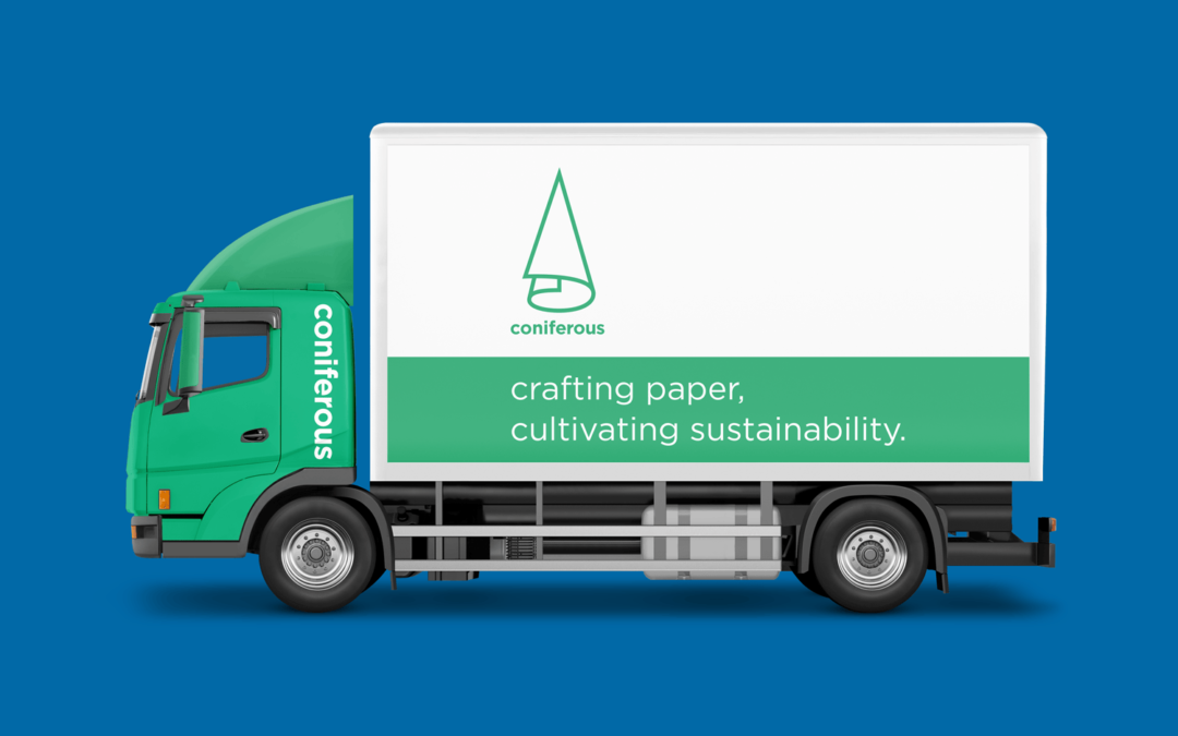
We crafted Coniferous’s brand identity by combining the shapes of a coniferous tree and a paper roll in the logo. This design symbolises the company’s dedication to sustainability and its core paper trading business. The green color signifies eco-friendliness and growth, while the sleek design reflects modernity and efficiency. This thoughtful integration distinguishes Coniferous in the market and communicates its commitment to environmental responsibility and quality.
by pandesign | May 2, 2024
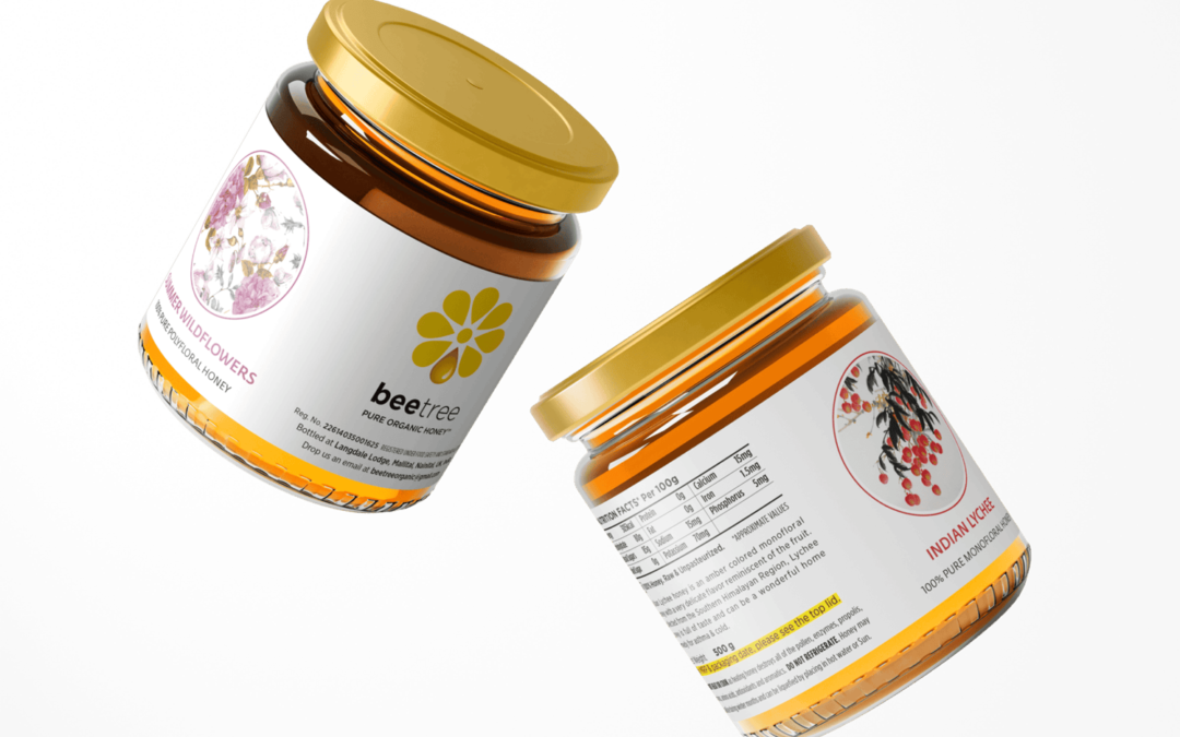
Beetree “nature’s sweet harmony” 3 Home 5 Project ( Page 2 ) Reading Time: 9 minutes Client Beetree Organics Pvt Ltd, Uttarakhand, India Industry Food & Beverage Services Brand Naming, Brand Identity,Packaging Design, Content,Brand Communication...
by pandesign | May 1, 2024
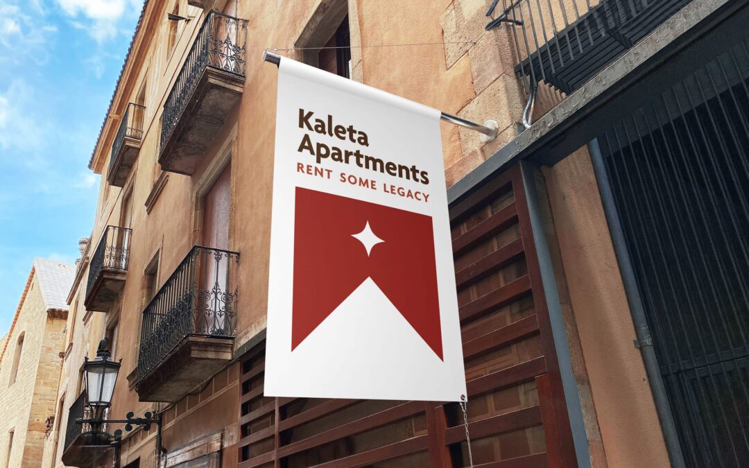
Kaleta Apartments “rent some legacy” 3 Home 5 Project Category: Tagline Reading Time: 7 minutes Client Kaleta Apartments, Croatia Industry Hospitality Services Brand Identity, Brand Tagline Introduction Kaleta Apartments is located in Split, Croatia—a 1700 year...
