Client
MICA, Ahmedabad
Industry
Education
Services
Brand Strategy, Brand Refresh, Brand Guidelines, Brand Collaterals, Brand Communication
Introduction
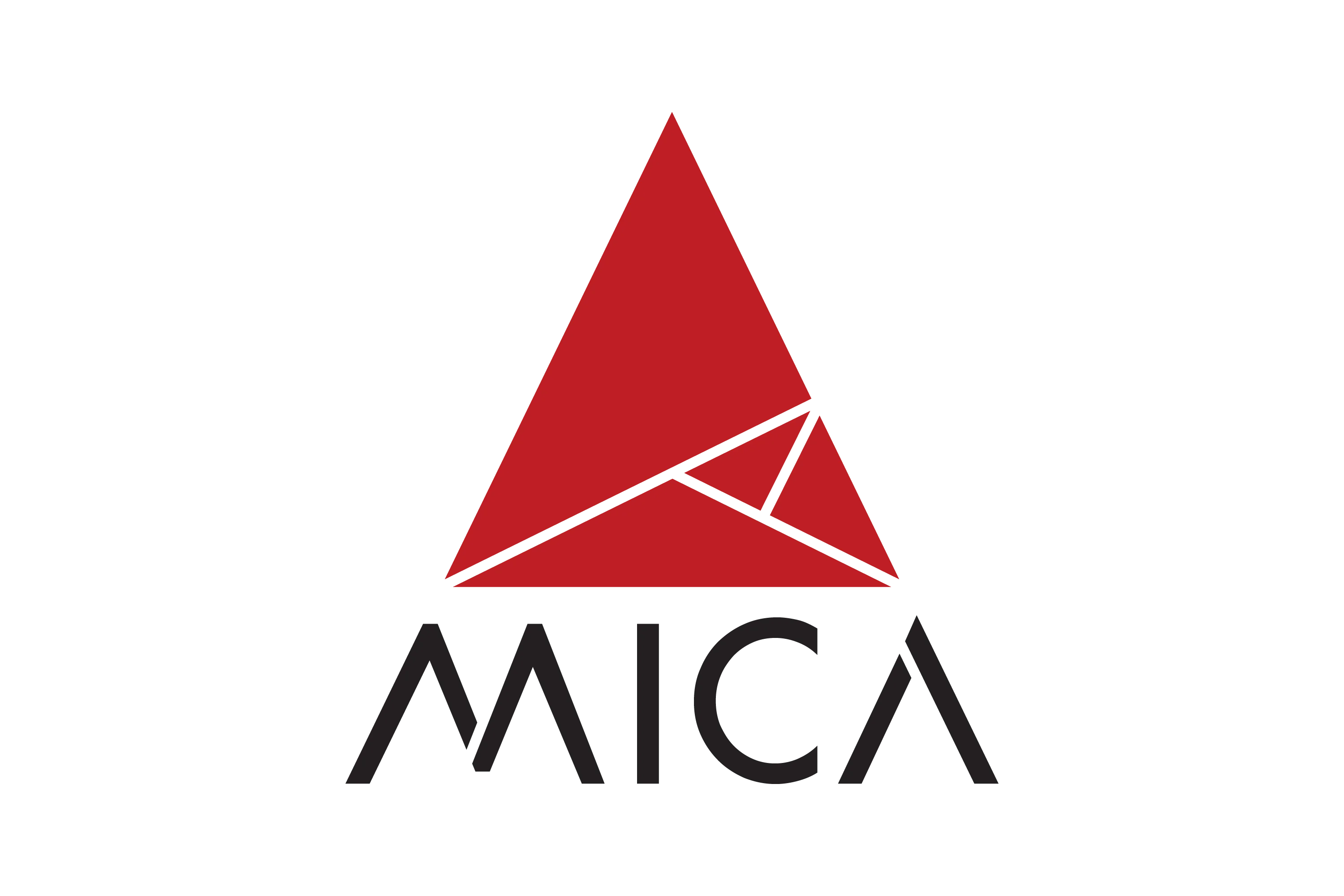
MICA, renowned as The School of Ideas, has led innovation in Strategic Marketing and Communication education since its inception. With its evolving role and ambitions, the institute sought to refresh its brand to better align with its values and aspirations. Pandesign undertook the task of redefining MICA’s identity to reflect its growth, dynamism, and commitment to creativity and strategy.
MICA’s diverse stakeholder perceptions—ranging from it being an advertising school to a creative arts institution or a niche business school—created fragmented positioning and inconsistent messaging. Pandesign’s challenge was to unify these varied perceptions into a cohesive narrative that highlighted MICA as a unique bridge between creativity and strategy. The refreshed identity needed to be adaptable across platforms, scalable for future growth, and instantly recognisable as a true reflection of MICA’s essence and vision.
Overview
Brief
The project aimed to:
Define MICA as a global leader in Strategic Marketing and Communication.
Highlight its dual focus on innovation and strategy.
Create a cohesive brand identity adaptable for diverse mediums and stakeholders.
Set the foundation for consistent communication across platforms.
Closely collaborate with Interbrand India to refine MICA’s new brand identity, ensuring it perfectly embodied the institute’s values and vision.
Inspiration
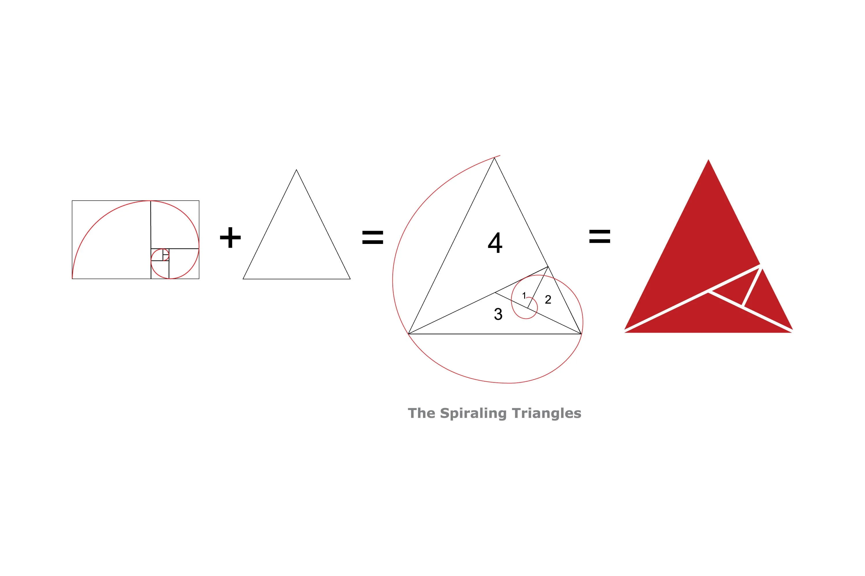
The new visual language captures the duality of MICA’s purpose: the science of Strategic Marketing (the rational aspect) and the art of Communication (the creative aspect).
Process
Brand Strategy
MICA’s brand strategy aimed to position it as a distinctive leader in Strategic Marketing and Communication by emphasising its unique integration of strategic rigour and creative excellence, setting it apart from traditional business schools and creative arts institutions.
- Positioning MICA in the Value Chain: Emphasizing MICA’s distinct role as a bridge between business schools and creative arts institutions, standing out with its combination of strategic rigor and creative excellence.
- Stakeholder Alignment: Developing communication and design systems that resonate with students, faculty, recruiters, and alumni, ensuring consistent brand messaging across touchpoints.
- Future-Proofing: Designing an identity system and guidelines that could evolve with MICA’s growth while maintaining its foundational values.
- Visual Storytelling: Utilising the spiraling triangles to convey MICA’s dynamic energy and positioning as a progressive, socially responsible institution
Visual Identity
The design retains continuity with MICA’s previous identity while introducing modern elements for adaptability and scalability across platforms.
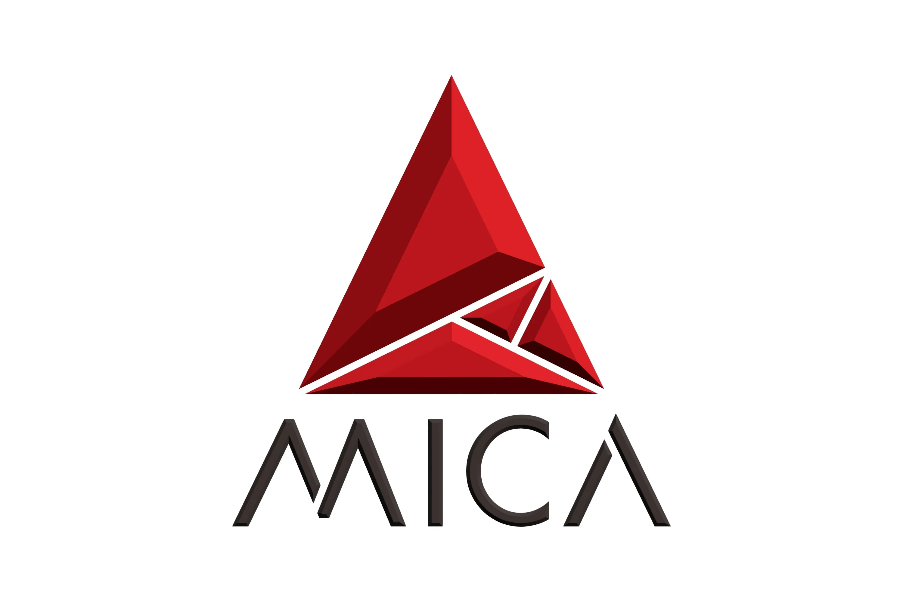
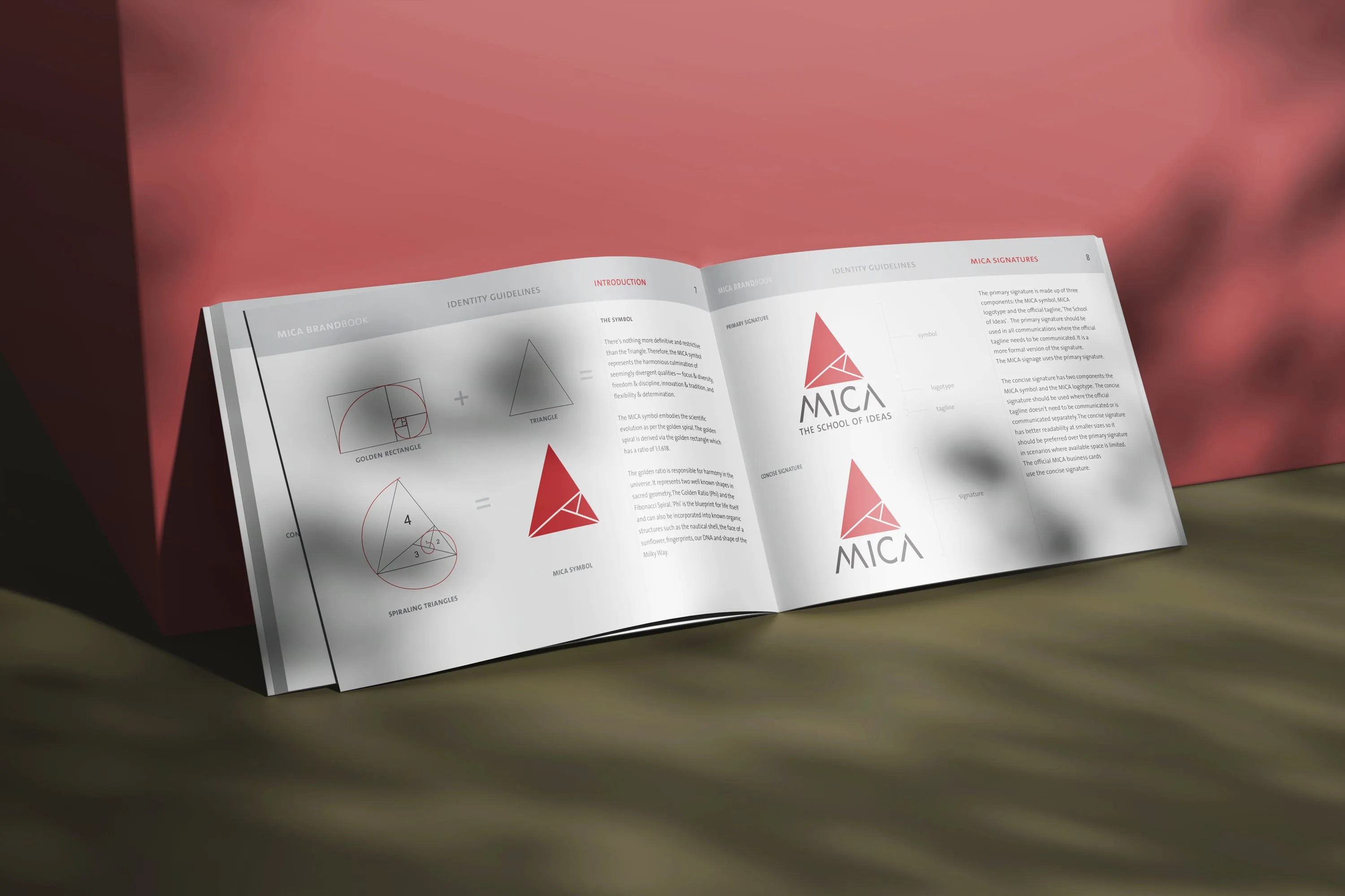
MICA’s refreshed visual identity centres on the spiraling triangle, inspired by the Fibonacci Spiral and Golden Ratio, symbolising growth, harmony, and transformation. At the heart of the refreshed identity is the spiraling triangle symbol, which reflects focus, adaptability, and innovation. This dynamic motif bridges the science of Strategic Marketing and the art of Communication, embodying MICA’s core values of innovation and inclusivity. The design retains continuity with MICA’s previous identity while introducing modern elements for adaptability and scalability across platforms.
Logo Construction
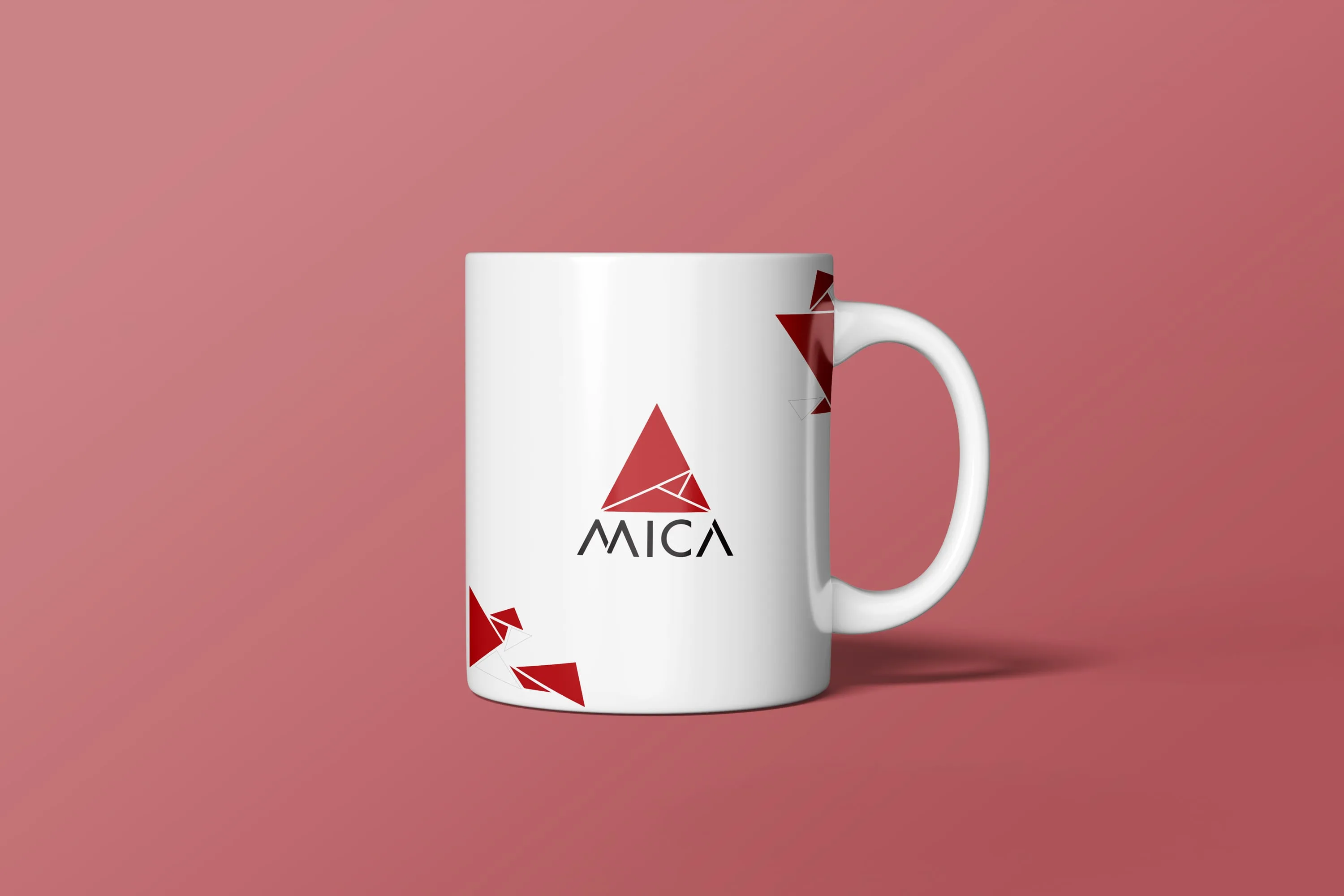
The MICA logo is a sophisticated composition that reflects the institution’s core values and dynamic identity. It is built around the spiraling triangle, inspired by the Fibonacci Spiral and Golden Ratio.
Built with precise proportions based on the Golden Ratio, the design ensures visual balance and appeal. Its flexibility is enhanced by a concise version (triangle and logotype) for restricted spaces and adaptable colour variations in Crimson Red, Black, grayscale, and reverse formats. Clear spacing and size guidelines maintain the logo’s integrity and readability across all applications.


Colour Palette
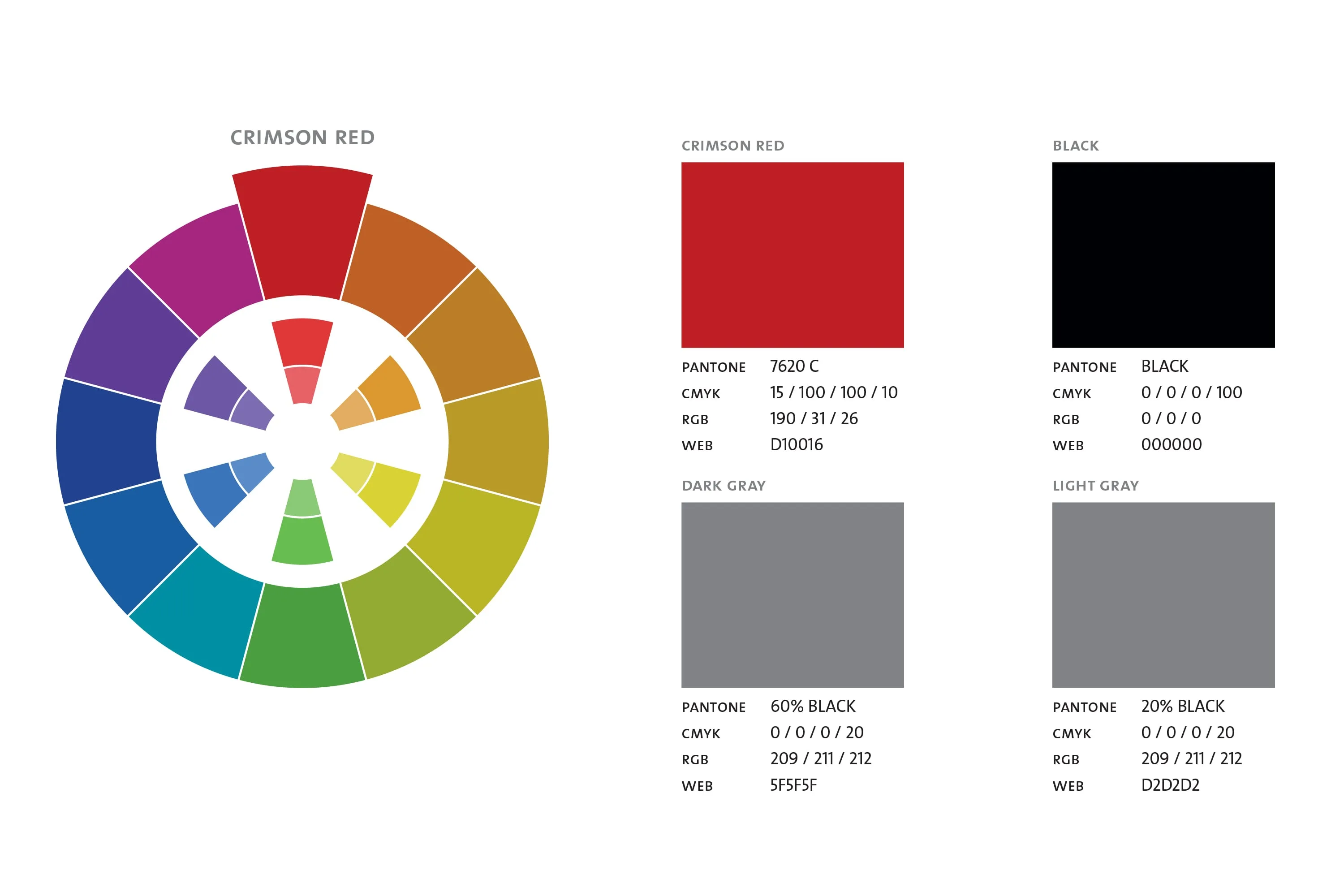
The primary colours—Crimson Red and Black—symbolize passion and professionalism. Complementary shades of grey and an extended secondary palette add vibrancy, ensuring versatility across all mediums. The palette reinforces MICA’s visual impact while maintaining elegance
Typography
The typography system of MICA is designed to reflect its modern, innovative, and professional identity, ensuring readability and consistency across diverse communication mediums.
Official Typeface
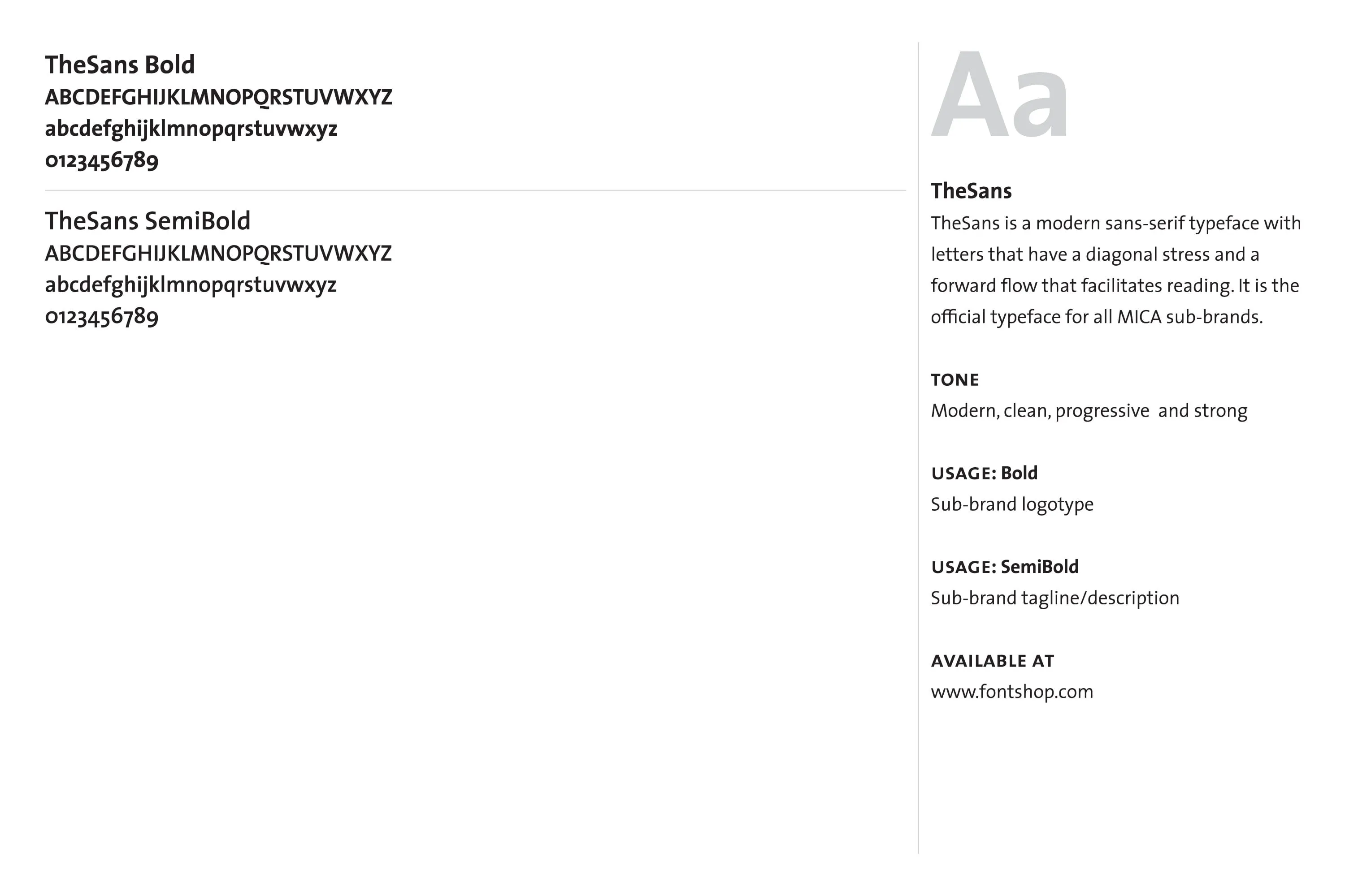
TheSans: This modern sans-serif font serves as MICA’s primary typeface. With diagonal stress and forward-flowing characters, it exudes clarity, strength, and progressiveness.
Usage:
- Bold and SemiBold: Ideal for headlines, subheadings, and key display elements.
- Regular and SemiLight: Used for body text and detailed content, ensuring legibility.
Web Typeface
Open Sans: Selected for digital platforms, it combines neutrality with a friendly appearance. Its optimization for screen use ensures seamless communication across websites, online advertisements, and mobile interfaces.
Visual Tone
The typography strikes a balance between modernity and tradition, aligning with MICA’s ethos of bridging creativity and strategy. Its clean and structured forms complement the visual identity’s focus on clarity and innovation.
This cohesive system ensures MICA’s communication is visually appealing, professional, and aligned with its forward-thinking identity.
Sub-branding
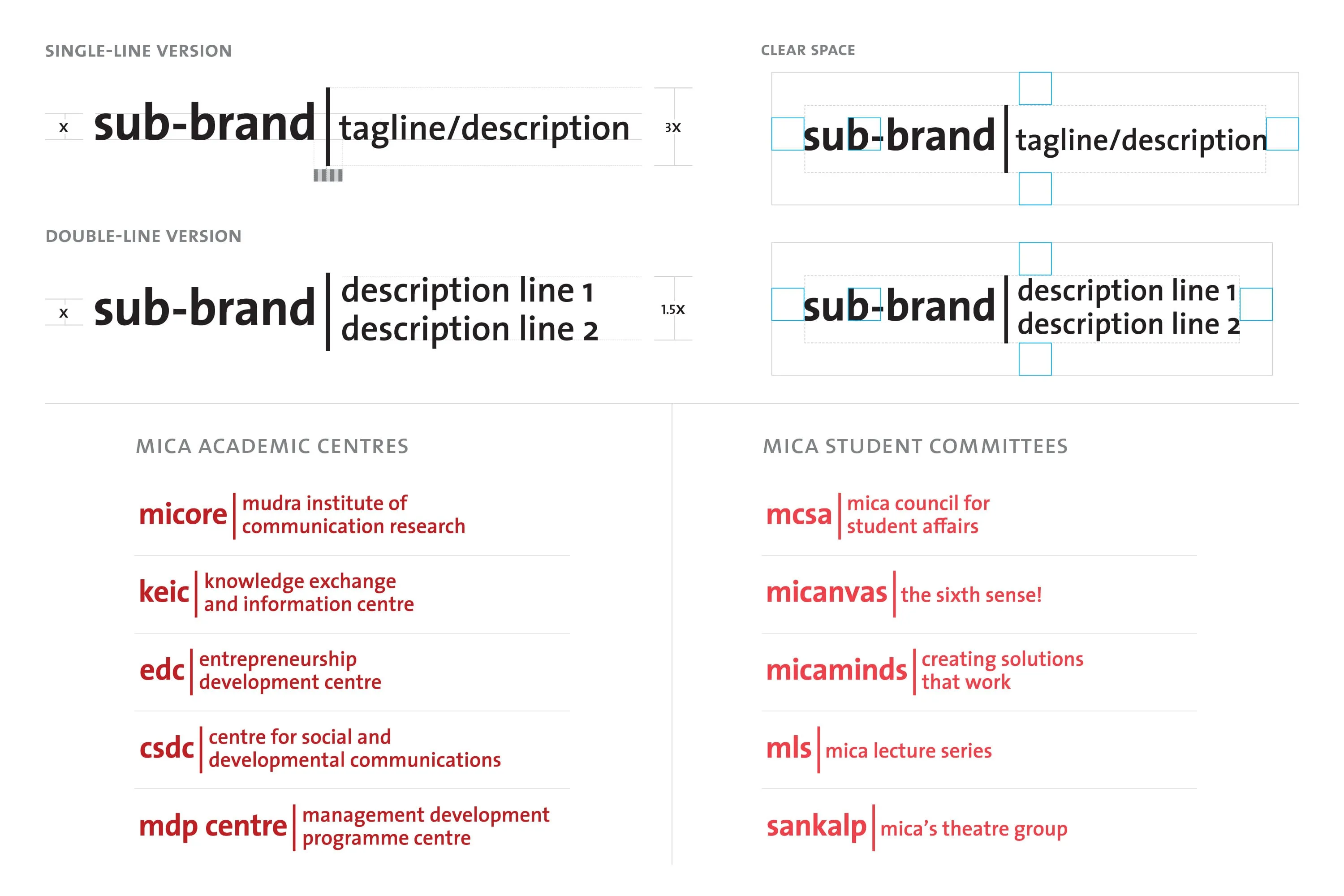
- Enhance Recognition: Ensure sub-brands are recognizable while maintaining association with MICA.
- Convey Hierarchy: Reflect the positioning of academic and student entities within the overall MICA brand.
- Provide Flexibility: Allow customisation for different sub-brands without compromising consistency.
Application



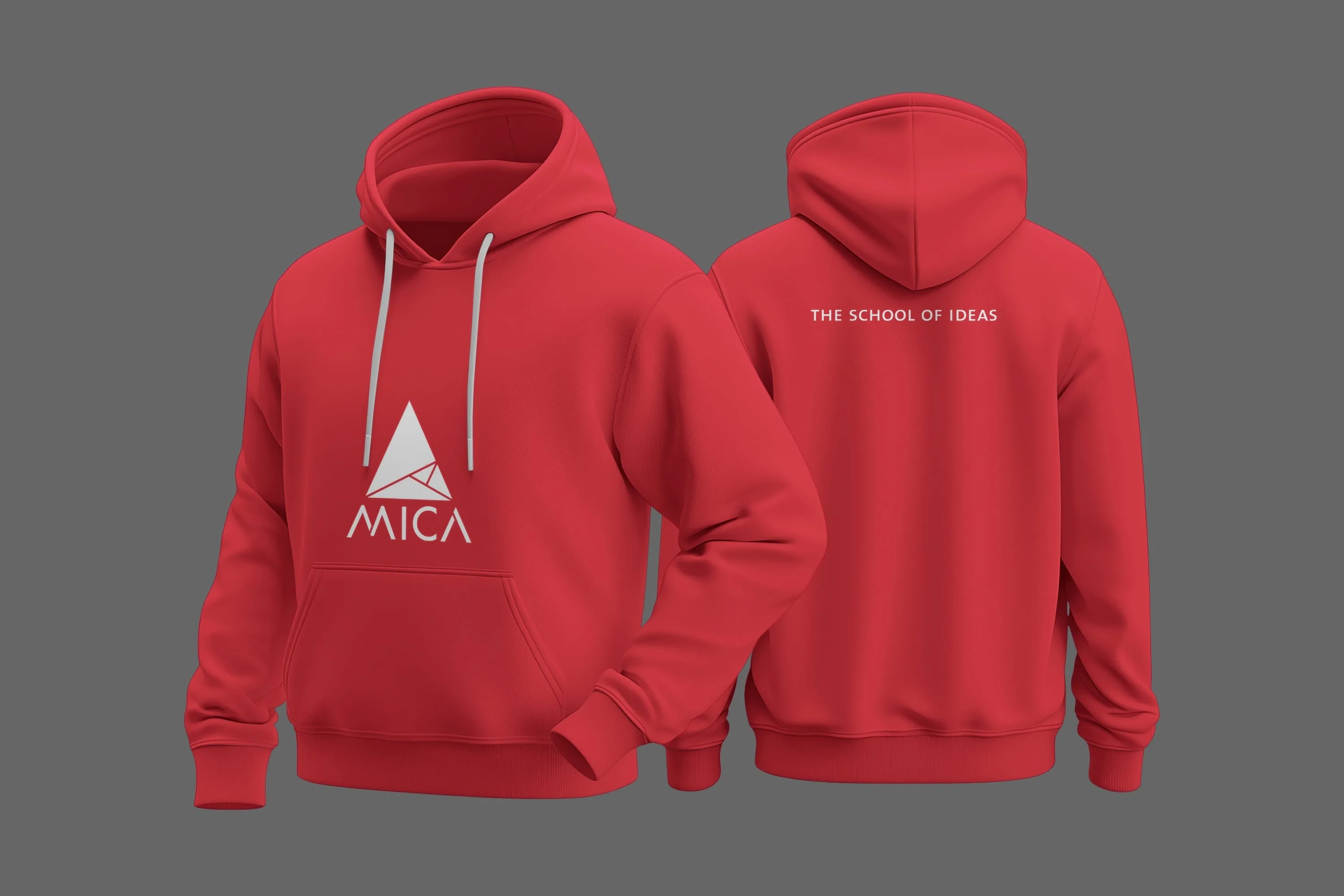
MICA Brandbook
Overview
Pandesign developed the MICA Brandbook to establish a unified, consistent, and scalable visual identity for the institution. The process aimed to resolve varied perceptions of MICA, reinforce its position as a leader in Strategic Marketing and Communication, and ensure coherence across all communication touchpoints.
Process
1. Research and Alignment:
- Studied MICA’s evolution, programs, and stakeholder needs.
- Integrated MICA’s vision statement into the branding framework.
2. Design and Development:
- Created a refreshed identity with the Fibonacci-inspired logo symbolising growth and adaptability.
- Defined clear guidelines for sub-brands, ensuring individuality within a cohesive system.
- Established a bold visual language using TheSans typography and a defined colour palette (Crimson Red for academic centres, Bright Red for student committees).
3. Systematising Guidelines:
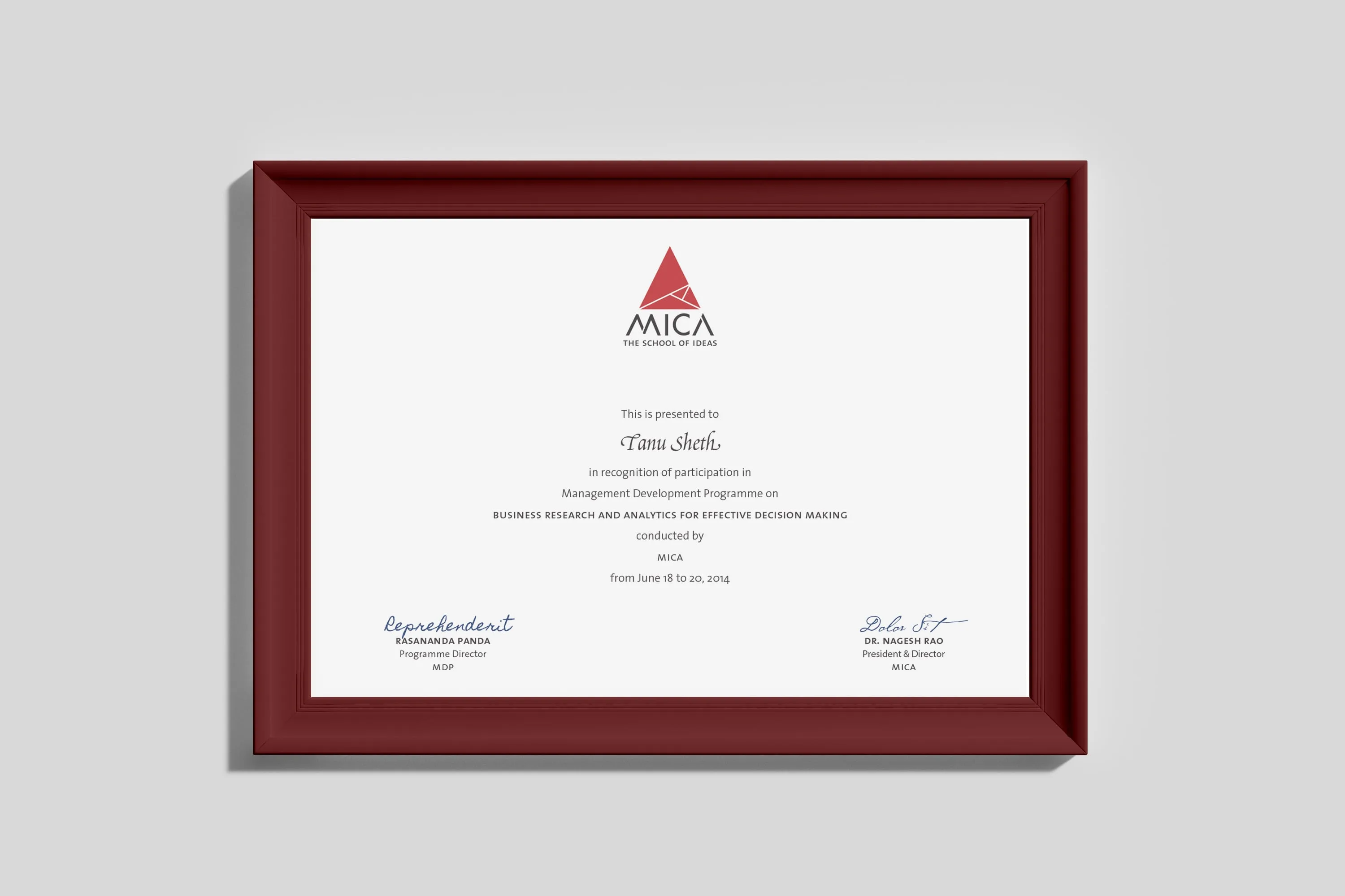
- Detailed rules for logo usage, typography, colour application, and design patterns.
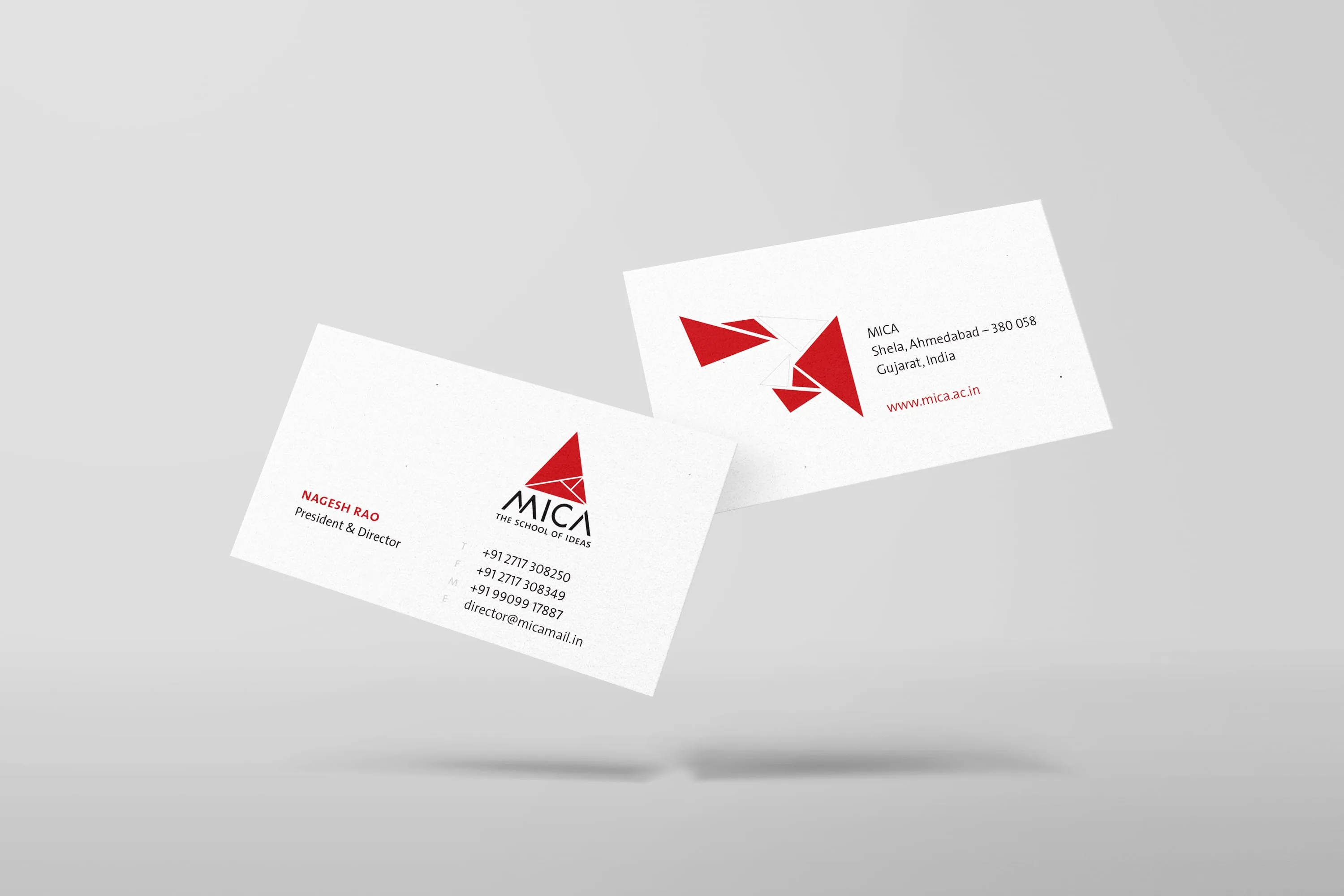
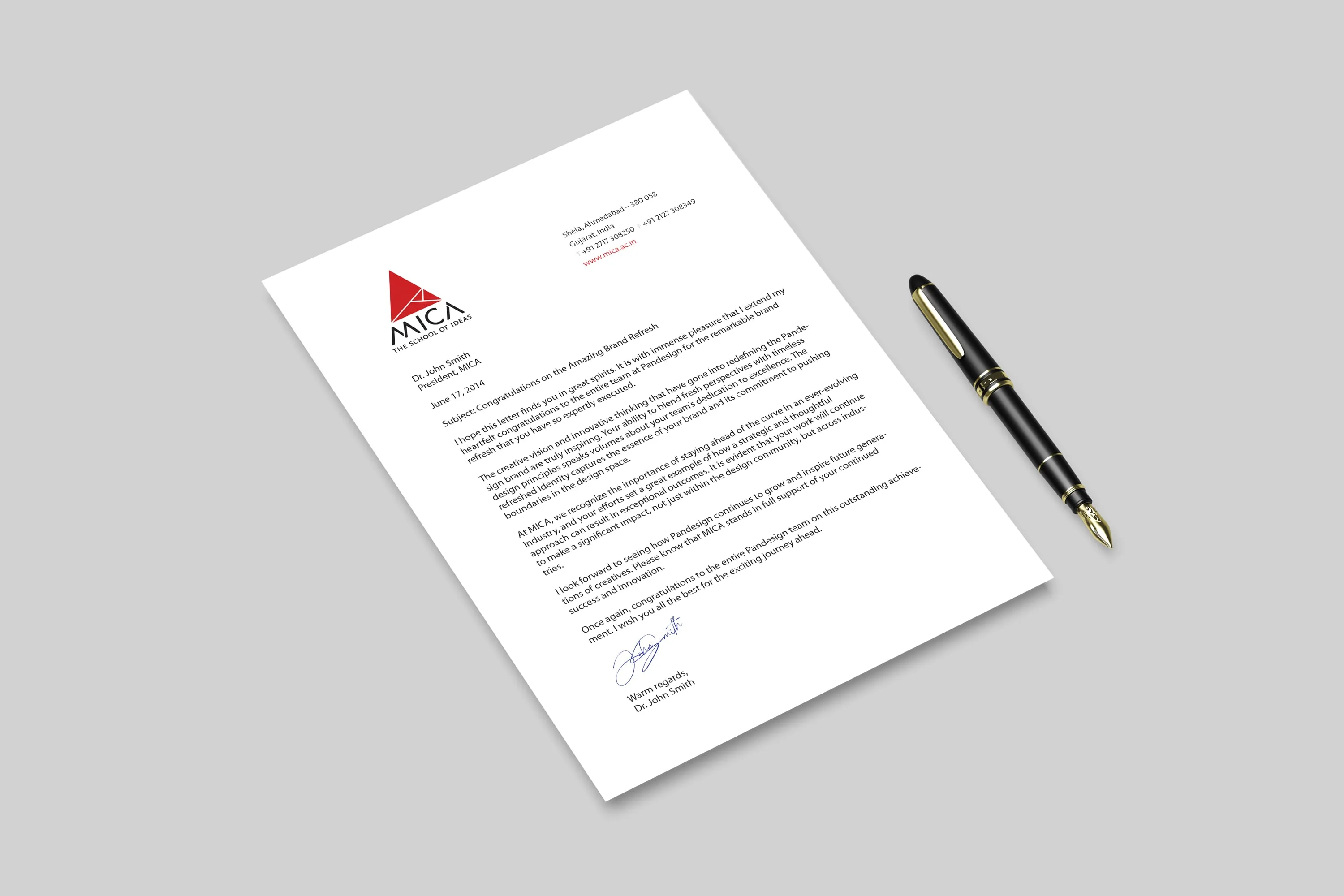
- Developed templates for business cards, letterheads, digital signatures, and web layouts.
4. Collaboration and Testing
- Worked with MICA’s stakeholders to align goals and refine guidelines for practical use.
- Tested applications across print and digital formats for scalability.
Impact
The Brandbook serves as a comprehensive guide, enhancing MICA’s professionalism and recognition. It provides a cohesive visual language for all stakeholders, supporting the institution’s growth while preserving its identity as The School of Ideas.
