Client
Kule Kule Dressing & Décor Pvt Ltd
Industry
Dressing & Décor
Services
Brand Strategy, Brand Naming, Brand Identity, Brand Tagline, Packaging Design, Photography, Brand Collaterals, Brand Communication
Introduction

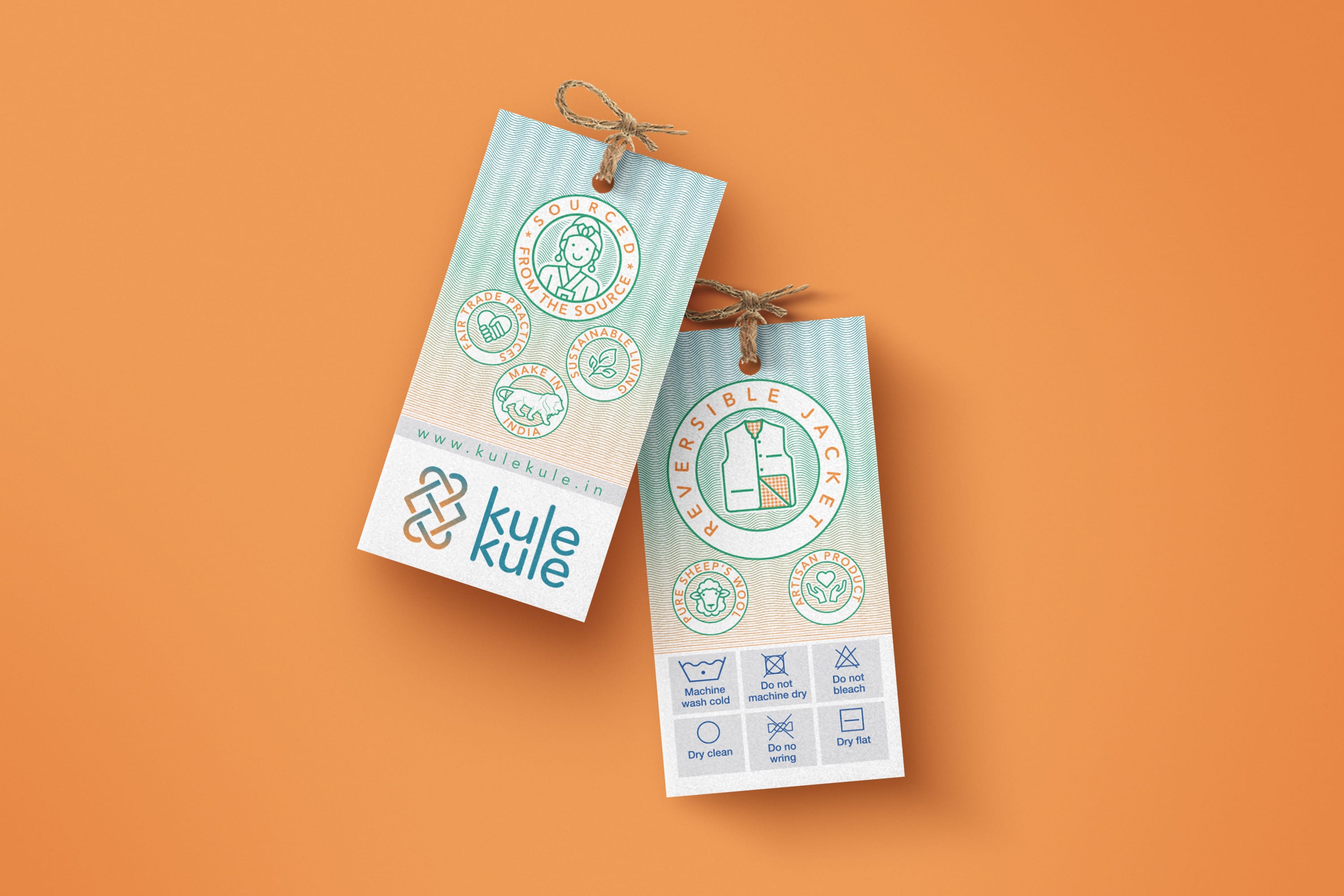

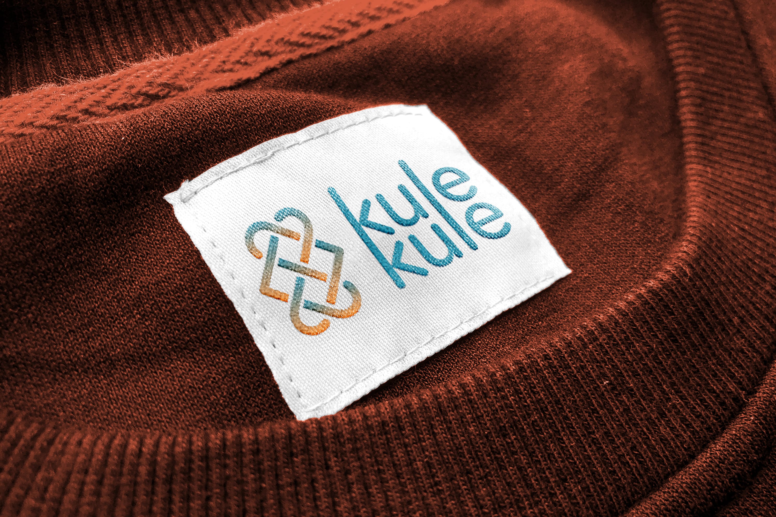

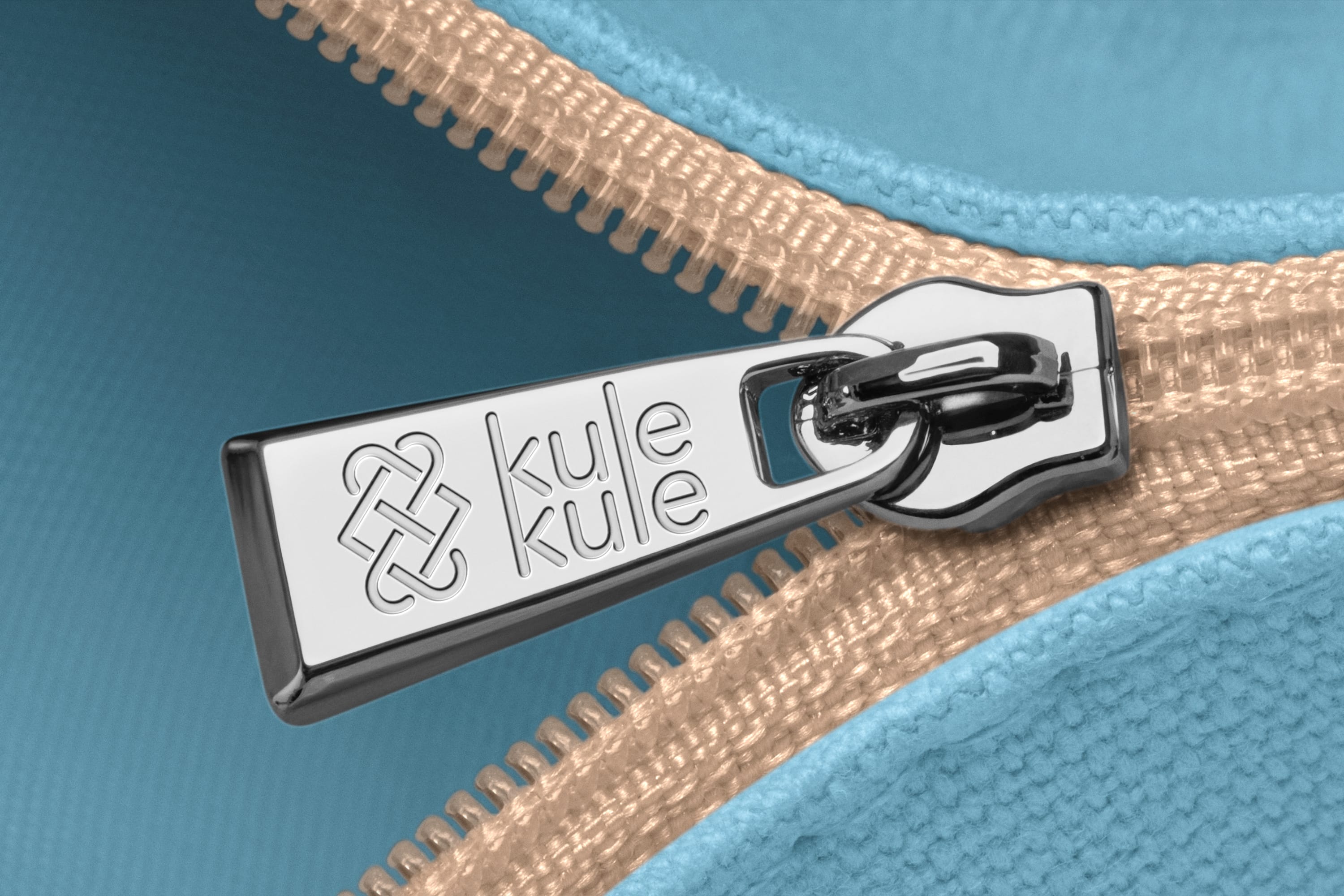
Kule Kule Dressing & Décor Pvt Ltd specialises in authentic fabrics and products sourced from Leh, Kullu, and Srinagar. Dedicated to supporting artisans with fair compensation and promoting their independence, Kule Kule is recognized by Startup India and Make in India. The company combines traditional craftsmanship with sustainable practices to celebrate and preserve indigenous art.
Our challenge was to create a brand that embodies trustworthiness and authenticity. We aimed to develop a name and logo that effectively convey these values in an engaging and coherent manner. The logo was designed to resemble an official mark—a symbol of trust and authenticity.
Overview
Brief
Kule Kule engaged Pandesign for full-scale brand development, including:
Brand Naming: Inspired by Ladakh’s heritage, we named the brand “Kule Kule,” a phrase used by mountain guides meaning “slowly slowly,” symbolising meticulous craftsmanship.
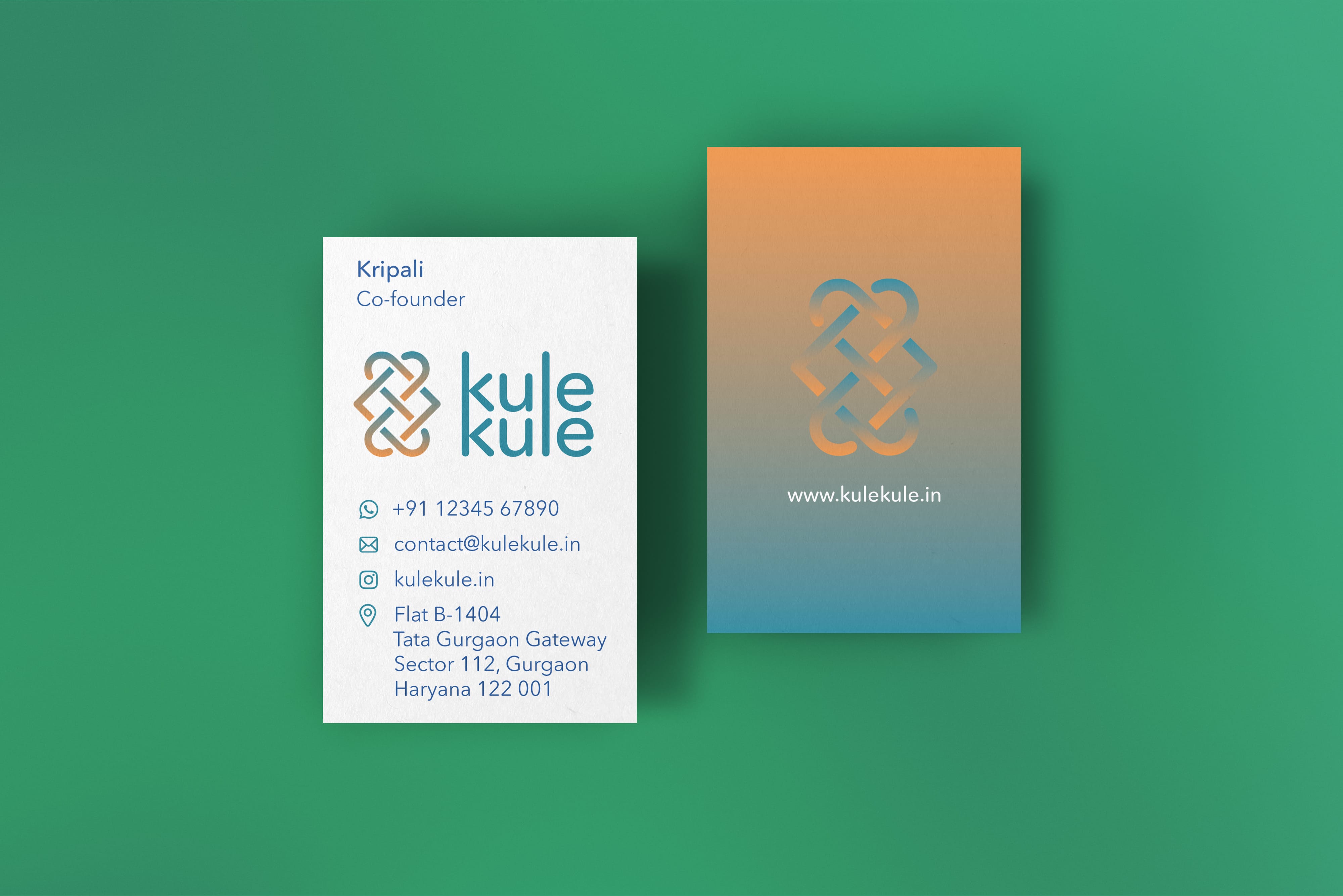
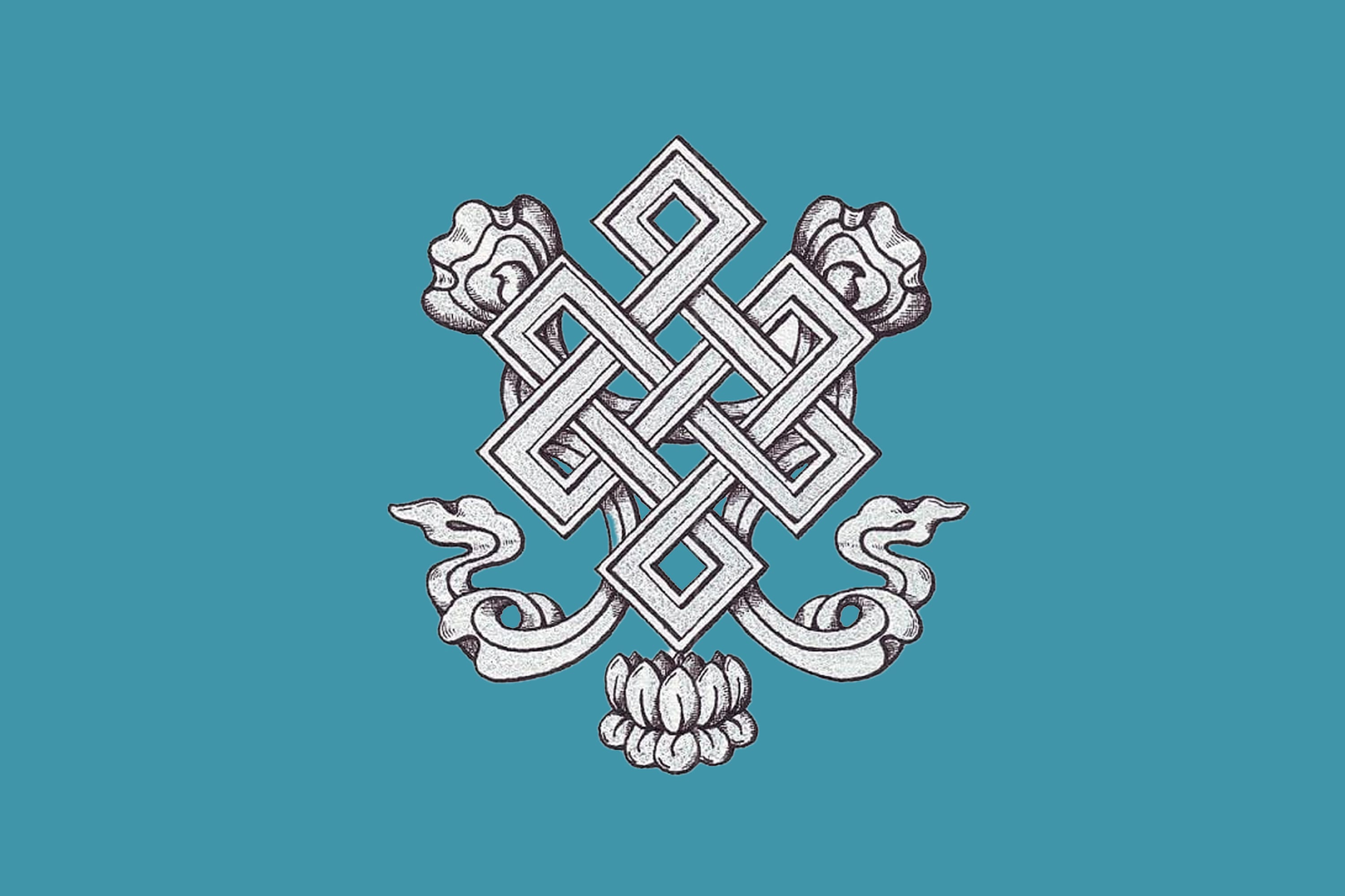
Visual Identity: Incorporating the Tibetan “Shrivatsa,” an eternal-weave motif symbolizing the intertwining of wisdom and compassion, we created a timeless and culturally rich brand image.
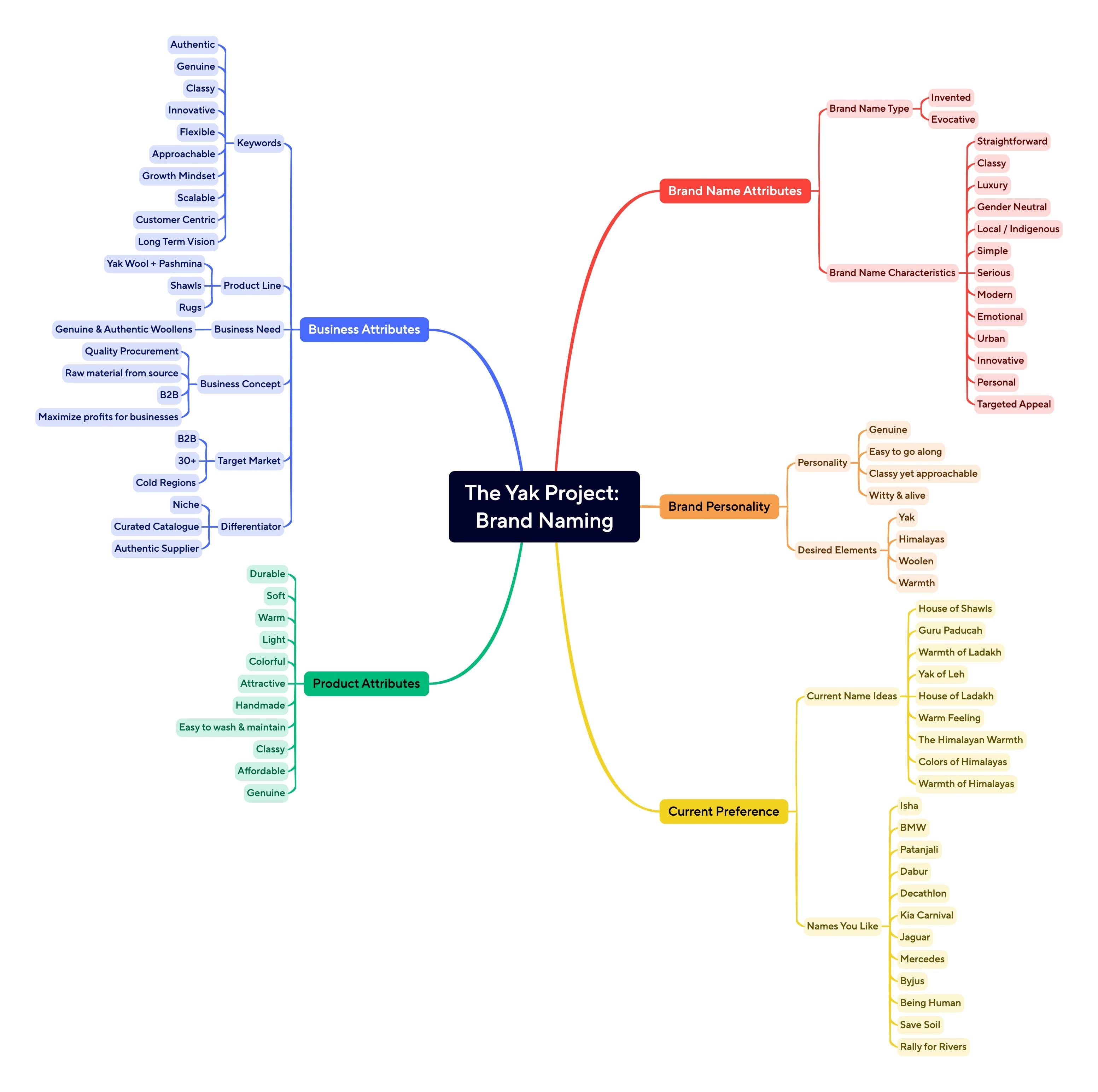
Tagline: “Sourced from the source” was coined to highlight the authenticity and origin of the products.
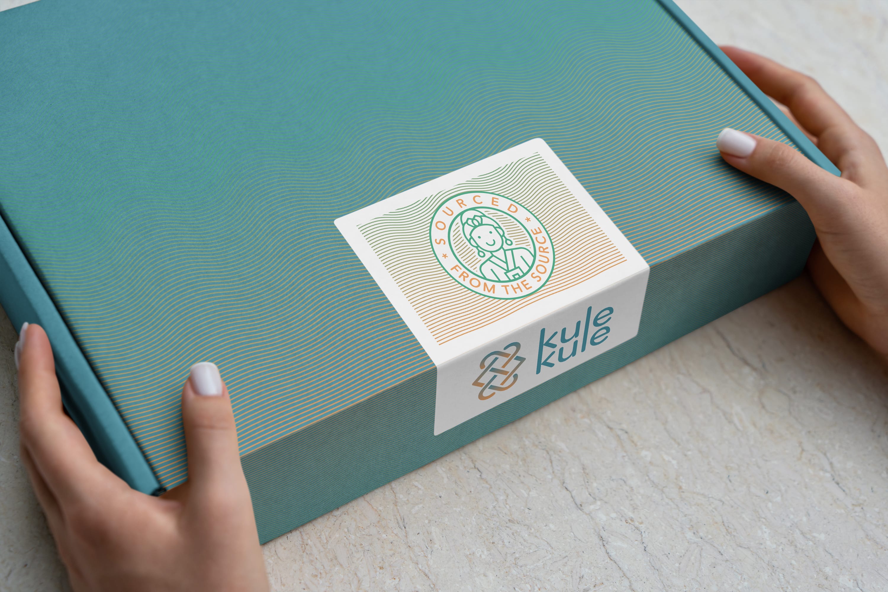
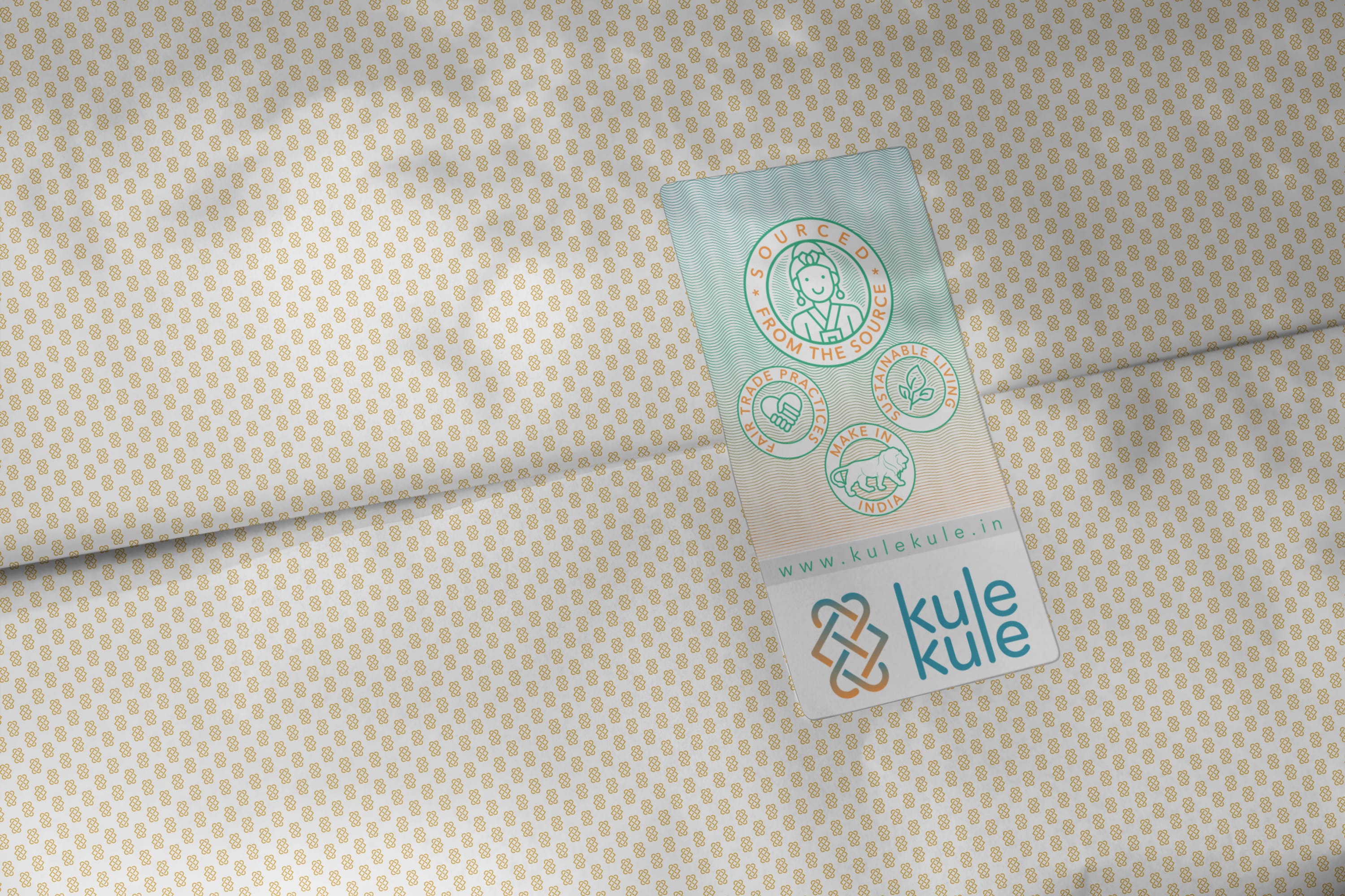
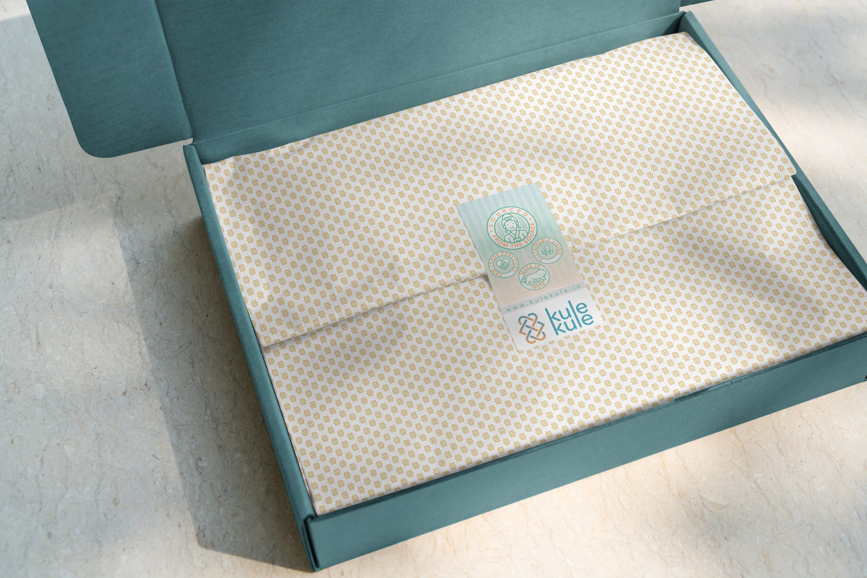
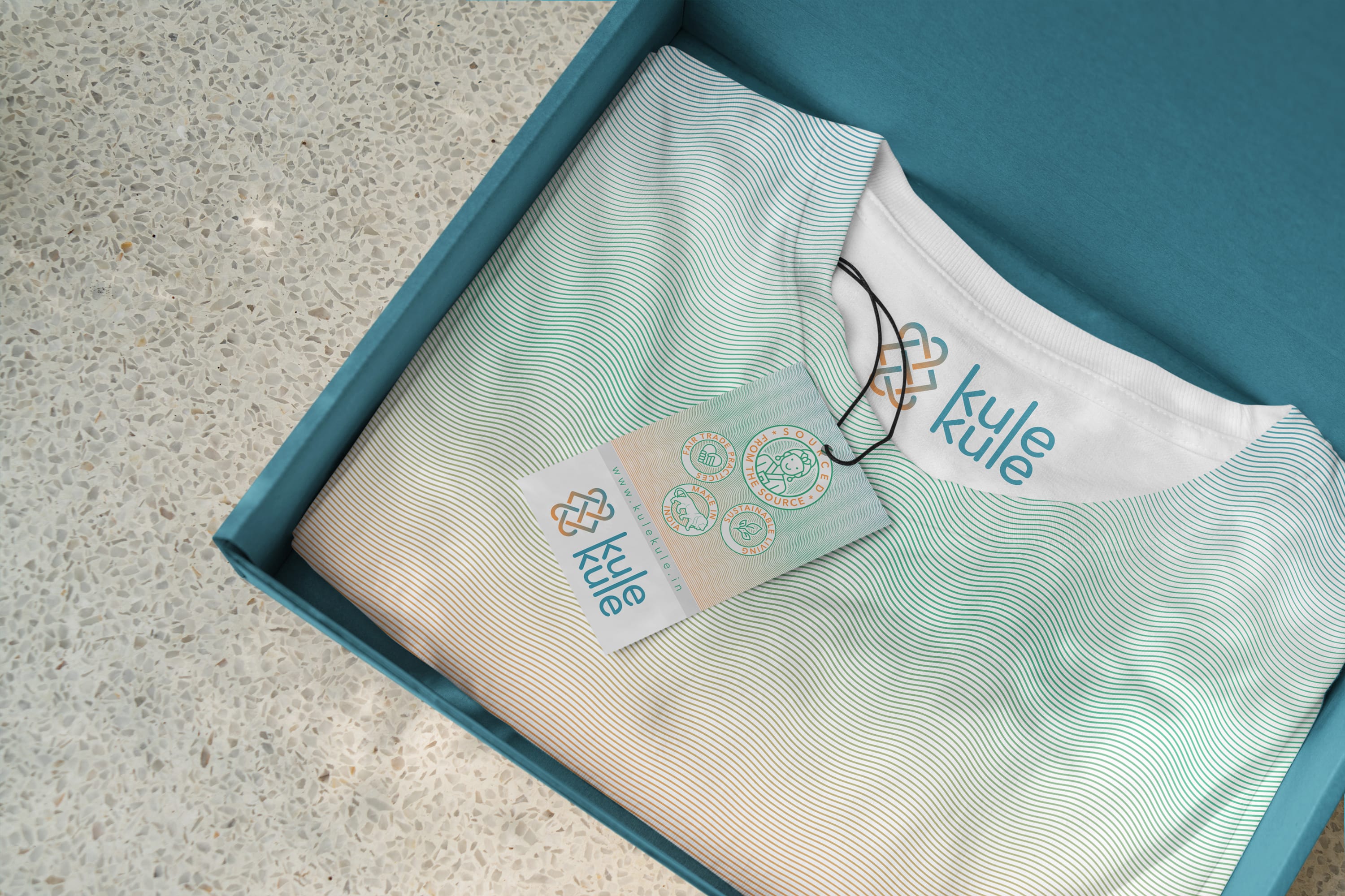
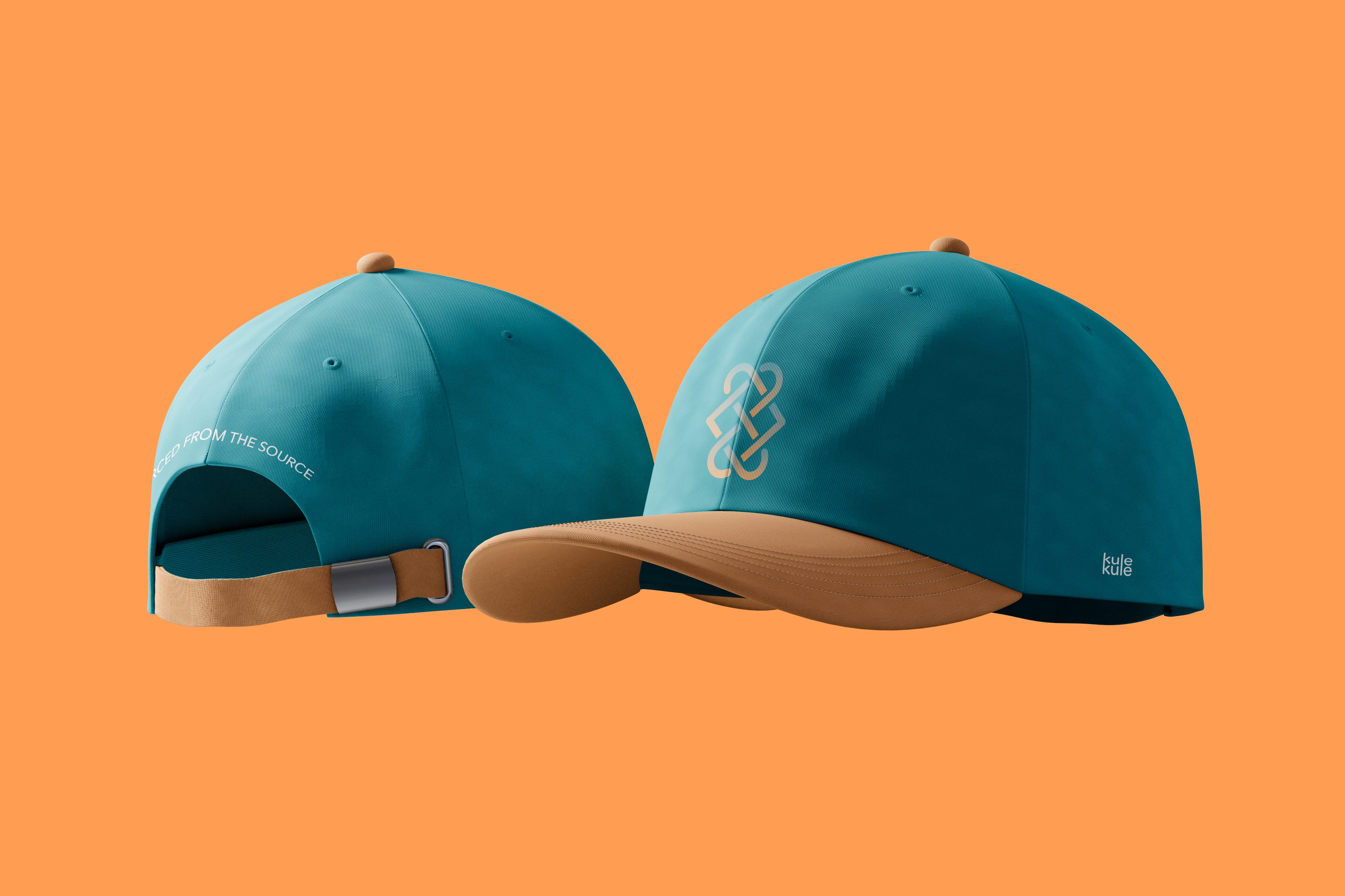
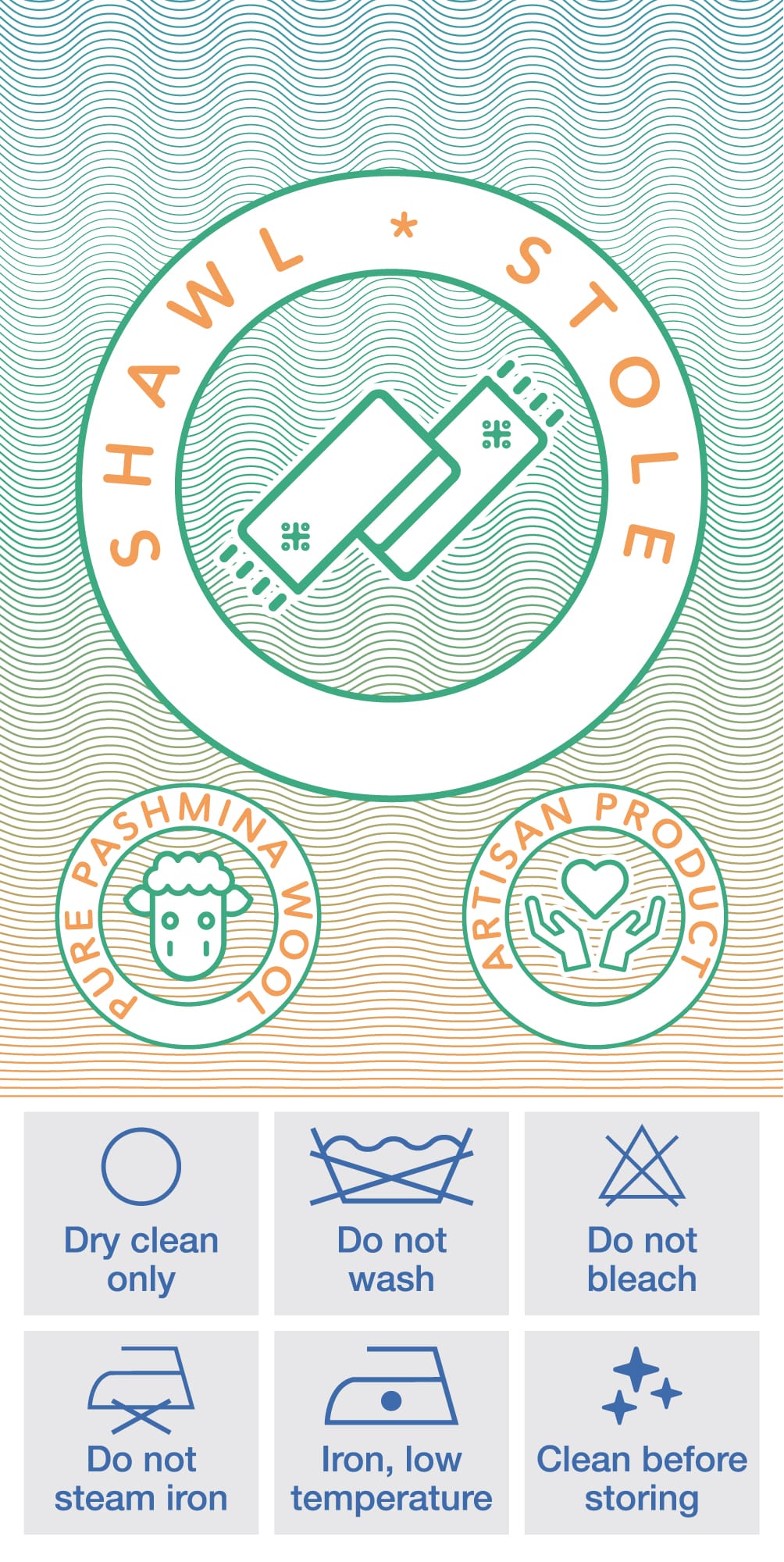
Packaging and Applications: Our packaging design integrated the visual identity and tagline, ensuring a cohesive and memorable brand experience with a focus on sustainability.


Inspiration
We coined the tagline “sourced from the source” to emphasise the authenticity and origin of the products and the brand.
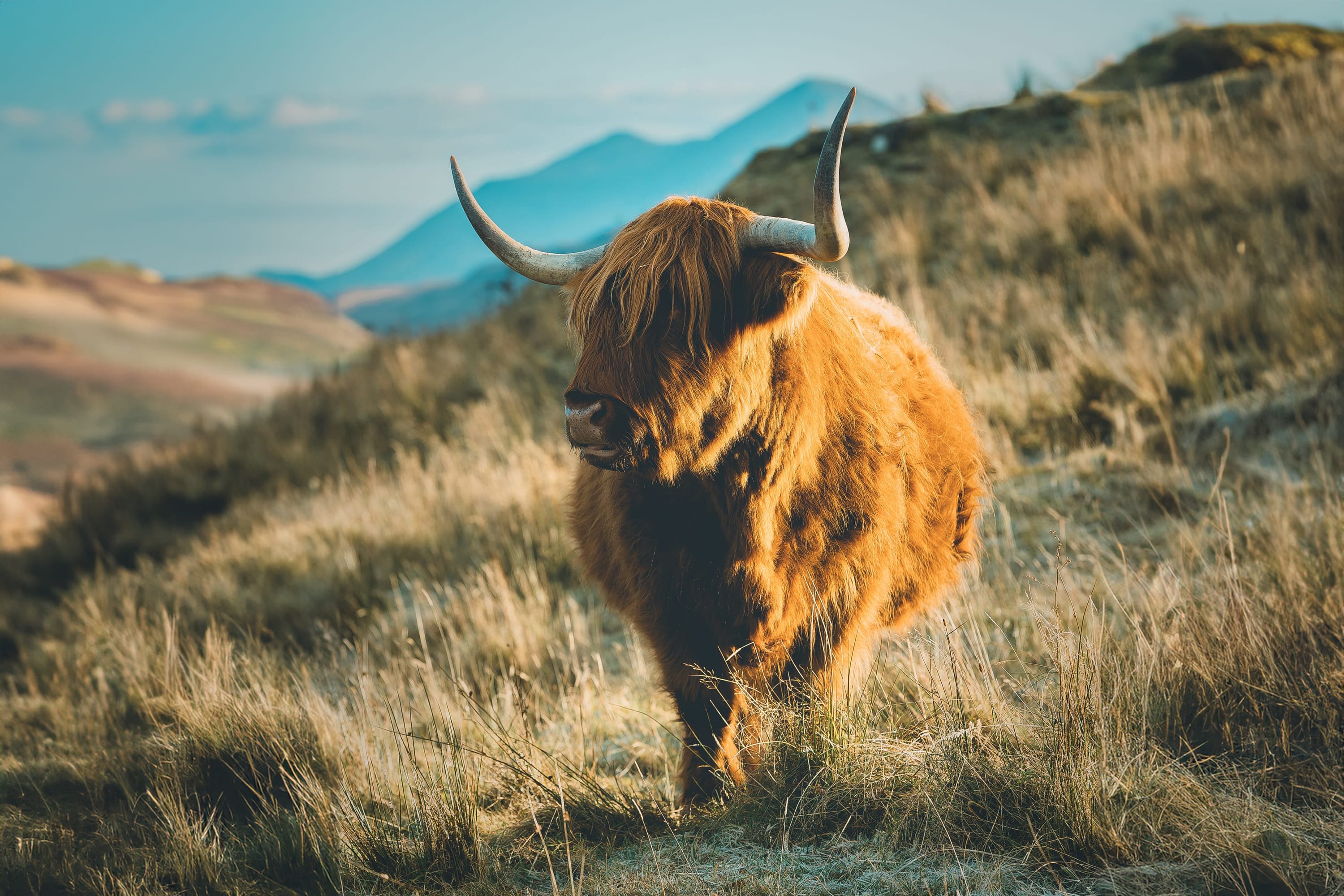
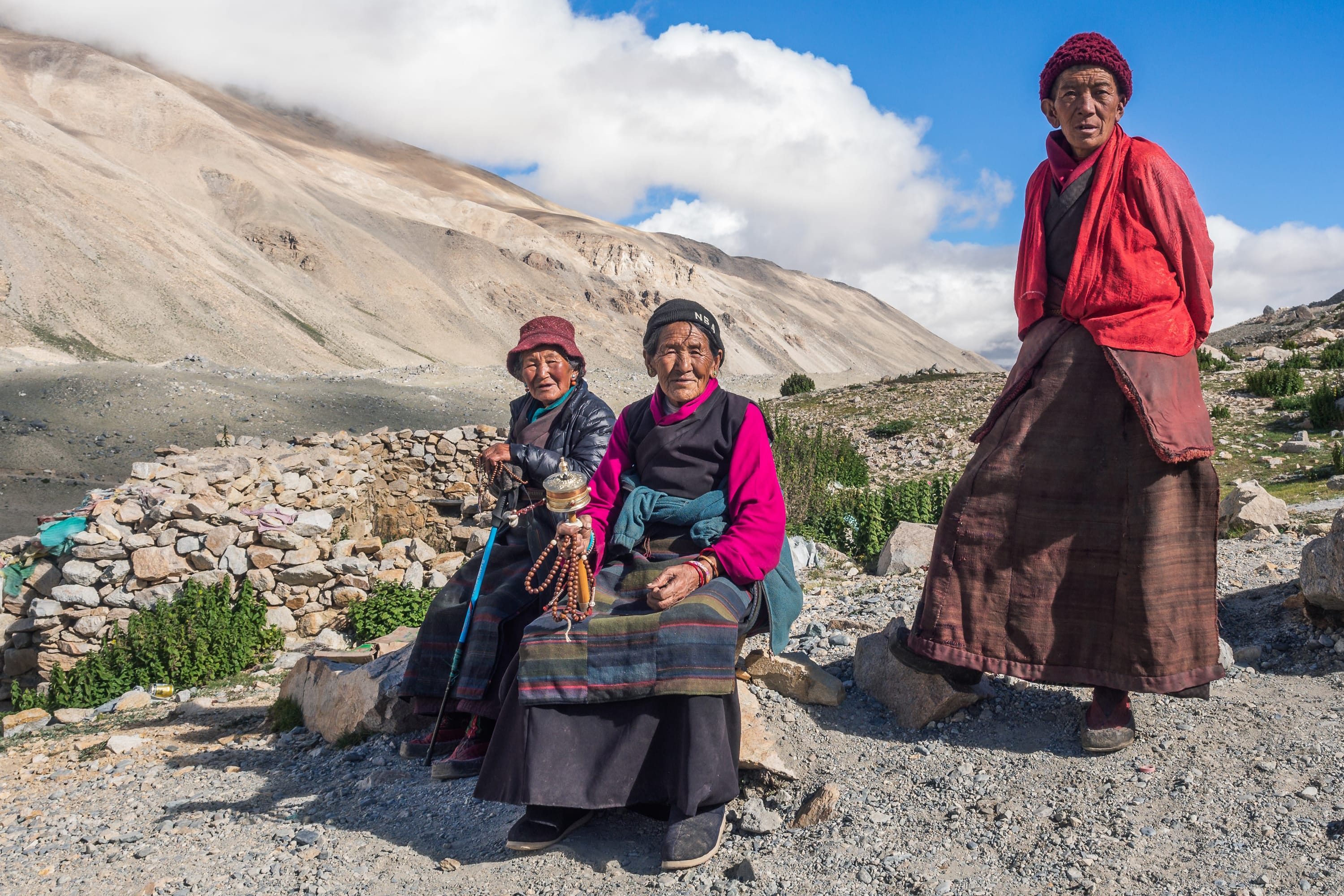
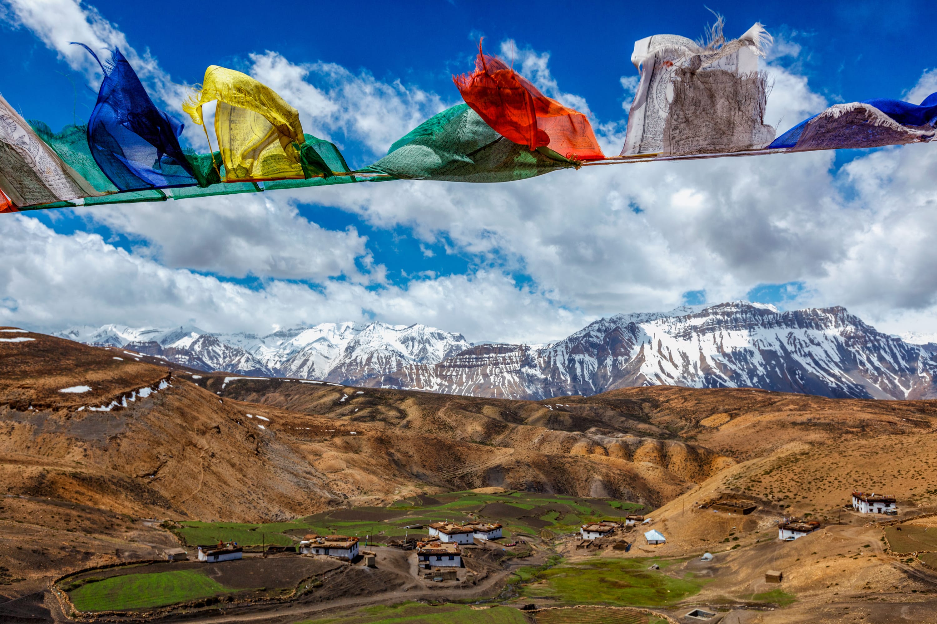
We drew inspiration from Ladakh’s rich cultural heritage to coin the name “Kule Kule,” a phrase used by mountain guides meaning “slowly slowly”, reflecting meticulous craftsmanship. The visual identity takes inspiration from the Tibetan “Shrivatsa”, an eternal weave symbolising the intertwining of wisdom and compassion. Additionally, we coined the tagline “sourced from the source” to emphasise the authenticity and origin of the products and the brand.
Process
Brand Naming
Our selection of “Kule Kule” was not merely about adopting local vernacular; it was a deliberate effort to infuse our brand identity with a meaningful narrative.
other finalised names
Visual Identity
Our meticulous approach ensured that the chosen logo not only encapsulated the brand’s essence but also resonated authentically with its cultural roots and market positioning.
Pandesign’s creation of multiple logo iterations for “Kule Kule” was a structured process that blended creativity with strategic refinement:
Concept development: We began by exploring concepts aligned with “Kule Kule’s” values of patience and craftsmanship, drawing inspiration from Ladakh’s cultural heritage.
Sketching and digital drafting: Initial ideas were sketched out and then refined digitally to visualise different design interpretations.
Feedback loop: Iterations were presented to our client, to gather feedback and ensure alignment with the brand’s identity and audience preferences.
Refinement and final selection: Through iterative refinement, we honed in on a final design that effectively represented “Kule Kule” visually and culturally.
Our meticulous approach ensured that the chosen logo not only encapsulated the brand’s essence but also resonated authentically with its cultural roots and market positioning.
Logo Iterations
Logo Construction
The logo seamlessly integrates the Shrivasta symbol, embodying the essence of the “eternal weave.” Additionally, we incorporated hearts to represent our “love of craft and artisans,” which is at the core of our brand’s identity.
Colour Palette
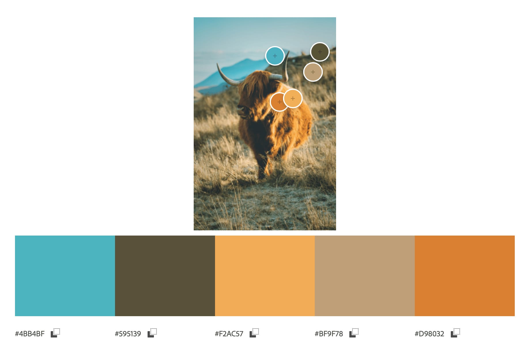
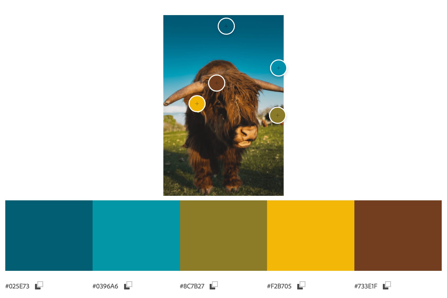
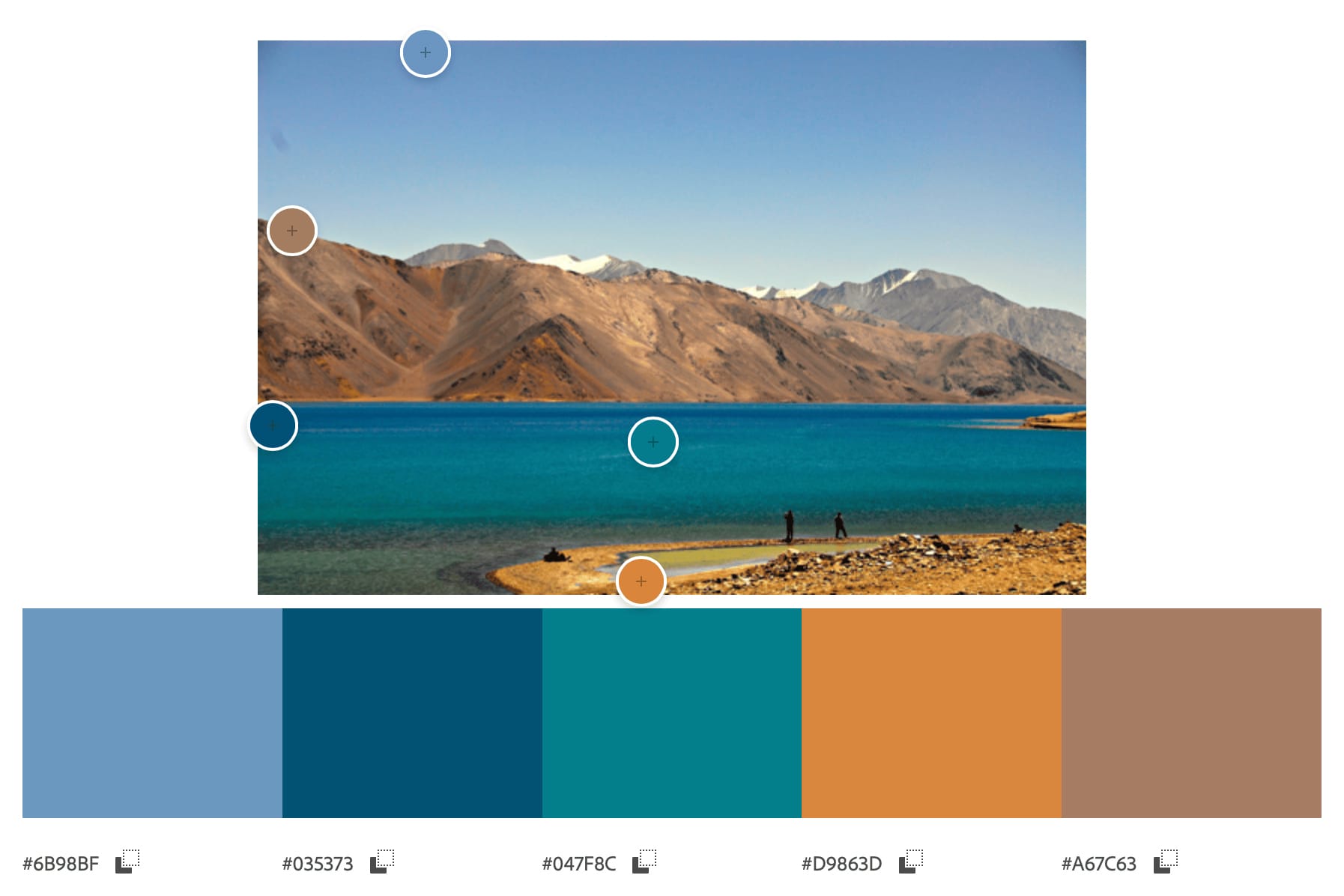
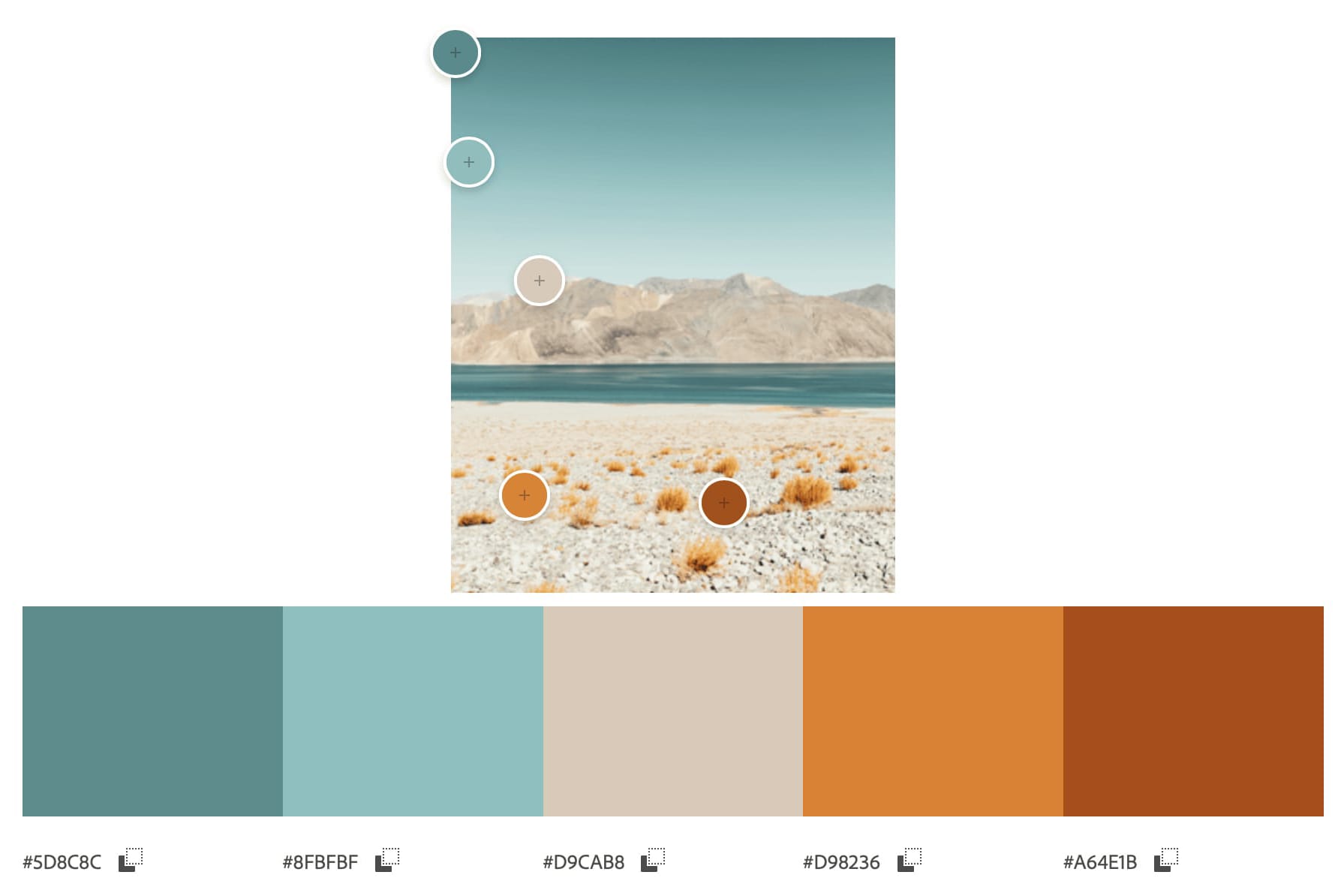
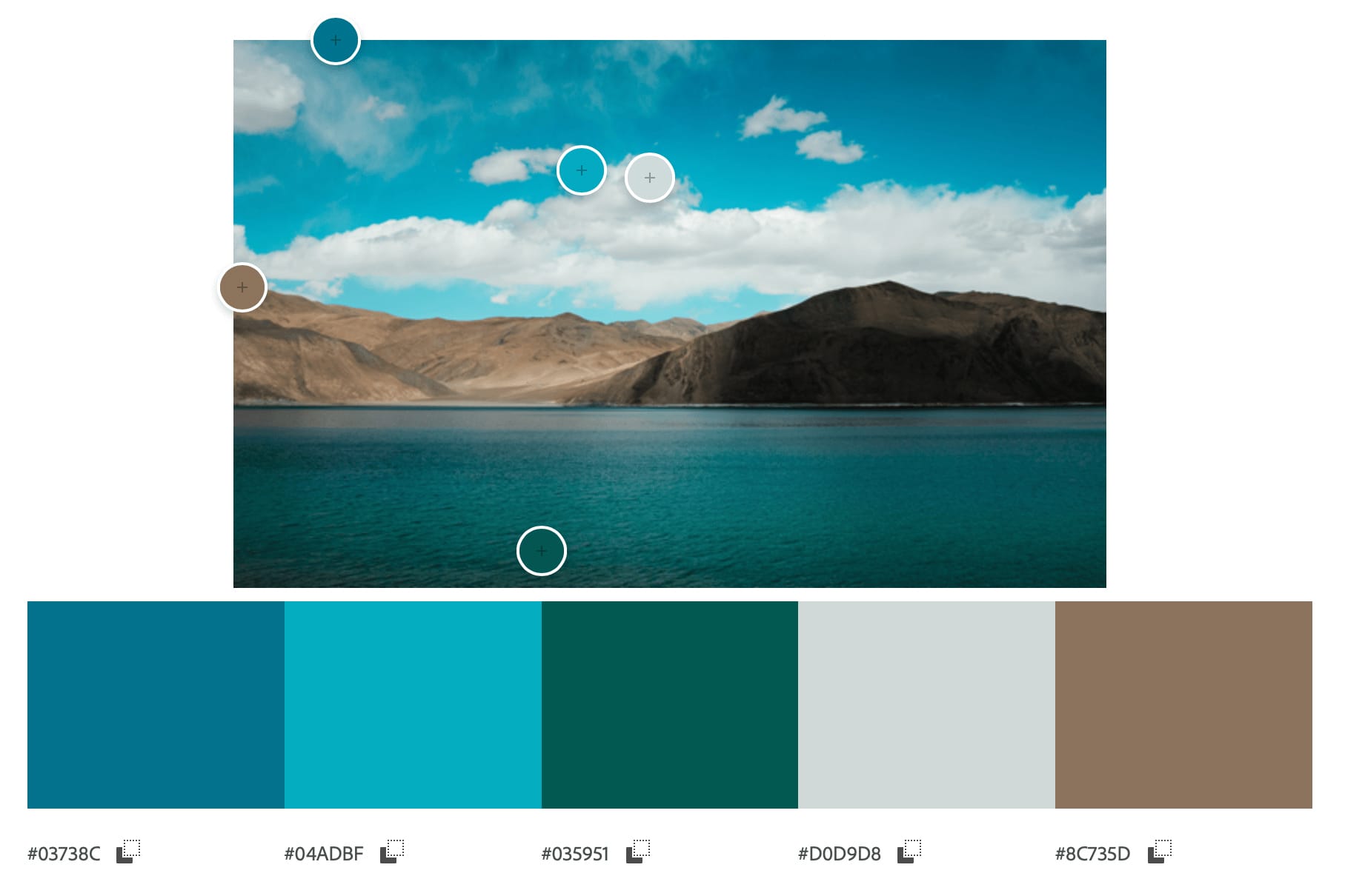
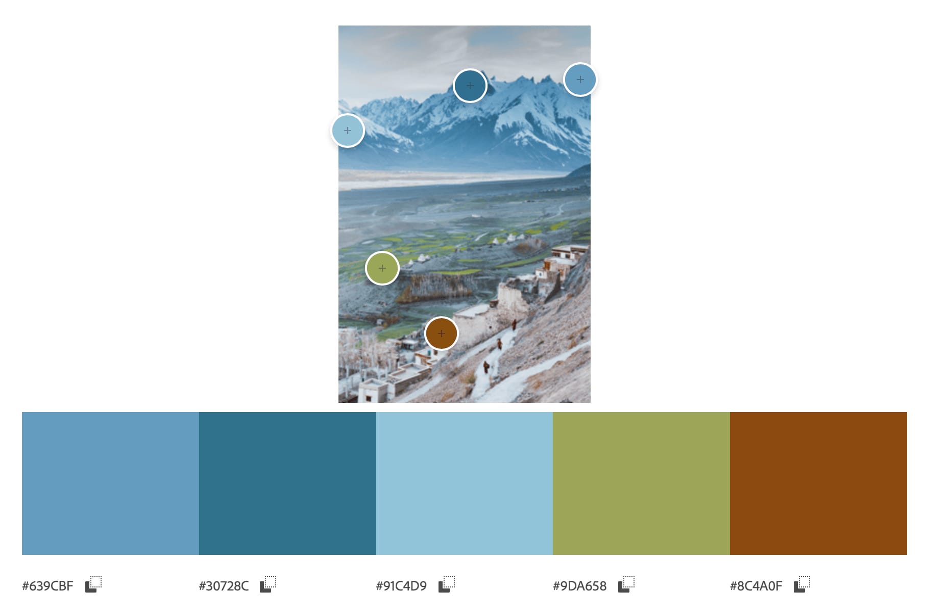
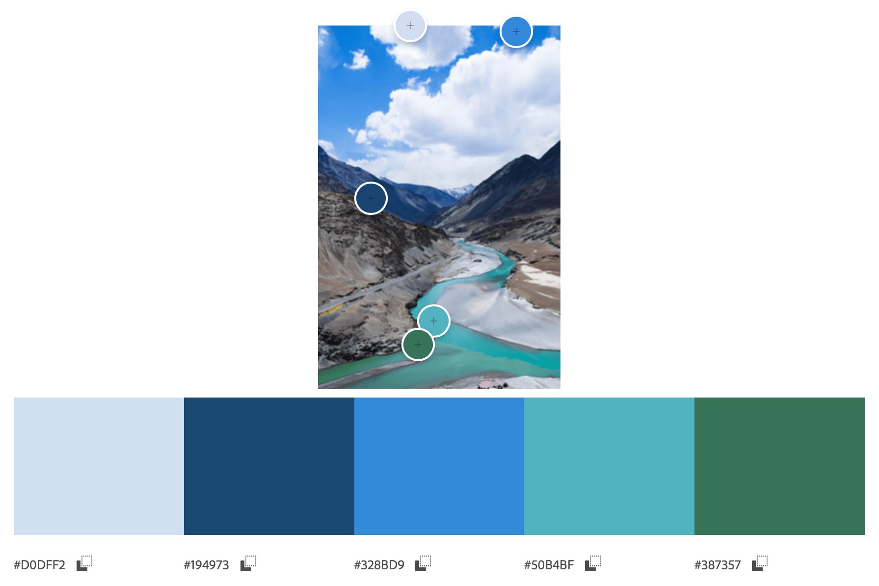
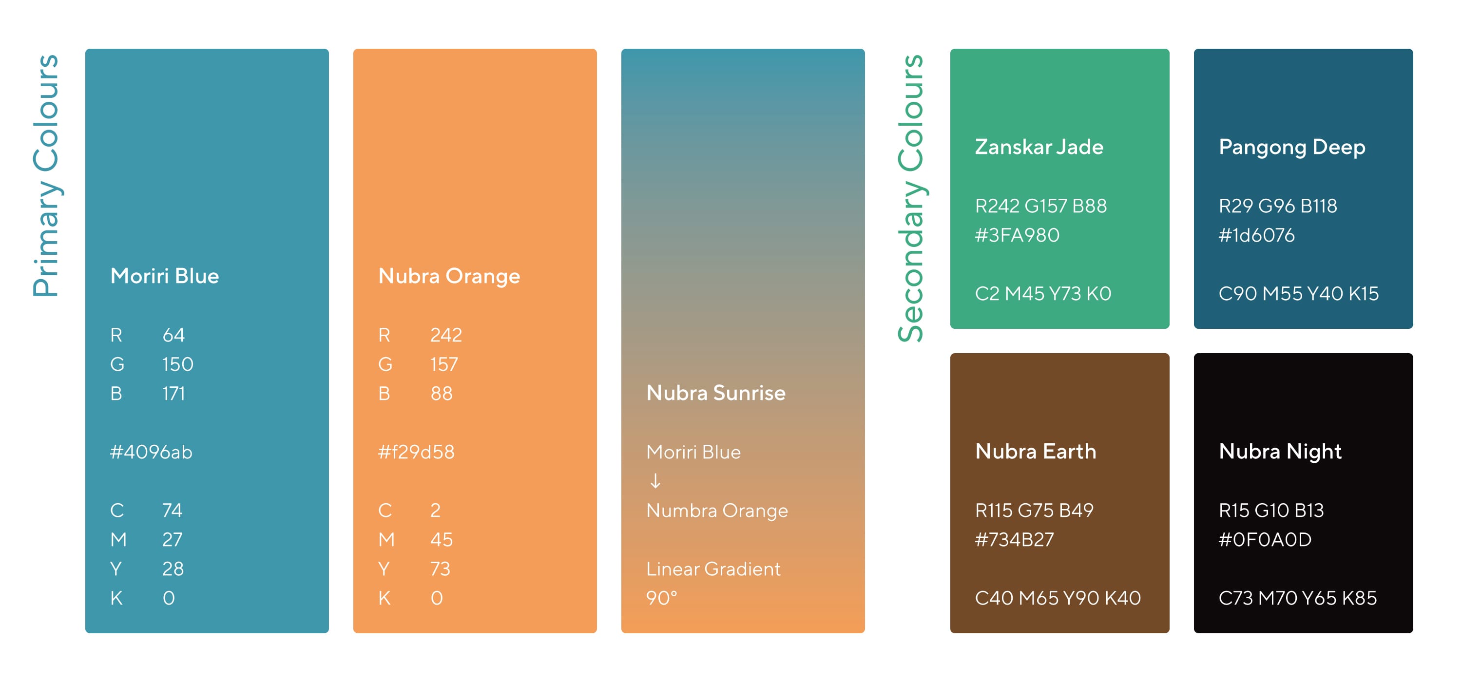
Pandesign meticulously crafted the “Kule Kule” colour palette, drawing inspiration from the vivid landscapes of Ladakh. The final palette pays homage to the serene tones of Nubra Valley and the vibrant hues of the lakes of Ladakh.
Story behind Kule Kule’s colour names
Pandesign drew inspiration from the vibrant and picturesque landscapes of Ladakh to name the colours for Kule Kule. The primary brand colours—Moriri Blue, Nubra Orange, Nubra Sunrise (gradient), and Zanskar Jade—reflect the region’s natural beauty. The secondary colorus—Zanskar Jade, Pangong Deep, Nubra Earth, and Nubra Night—further capture Ladakh’s diverse and vivid scenery. These names not only enhance the brand’s identity but also pay homage to the breathtaking hues found in this unique part of the world.
Typography
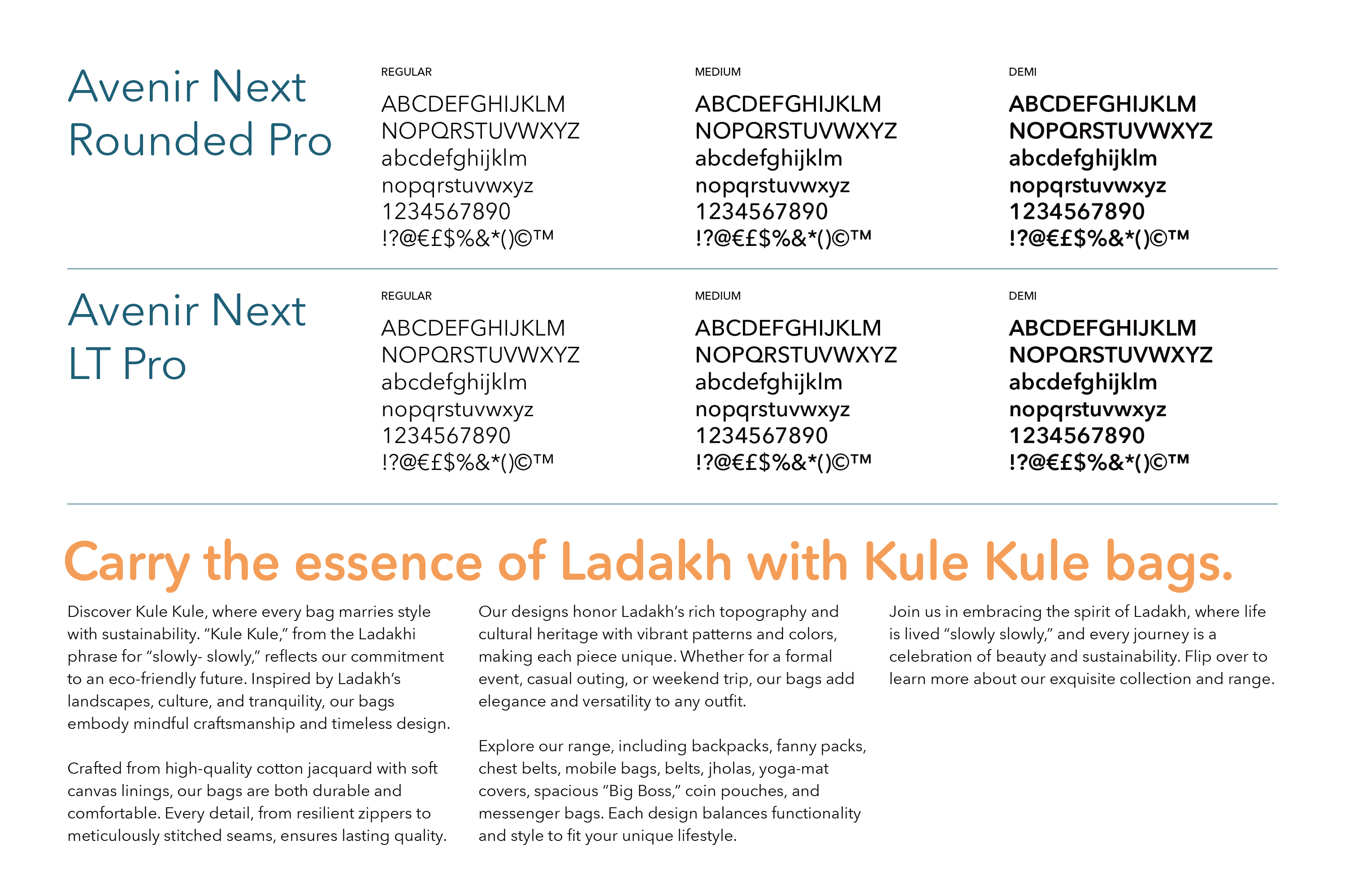
We crafted a cohesive typographic voice for Kule Kule by strategically using Avenir Next Rounded and Avenir Next Pro to reflect the brand’s warm, friendly, and enthusiastic tone.
Font Selection
-
- Avenir Next Rounded: Chosen for its soft, approachable curves, conveying friendliness and warmth.
- Avenir Next Pro: Selected for its clean, modern design, ensuring readability and professionalism.
Consistent Application
-
- Headers and Key Messages: Avenir Next Rounded set a welcoming tone in prominent text.
- Body Text: Avenir Next Pro provided clarity and a seamless reading experience.
Visual Hierarchy
-
- Using size, weight, and spacing, Pandesign created a dynamic yet cohesive look, highlighting key messages with Avenir Next Rounded and supporting details with Avenir Next Pro.
Tone Alignment
-
- Warmth and Friendliness: Avenir Next Rounded’s forms project warmth, making communications feel personal.
- Enthusiasm: Avenir Next Pro’s clean lines added energy without overwhelming the reader.
Consistency Across Platforms
-
- Typographic choices were consistently applied across digital and print media, reinforcing brand identity and enhancing recognition.
Through the thoughtful use of these fonts, Pandesign effectively embodied Kule Kule’s personality, building a strong visual identity that resonates with the audience.
Application
