Client
Coniferous Multitrade Pvt Ltd, Mumbai, India.
Industry
Paper manufacturing
Services
Brand Identity, Brand Tagline, Packaging Design, Brand Collaterals, Brand Communication
Introduction
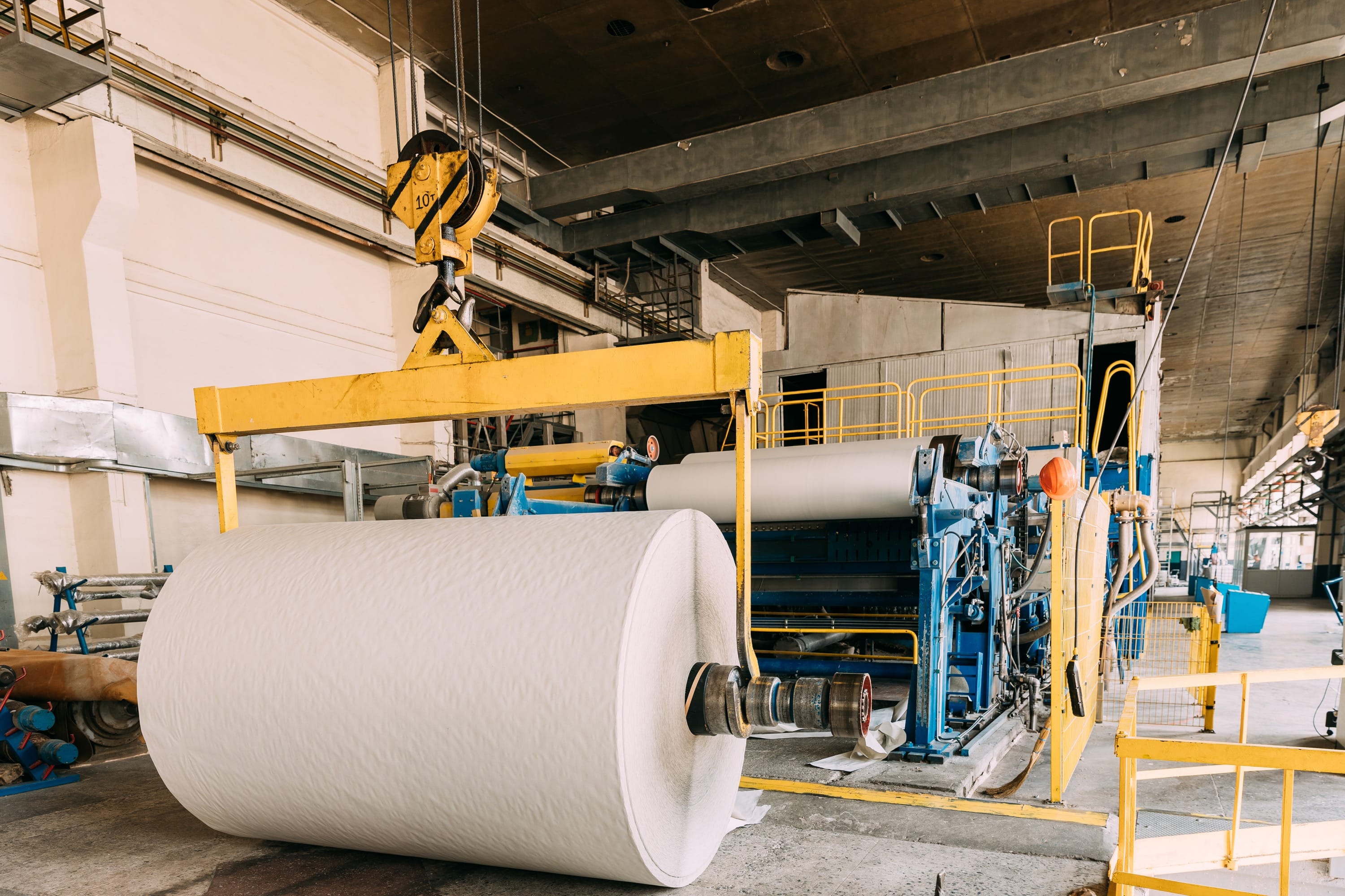
Coniferous Multitrade, founded in February 2020 in Mumbai, is a leading paper and board trading company in India. It specializes in eco-friendly paper hygiene and packaging solutions, serving markets in the USA, Africa, the Middle East, Southeast Asia, and nearby regions. The company is committed to sustainability, sourcing wood from renewable coniferous forests to ensure responsible use of natural resources for future generations. Coniferous aims to deliver high-quality products and exceptional customer service.
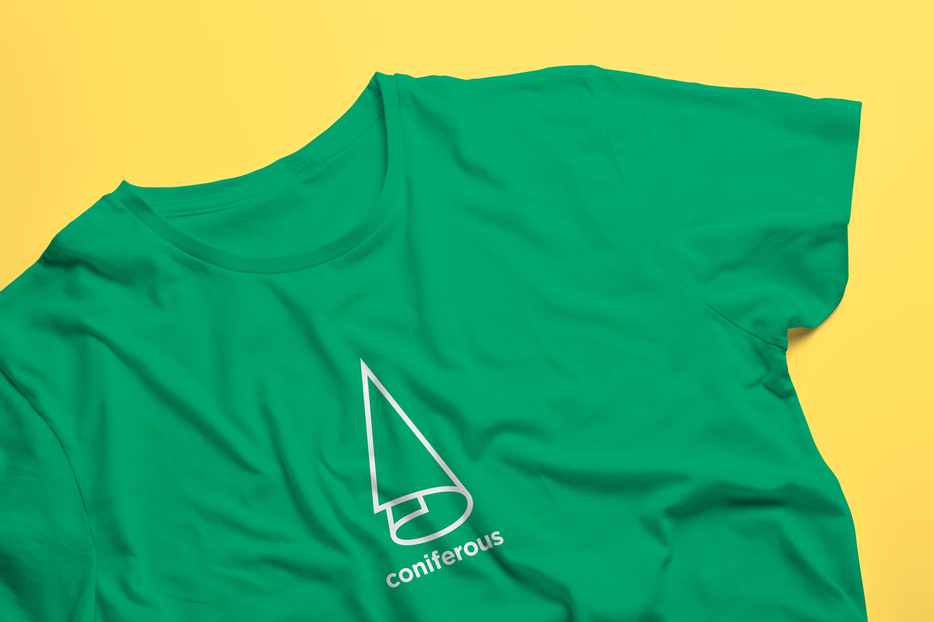
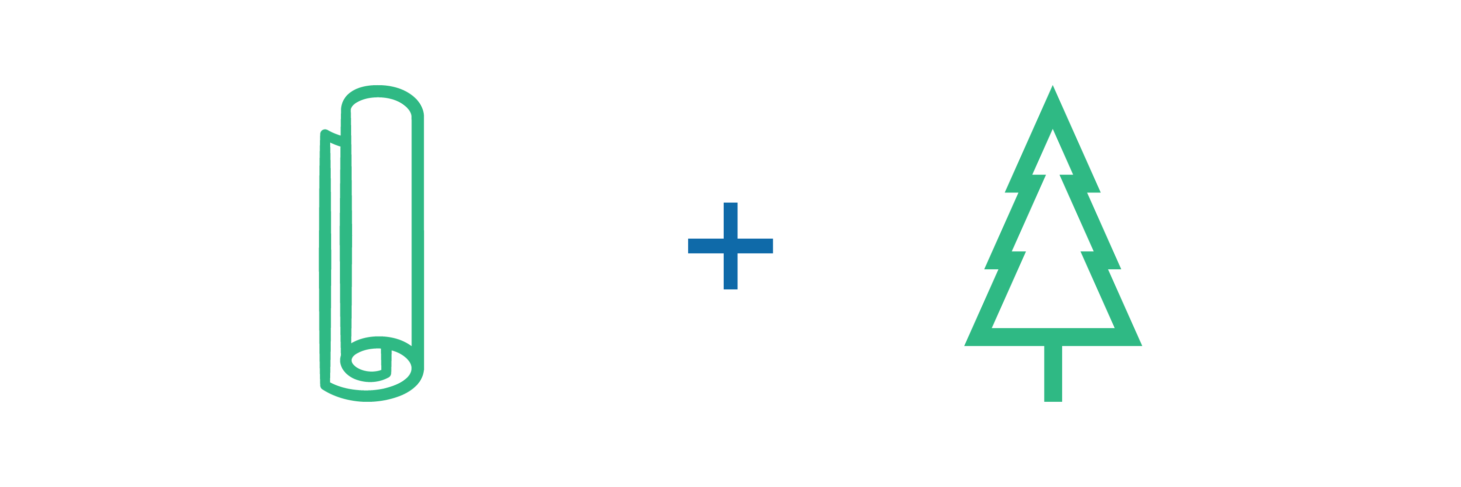
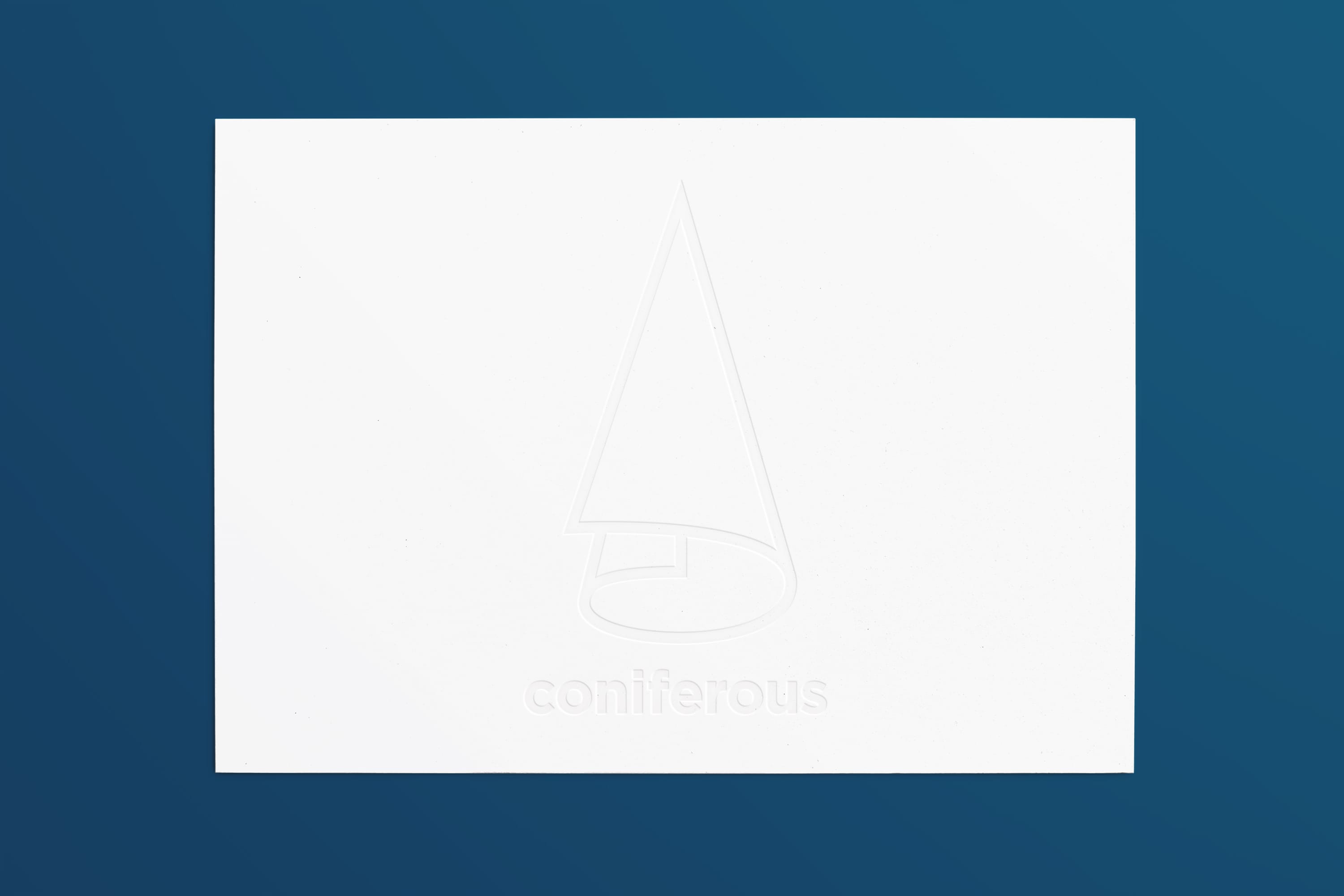
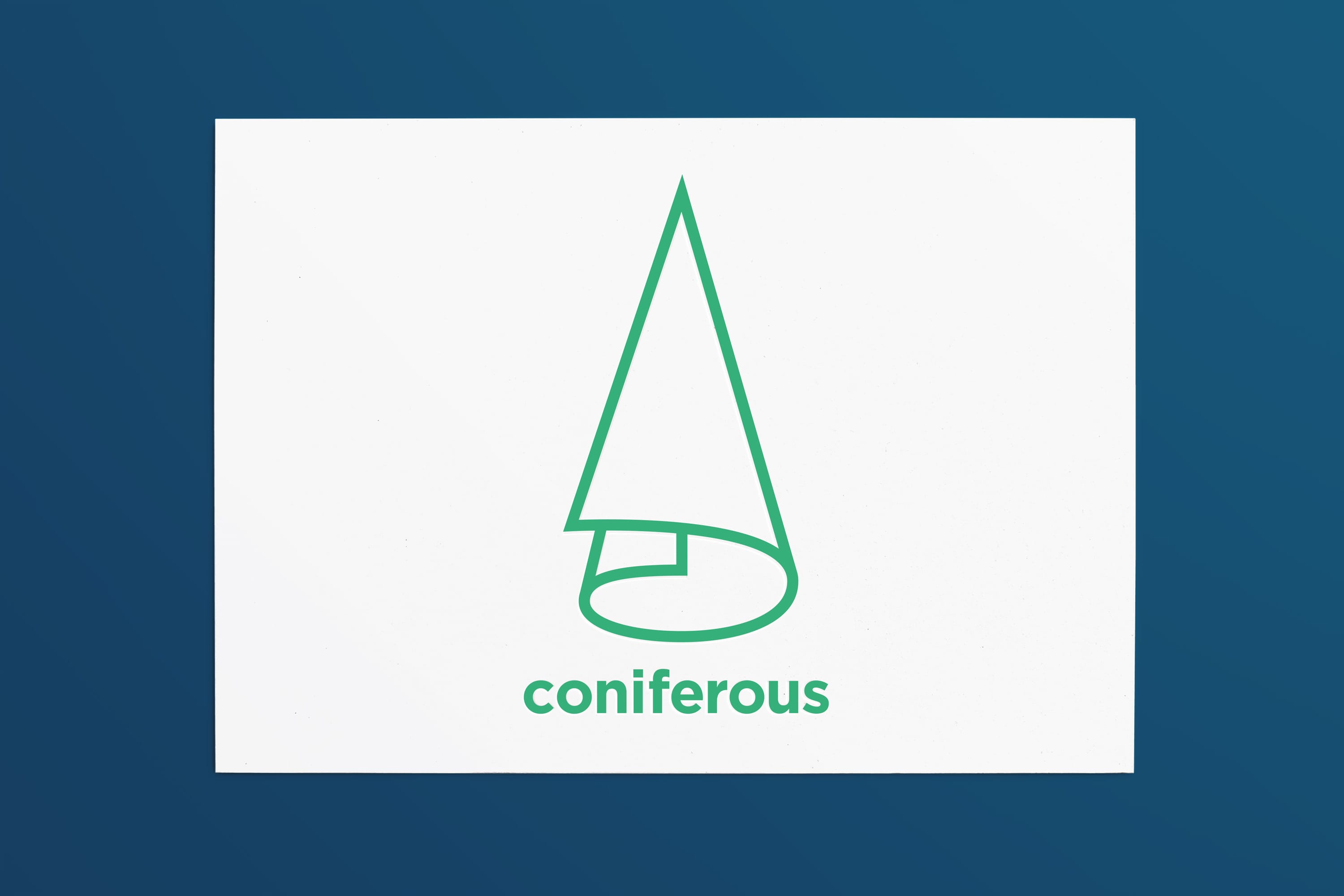
We crafted Coniferous’s brand identity by combining the shapes of a coniferous tree and a paper roll in the logo. This design symbolises the company’s dedication to sustainability and its core paper trading business. The green color signifies eco-friendliness and growth, while the sleek design reflects modernity and efficiency. This thoughtful integration distinguishes Coniferous in the market and communicates its commitment to environmental responsibility and quality.
Overview
Scope
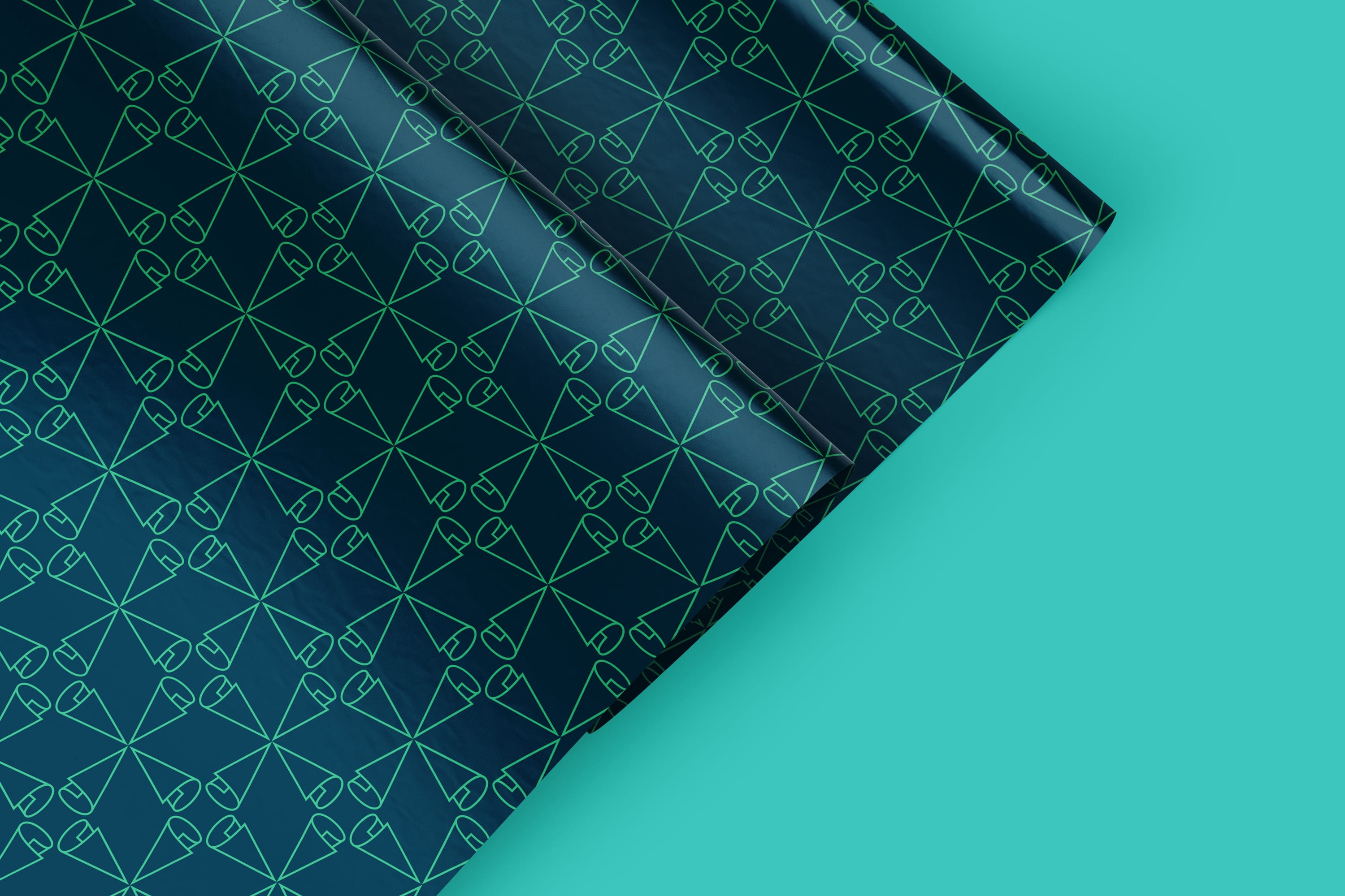
Brand Identity: Developed a unique logo inspired by the shape of a coniferous tree and a paper roll, symbolising sustainability and core business values.
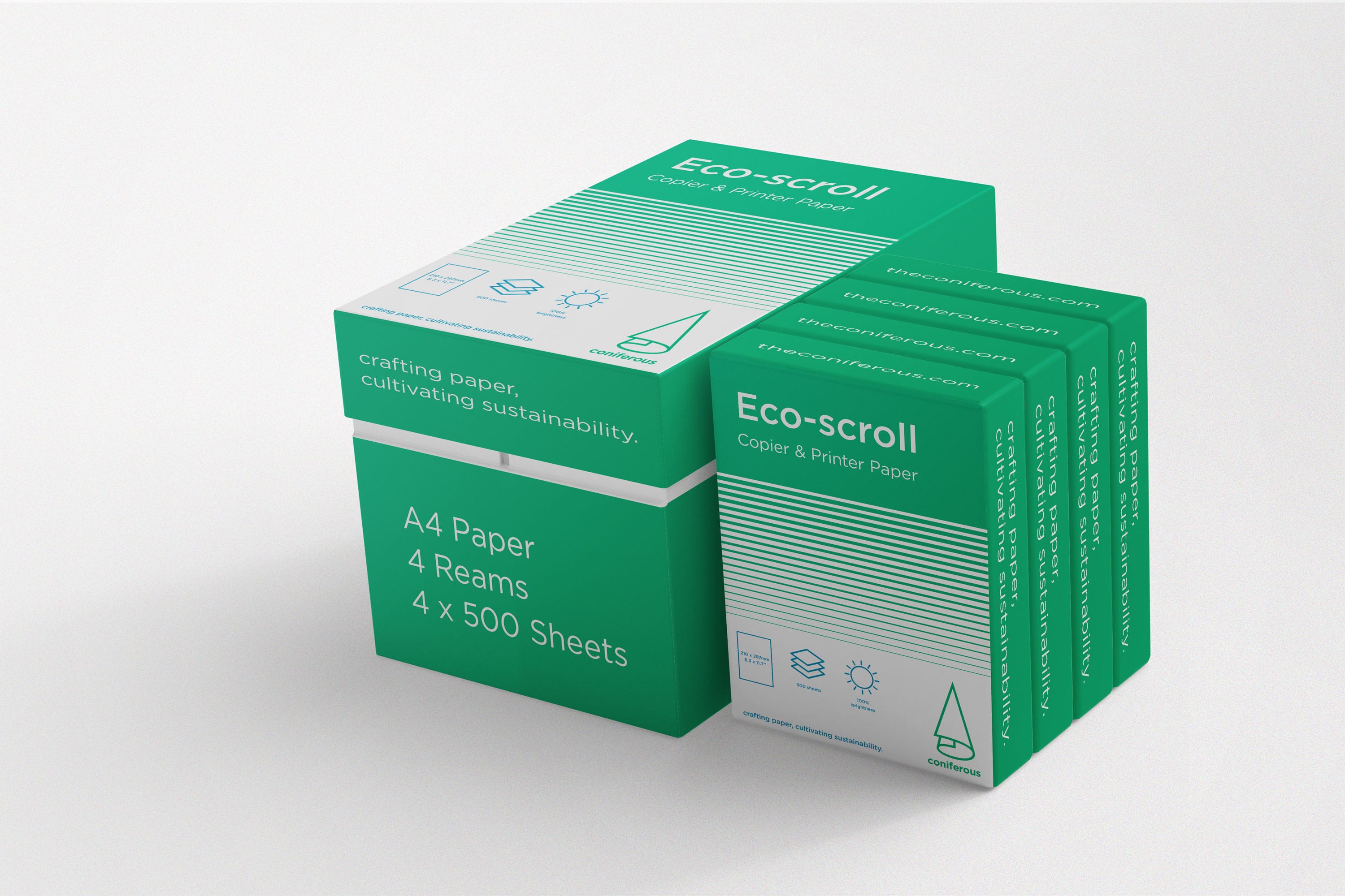
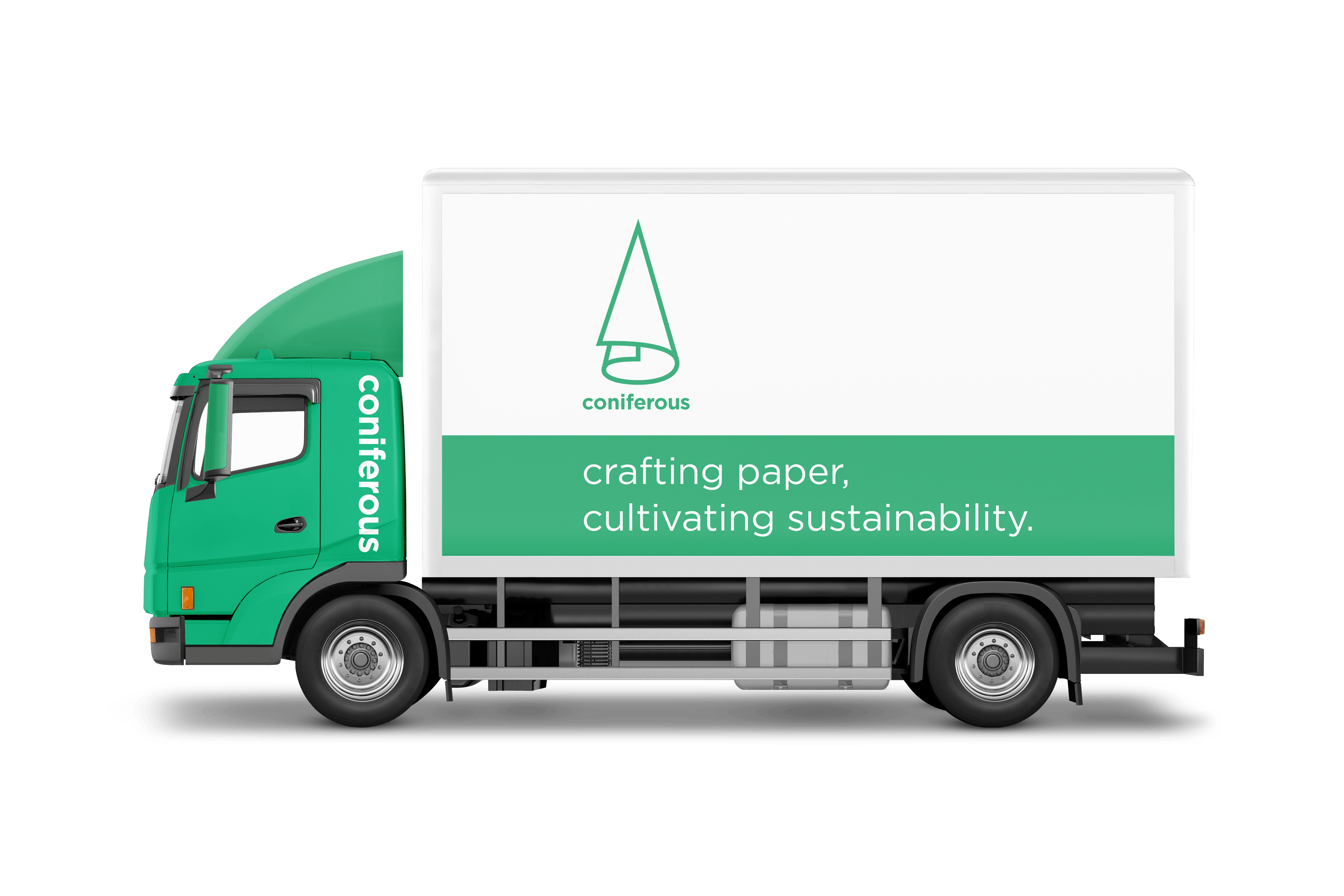
Brand Tagline: Crafted the tagline, “crafting paper,
cultivating sustainability”, to reflect the brand’s mission and values.
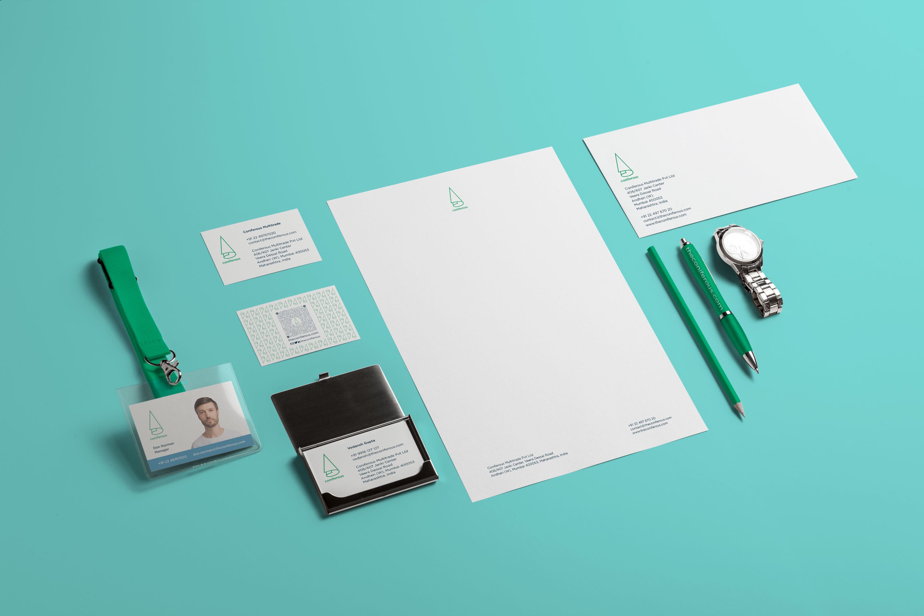
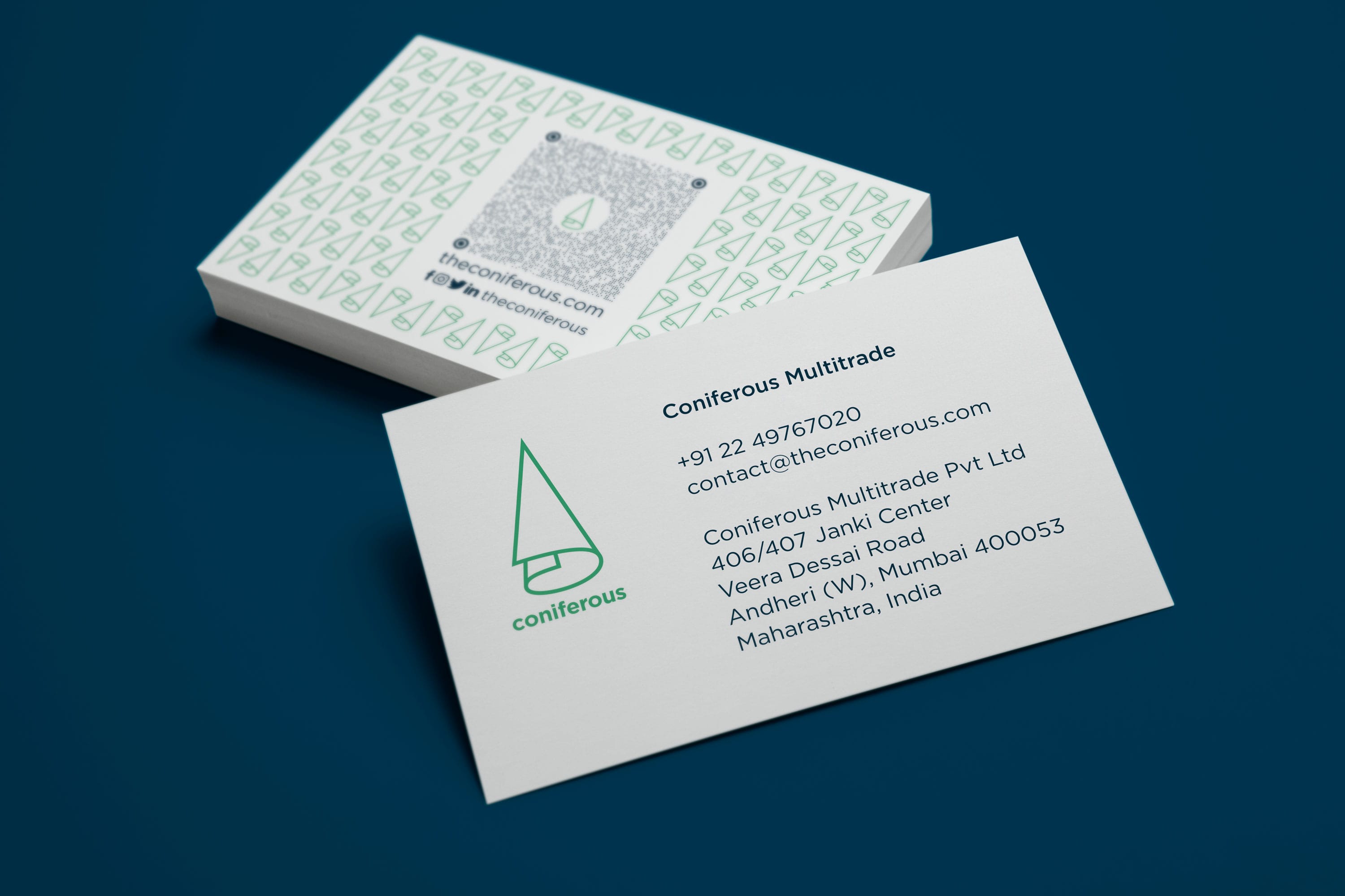
Brand Collaterals: Designed essential marketing materials to ensure a cohesive brand presence.
Product Brochure: Created an informative and visually appealing product brochure to showcase Coniferous’s offerings and commitment to quality and sustainability.



Inspiration
The phrase “Crafting Paper” highlights the brand’s expertise in paper trading, while “Cultivating Sustainability” underscores their commitment to eco-friendly practices.
We developed Coniferous’s brand identity with inspiration from the renewable coniferous forests that supply the wood for their paper products. The logo, blending the shape of a coniferous tree and a paper roll, symbolizes the integration of natural resources with paper production. This approach reflects Coniferous’s commitment to sustainability and environmental stewardship. The overall brand direction, including the tagline “Crafting Paper, Cultivating Sustainability,” emphasizes quality, eco-friendliness, and a dedication to preserving the environment for future generations.
The brand tagline encapsulates Coniferous’s dual focus on quality paper production and environmental stewardship. The phrase “Crafting Paper” highlights their expertise in paper trading, while “Cultivating Sustainability” underscores their commitment to eco-friendly practices.
Strategy
Through meticulous research and thoughtful design, Pandesign layered the brand with elements that highlight Coniferous’ commitment to sustainability and innovation.
Our approach helped Coniferous build a brand that stands above the competition, much like a finely crafted piece of paper that captures the essence of quality and elegance. Through meticulous research and thoughtful design, we layered the brand with elements that highlight Coniferous’ commitment to sustainability and innovation. Each iteration of the logo and brand elements was carefully refined, much like the process of creating the perfect sheet of paper, resulting in a distinctive and memorable identity. This cohesive and well-defined brand presence allows Coniferous to unfold its story and values clearly and impressively, setting it apart in a crowded market.
Focus
Our commitment to minimalism guided us to eliminate unnecessary elements, allowing us to convey the brand’s message succinctly and effectively.
Our alignment with Coniferous’ vision of a greener future is evident in our design approach.
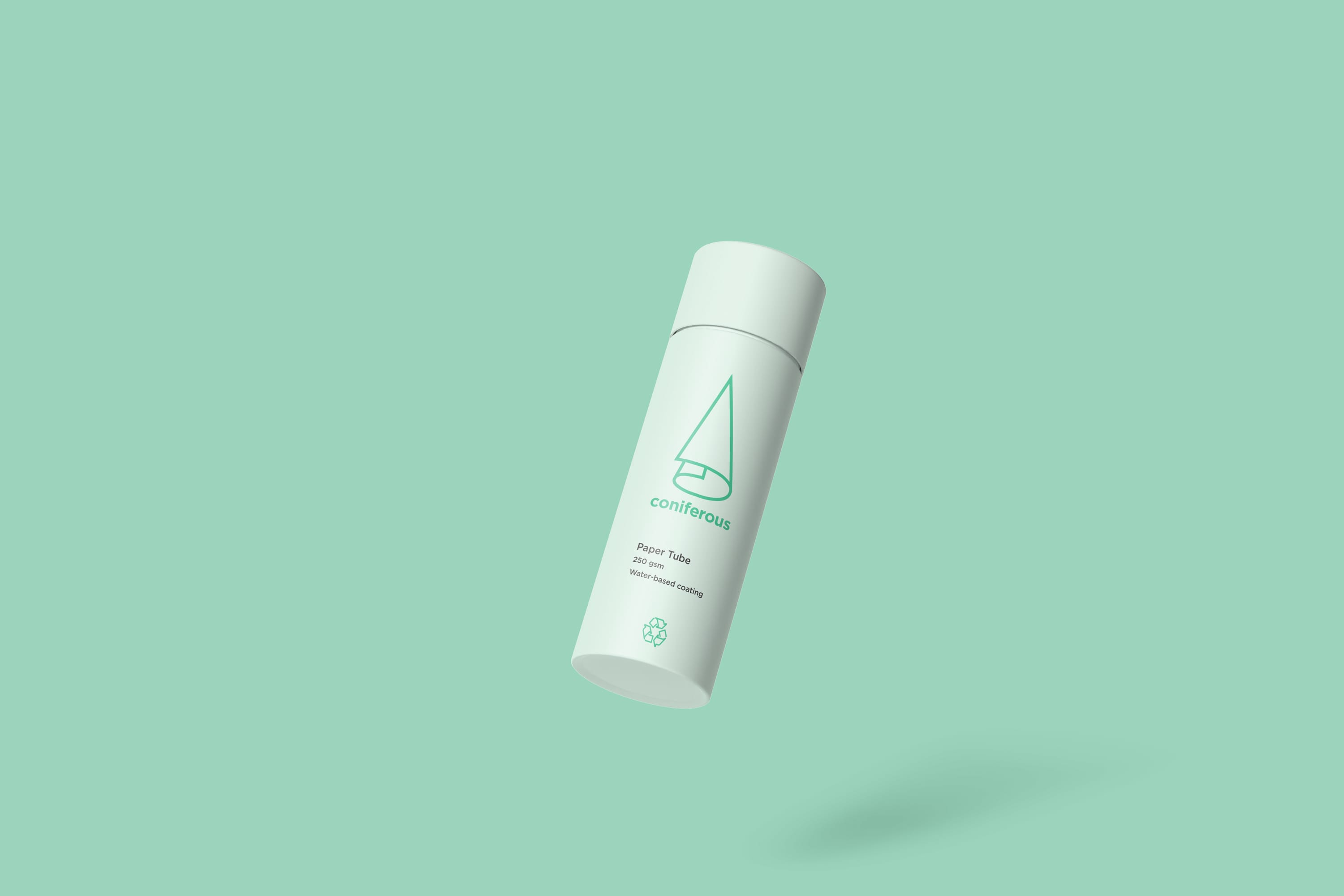
Conscious of environmental impact, we prioritised efficiency by utilising fewer resources for packaging.
Our commitment to minimalism guided us to eliminate unnecessary elements, allowing us to convey the brand’s message succinctly and effectively.
This approach not only reduces waste but also embodies the ethos of saying more with less, resonating with Coniferous’ dedication to sustainability.
Process
Visual Identity
The logo is minimalistic, ensuring it can be widely applied and easily scaled across various platforms and mediums.
The design qualities of Coniferous’ brand identity are inspired by both a paper roll and a coniferous tree, symbolising their core business and commitment to sustainability.
The logo is minimalistic, ensuring it can be widely applied and easily scaled across various platforms and mediums. This simplicity not only enhances its visual appeal but also reinforces the brand’s focus on sustainability and efficiency.
The brand identity seamlessly complements their wide portfolio, which ranges from tissue rolls to printing paper and from packaging materials to paper cups. This cohesive design language ensures that every product, whether a tissue roll or packaging material, aligns with the brand’s overarching message of eco-friendly innovation and quality.
Initial Logo Iterations
Logo Idea
Final Logo
Colour Palette
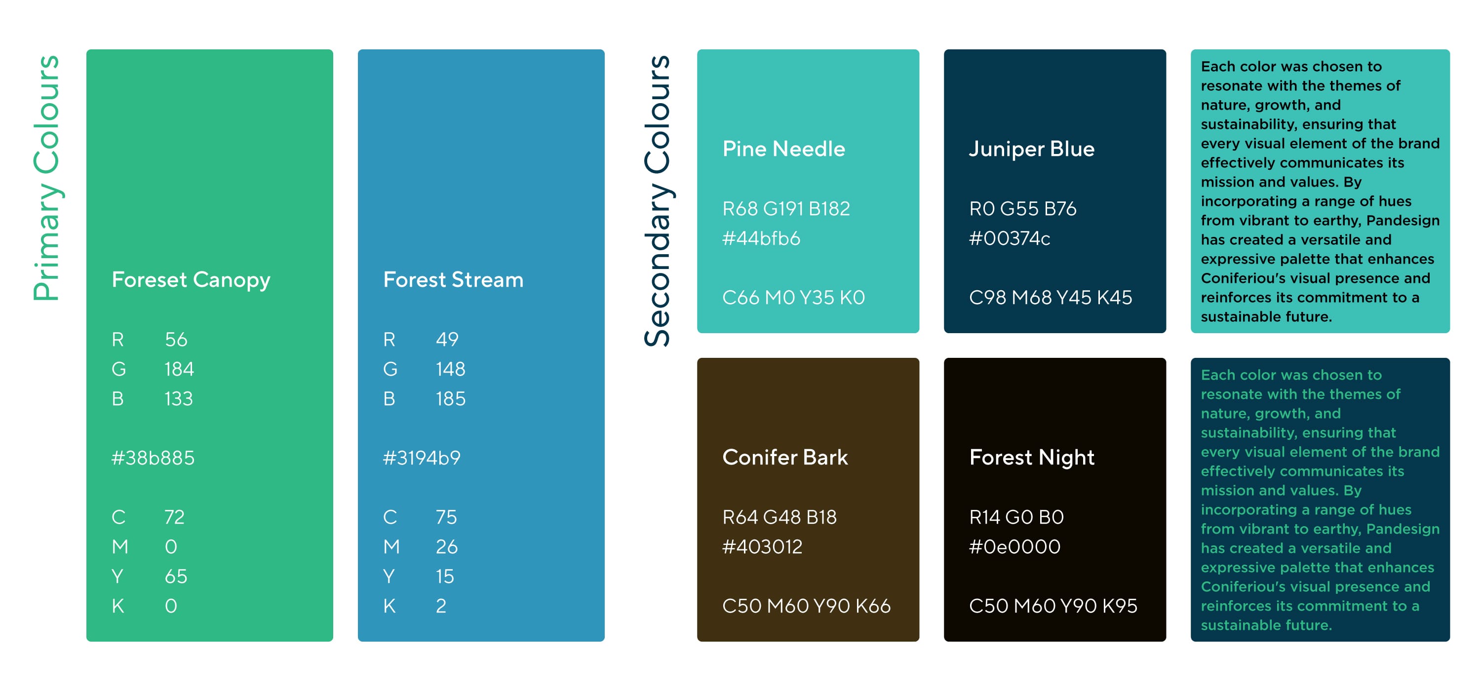
Pandesign has masterfully crafted Coniferiou’s color palette to reflect the brand’s profound commitment to environmental sensitivity and sustainability. This thoughtfully curated palette comprises a harmonious blend of colors, each evoking a deep sense of nature and ecological awareness.
Drawing inspiration from the vastness of forests and the serenity of clear skies and deep waters, the palette embodies the essence of the natural world. ‘Forest Canopy’ and ‘Pine Needle’ symbolize the lushness and vitality of nature, while ‘Mountain Stream’ evokes a calming, pristine environment. ‘Juniper Blue’, a deep and dynamic blue, reflects the organization’s efficiency and reliability. Additionally, ‘Conifer Bark’ and ‘Forest Night’ are rich, profound colors that represent Coniferiou’s deep-rooted values and stability.
This color palette not only underscores Coniferiou’s dedication to preserving natural landscapes but also promotes a clean, sustainable planet. Through these carefully chosen hues, Pandesign has successfully conveyed Coniferiou’s mission and commitment to environmental stewardship.
Typography
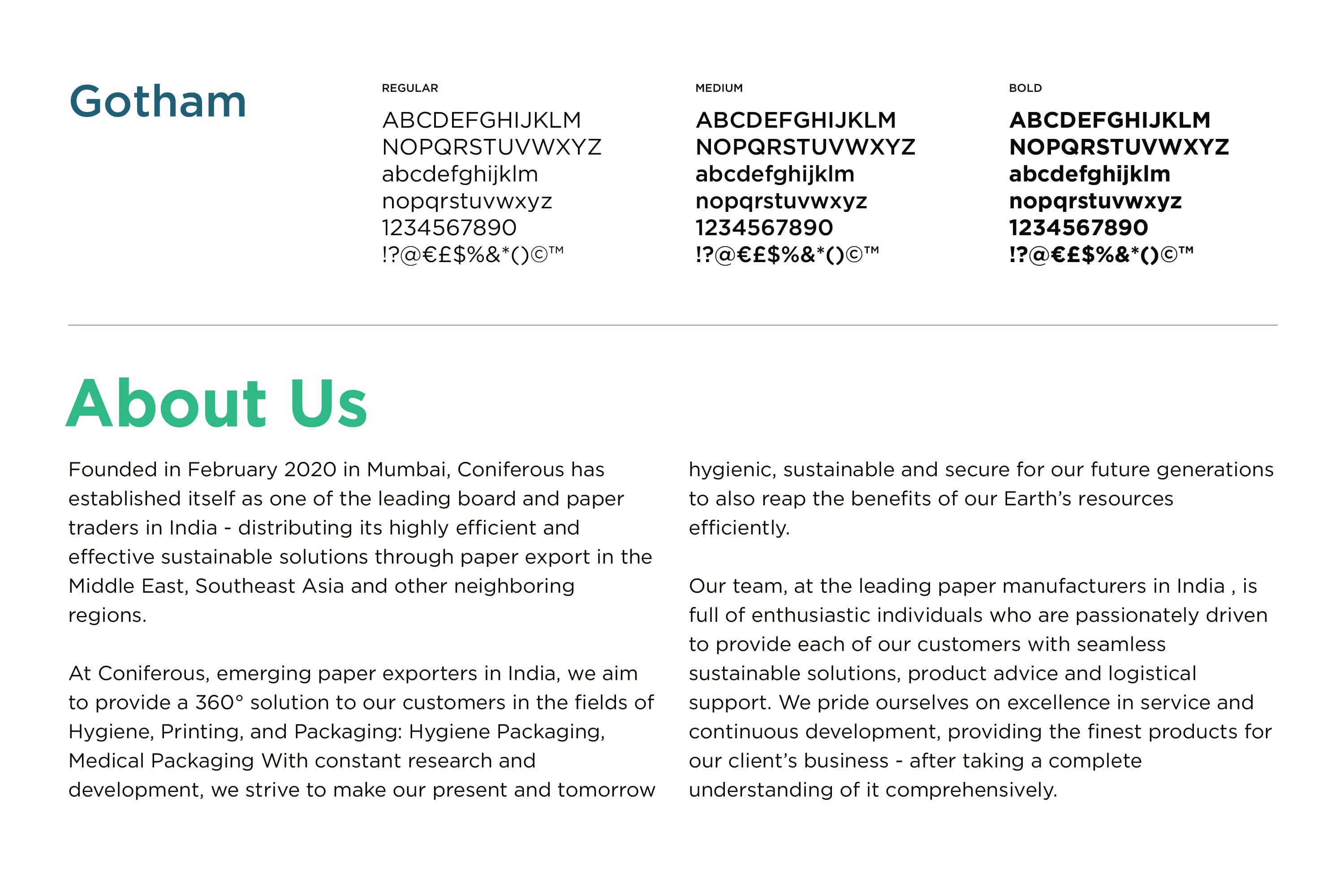
We skillfully utilized the Gotham font family to establish a distinctive and effective typographic language for Coniferous, significantly enhancing the brand’s visual identity.
Gotham, known for its clean lines and modern aesthetic, was selected for its versatility and timeless appeal. The font’s geometric structure conveys a sense of stability and professionalism, perfectly aligning with Coniferous’s values of environmental sustainability and corporate responsibility. Its simplicity and clarity ensure that all textual content is easily readable, which is crucial for effective communication.
Key aspects of Gotham’s use in Coniferous’s branding include:
- Professionalism and Trustworthiness: The strong, straightforward design of Gotham exudes confidence and reliability, traits that resonate with Coniferous’s mission.
- Modernity and Relevance: Gotham’s contemporary style keeps the brand current and appealing to a wide audience, reflecting Coniferous’s forward-thinking approach.
- Versatility: The range of weights and styles in the Gotham family allows for flexibility in design, enabling consistent yet varied typographic presentations across different platforms and materials.
By incorporating Gotham into Coniferous’s visual identity, Pandesign has created a cohesive and impactful typographic language. This strategic choice enhances the brand’s presence and effectively communicates its commitment to sustainability and innovation.
Application
