Client
Beetree Organics Pvt Ltd, Uttarakhand, India
Industry
Food & Beverage
Services
Brand Naming, Brand Identity,
Packaging Design, Content,
Brand Communication
Introduction

Beetree Organics Pvt Ltd, founded in 2008 and based in the picturesque mountain town of Nainital, is a distinguished home-grown brand dedicated to producing pure, raw honey and a range of herbs and spices. Operating as a cottage industry, Beetree Organics emphasizes quality and sustainability in its product offerings.
Pandesign played a pivotal role in the creation and development of the Beetree brand, meticulously crafting every aspect from the brand name to the visual identity, packaging, and communication design. Our comprehensive approach has resulted in a strong, cohesive identity that reflects the purity, quality, and sustainability of Beetree’s products. The name “Beetree” and the thoughtfully designed logo encapsulate the essence of the brand, making it both memorable and meaningful.
Visual Identity
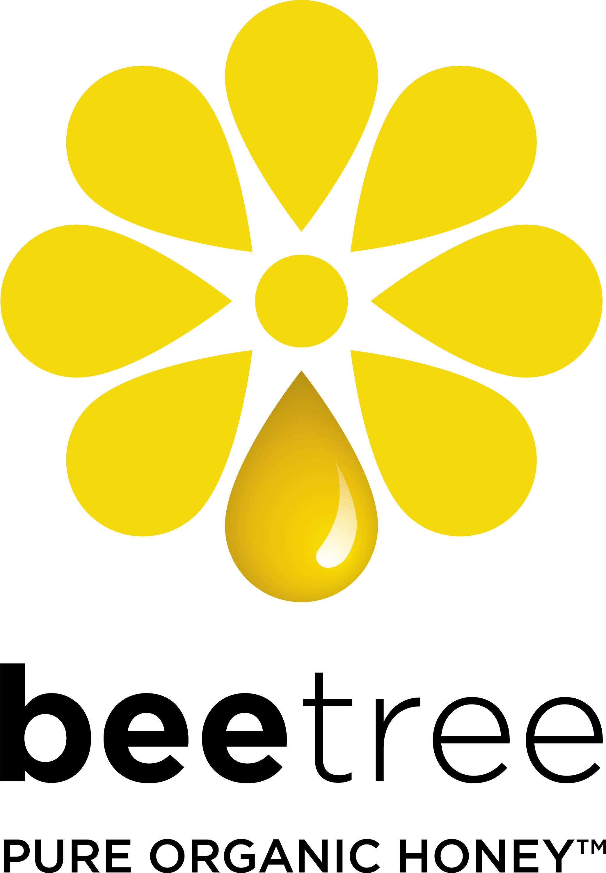
The Beetree logo is a masterful representation of the brand’s identity, blending simplicity with meaningful symbolism.
Logo Design Elements
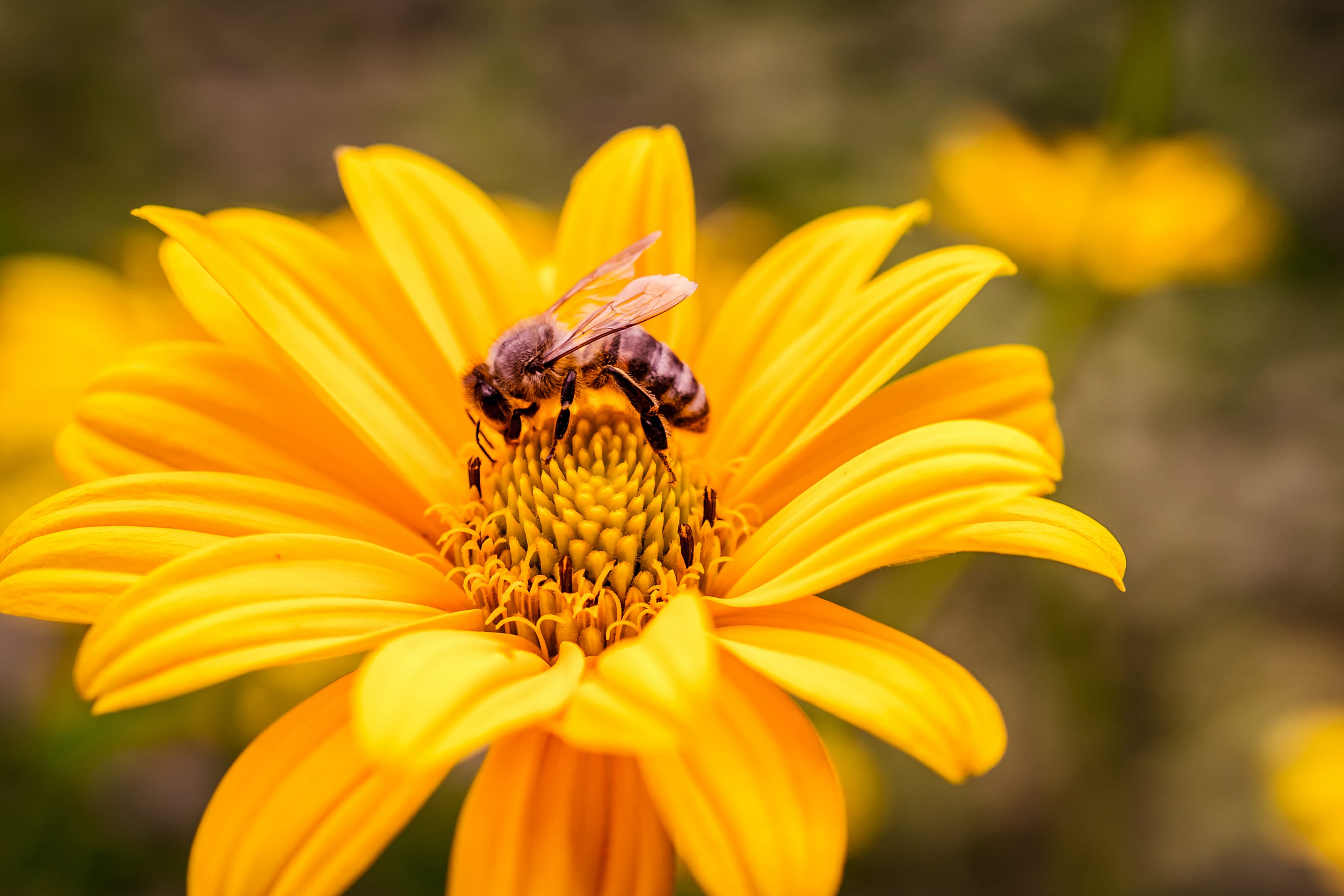
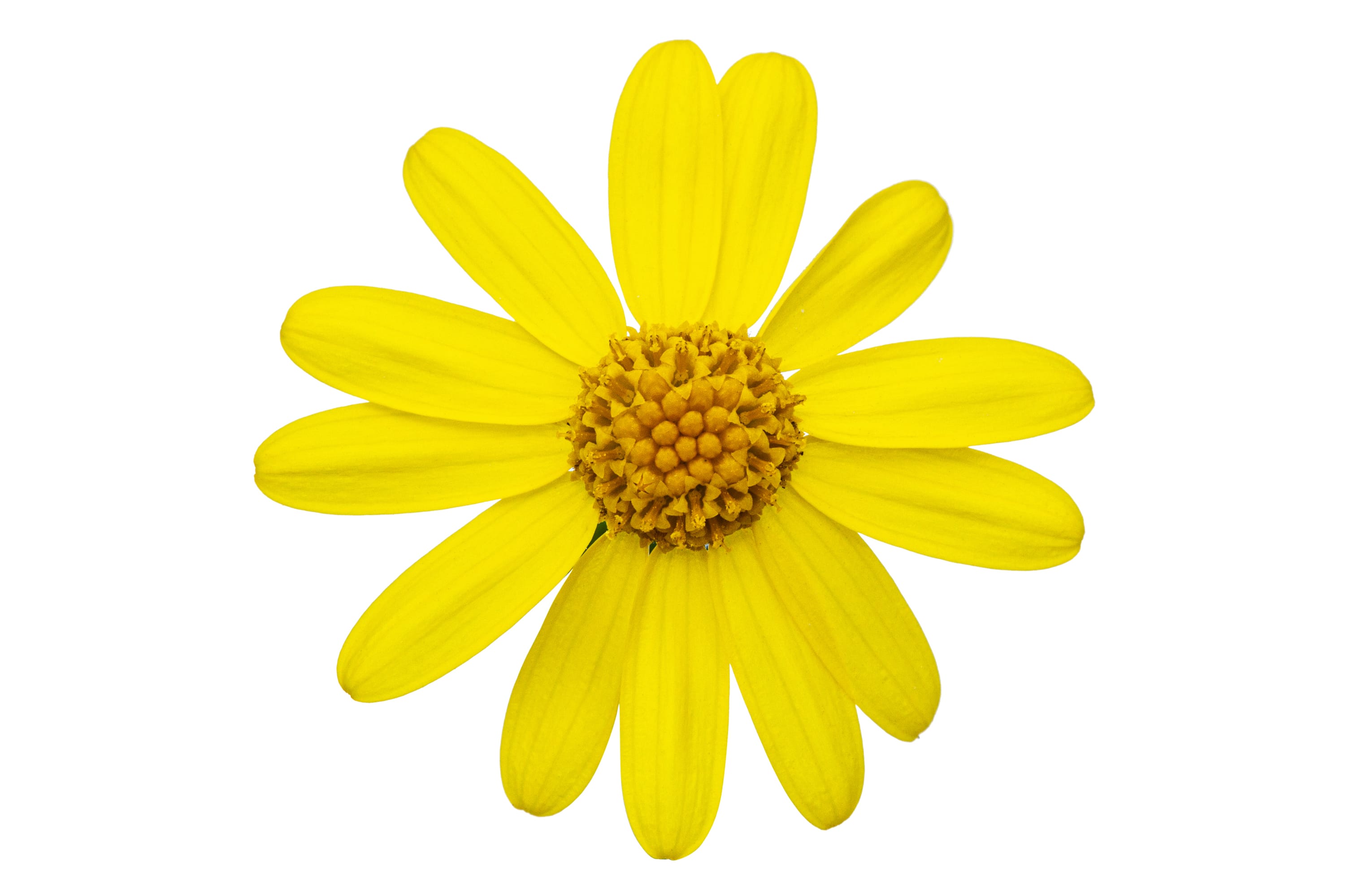
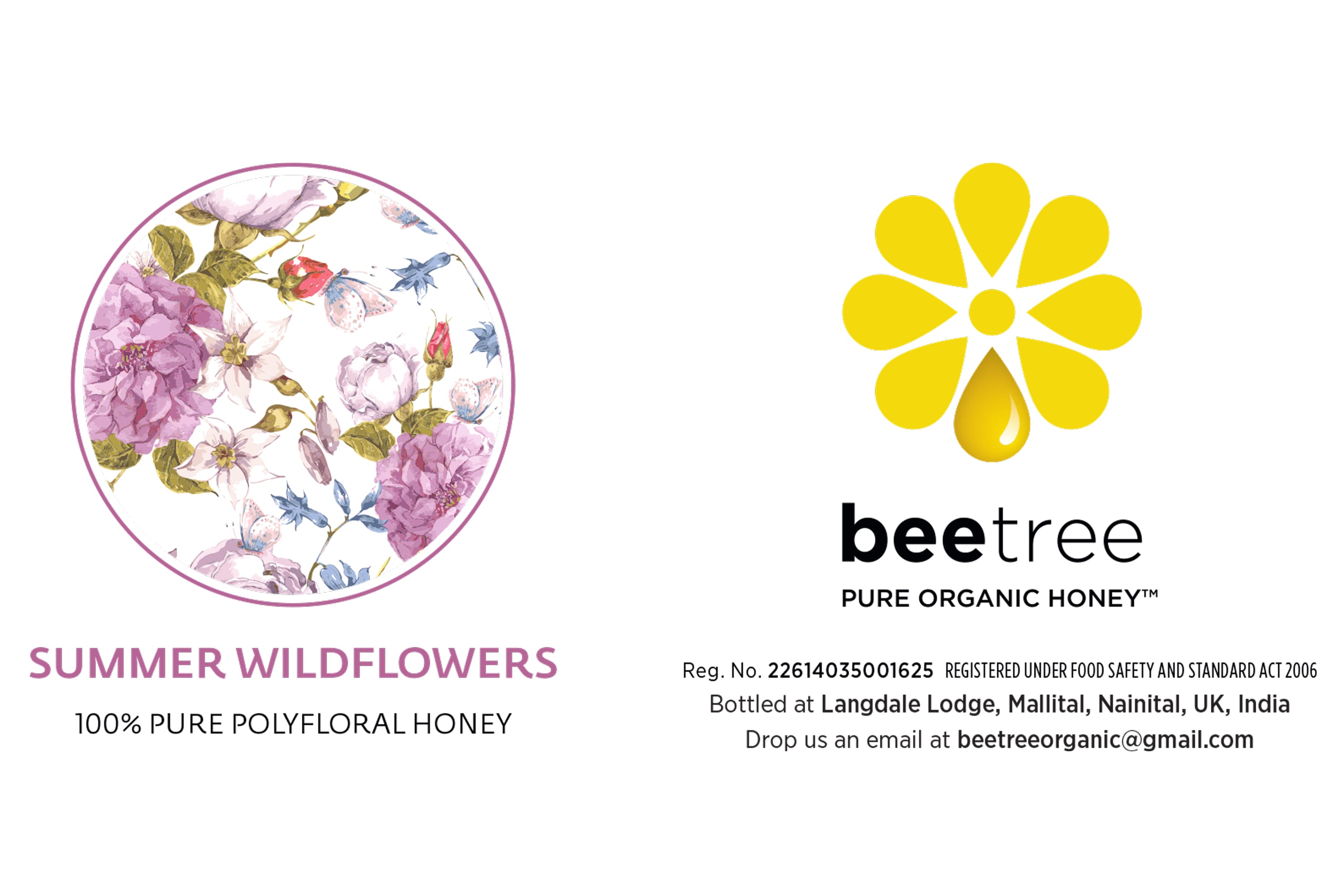
Flower Symbol: A stylized flower with eight yellow petals represents the source of honey—flowers—and conveys the product’s purity and natural origin.
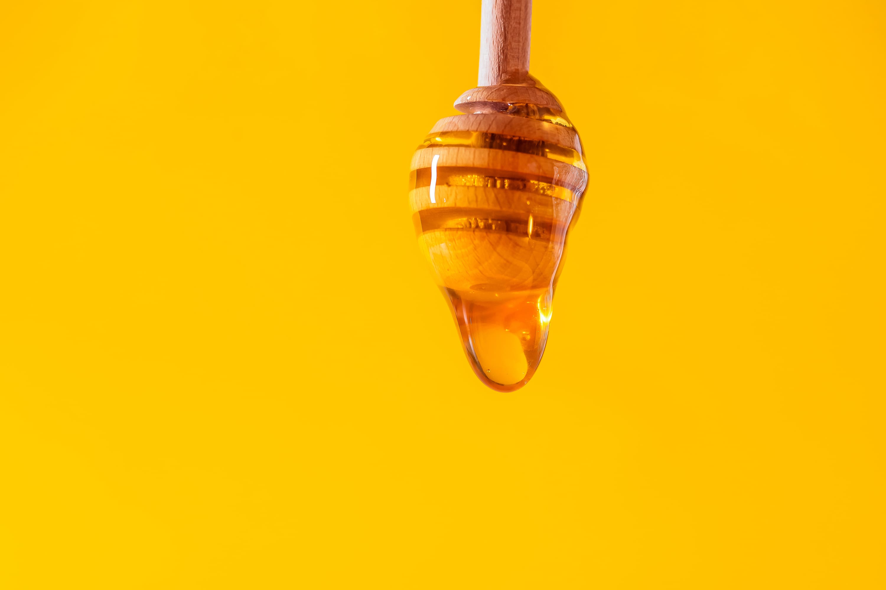
Honey Drop: A golden honey drop at the base of the flower emphasizes the product’s organic and unadulterated nature.
Typography: The brand name “beetree” is rendered in a clean, modern typeface. The use of lowercase letters gives a friendly, approachable feel, with the bold ‘bee’ contrasting the lighter ‘tree’ to highlight the importance of bees.
Name: The name “Beetree” was chosen for its meaningful reference to a “hollow tree in which honeybees nest.” This evocative name encapsulates the natural and organic essence of the brand’s core product—honey. It highlights the symbiotic relationship between bees and their habitat, emphasizing the brand’s commitment to sustainability and ecological harmony.
Tagline: “PURE ORGANIC HONEY™” underscores the product’s quality and organic nature, reinforcing the brand’s commitment to providing natural and pure honey.

Inspiration
The stylized flower with eight yellow petals represents the source of honey and highlights its purity and natural origin. The golden honey drop at the base emphasizes the product’s organic and unadulterated nature.
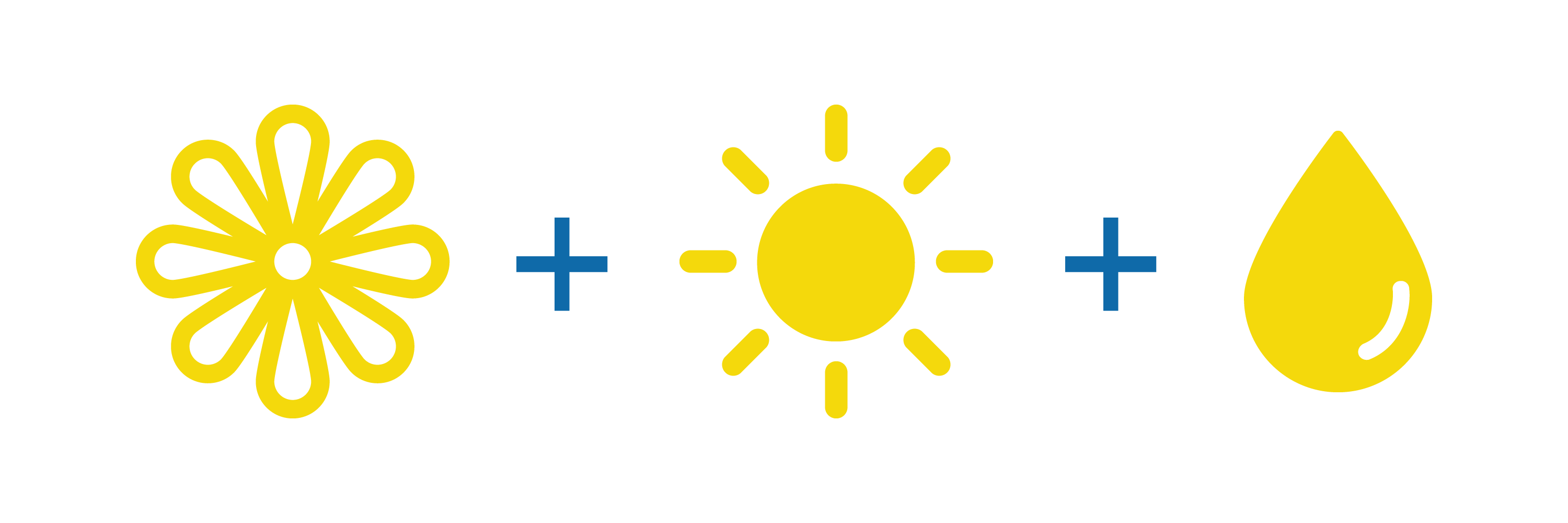
The Beetree logo is a thoughtfully crafted symbol combining a flower, honey drop, and sun to embody the brand’s essence and values.
Flower: The stylized flower with eight yellow petals represents the source of honey, highlighting the purity and natural origin of Beetree’s products.
Honey Drop: The golden honey drop at the base of the flower emphasizes the organic and unadulterated nature of the product.
Sun: The negative space within the logo forms the shape of a sun, symbolizing energy, growth, and the natural process of honey production.
By integrating these elements, the Beetree logo effectively communicates the brand’s dedication to purity, sustainability, and ecological harmony, making it a memorable and impactful symbol.
Colour Palette
The color palette is carefully chosen to convey the natural, unadulterated quality of Beetree’s honey and its roots in sustainable practices. The harmonious blend of these colors creates a visually cohesive and aesthetically pleasing packaging design that aligns with the brand’s identity and appeals to its target audience.
Yellow symbolizes honey and the essence of bees, evoking warmth, happiness, and natural energy.
Visual Impact: Stands out on shelves, creating an immediate association with honey.
Earthy tones featured in illustrations emphasise the brand’s connection to nature and organic sources.
Visual Impact: Creates a calming, natural look appealing to consumers seeking wholesome, environmentally-friendly products.
White background reinforces the purity and simplicity of the product.
Visual Impact: Provides contrast, ensuring product details and brand elements stand out clearly.
Packaging Design

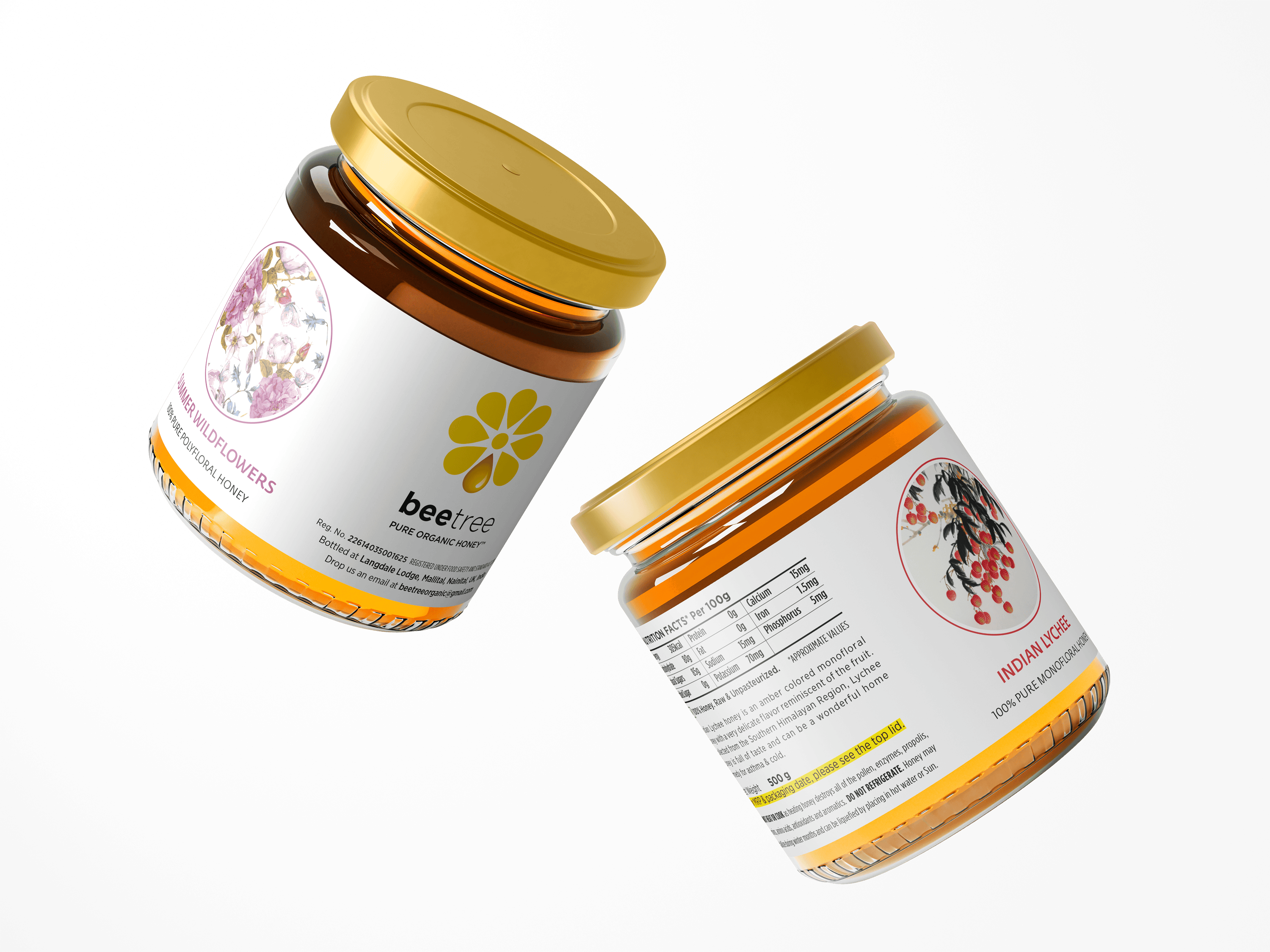
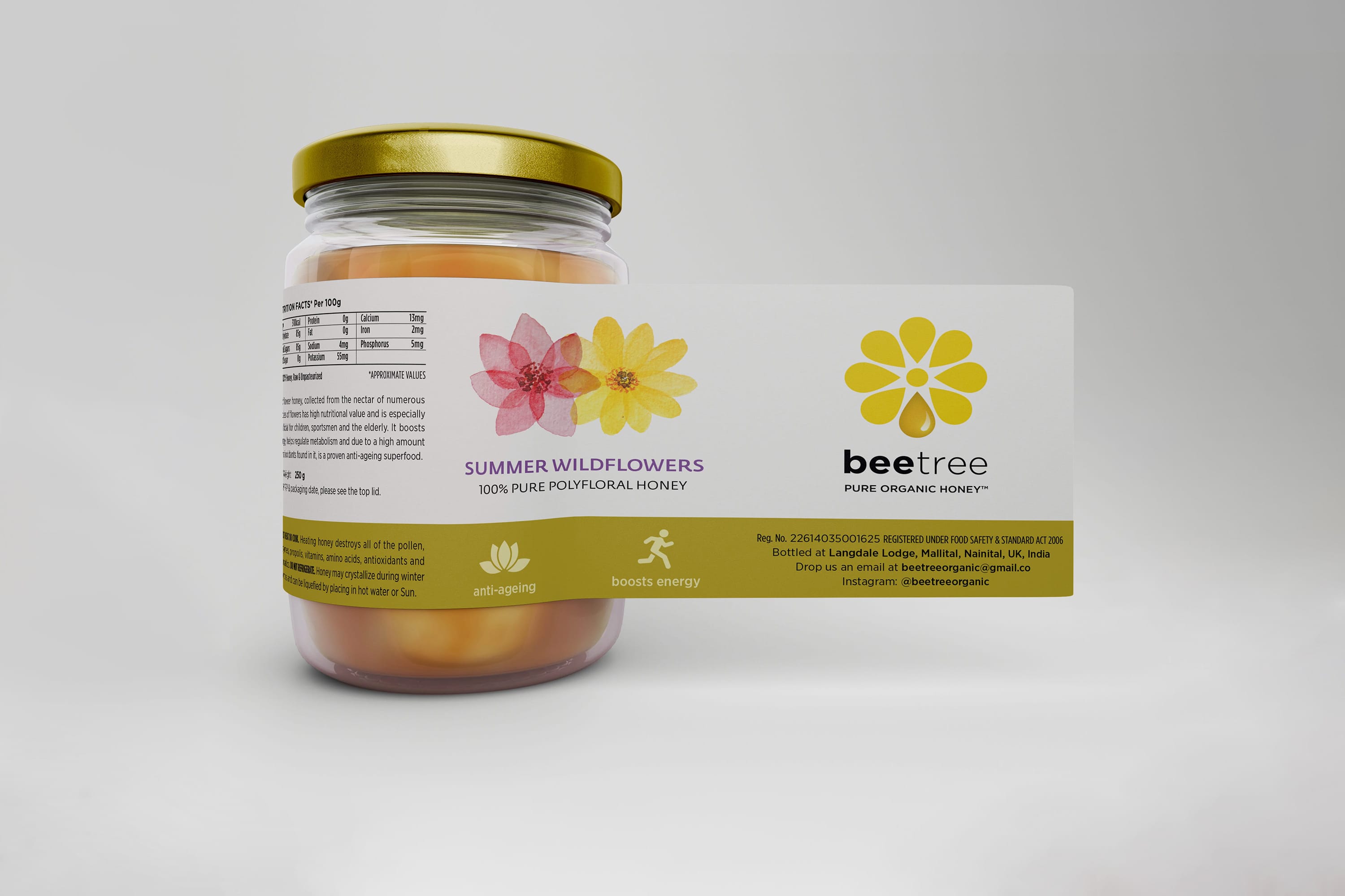
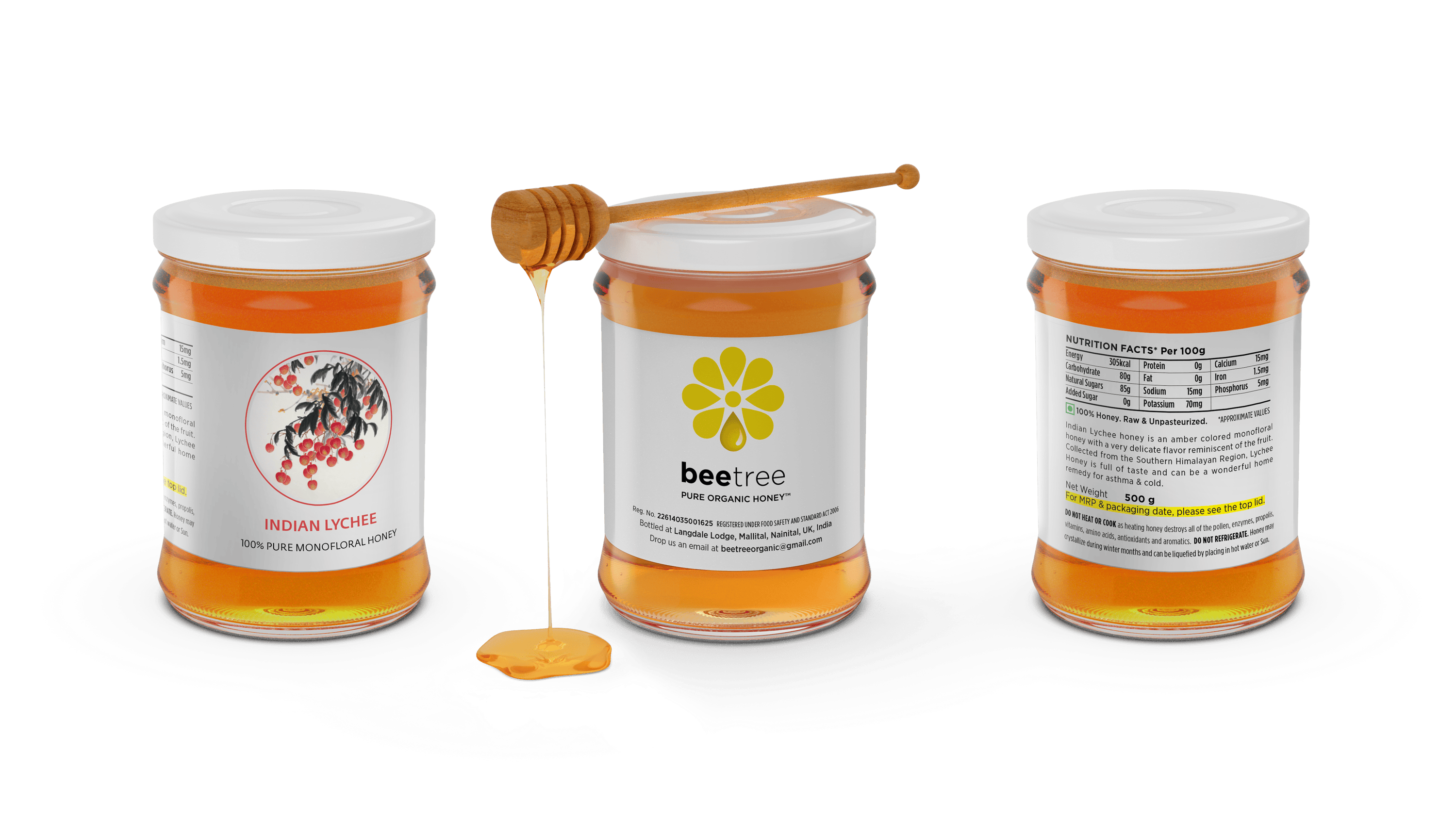
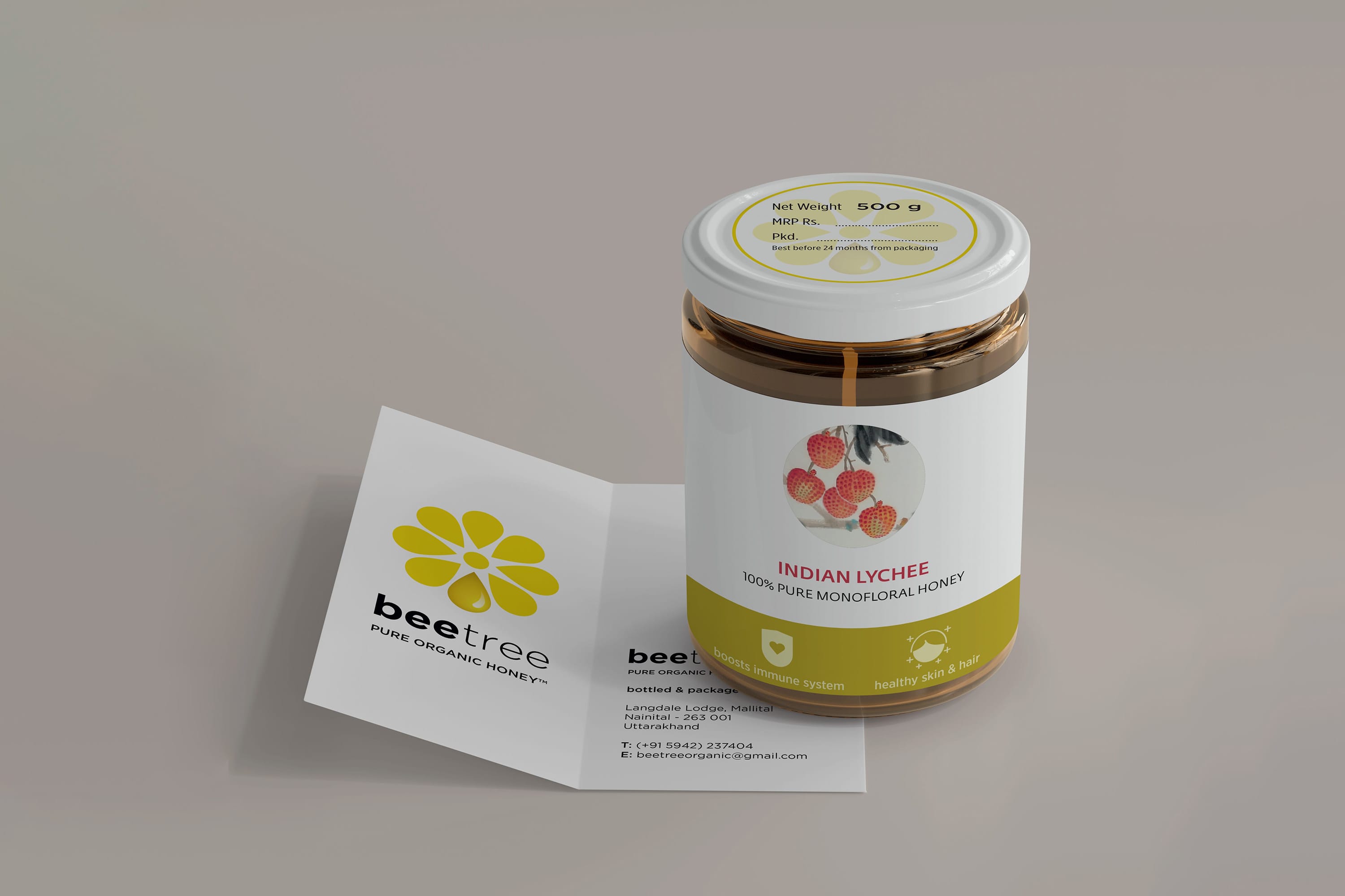
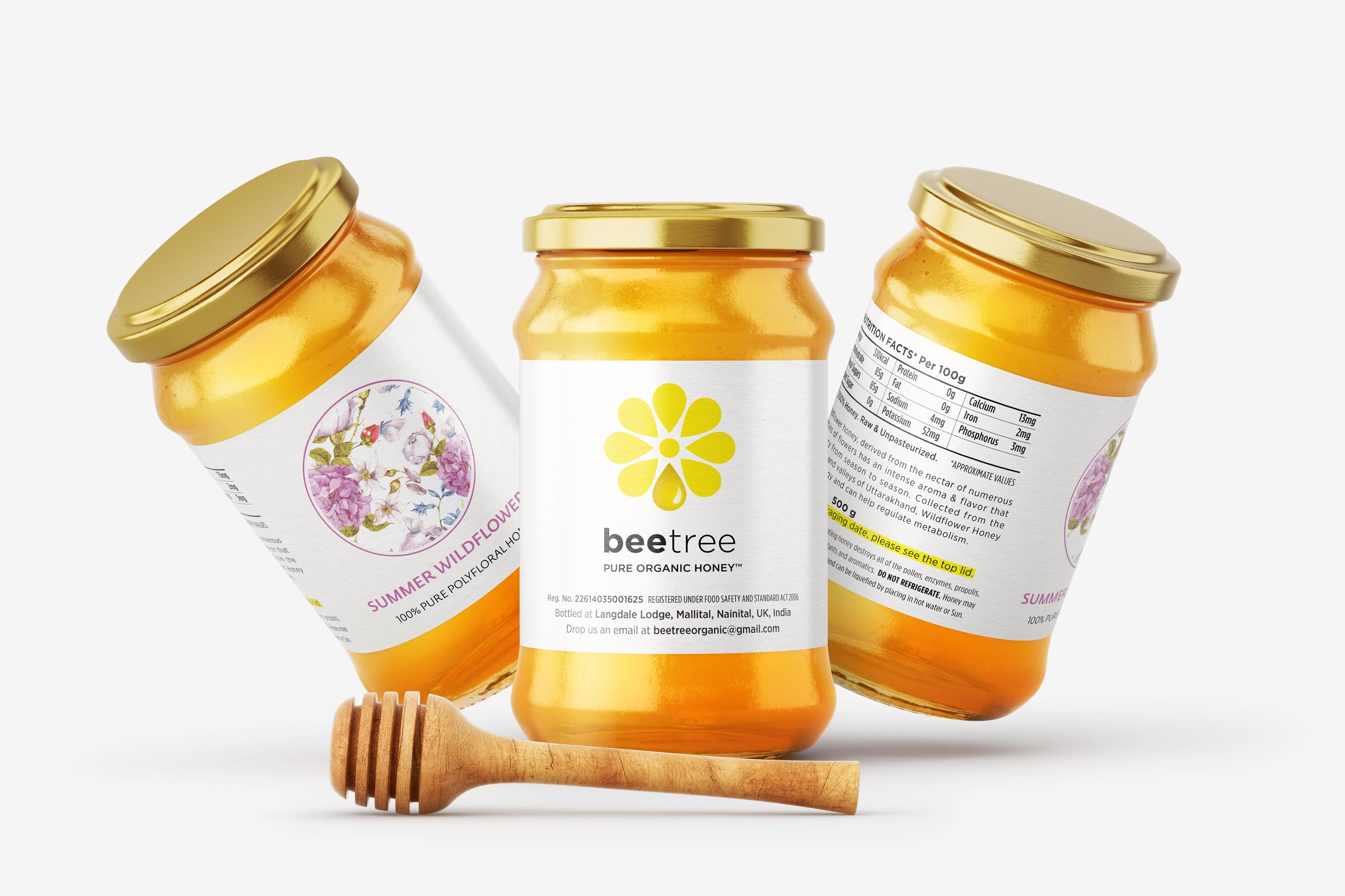
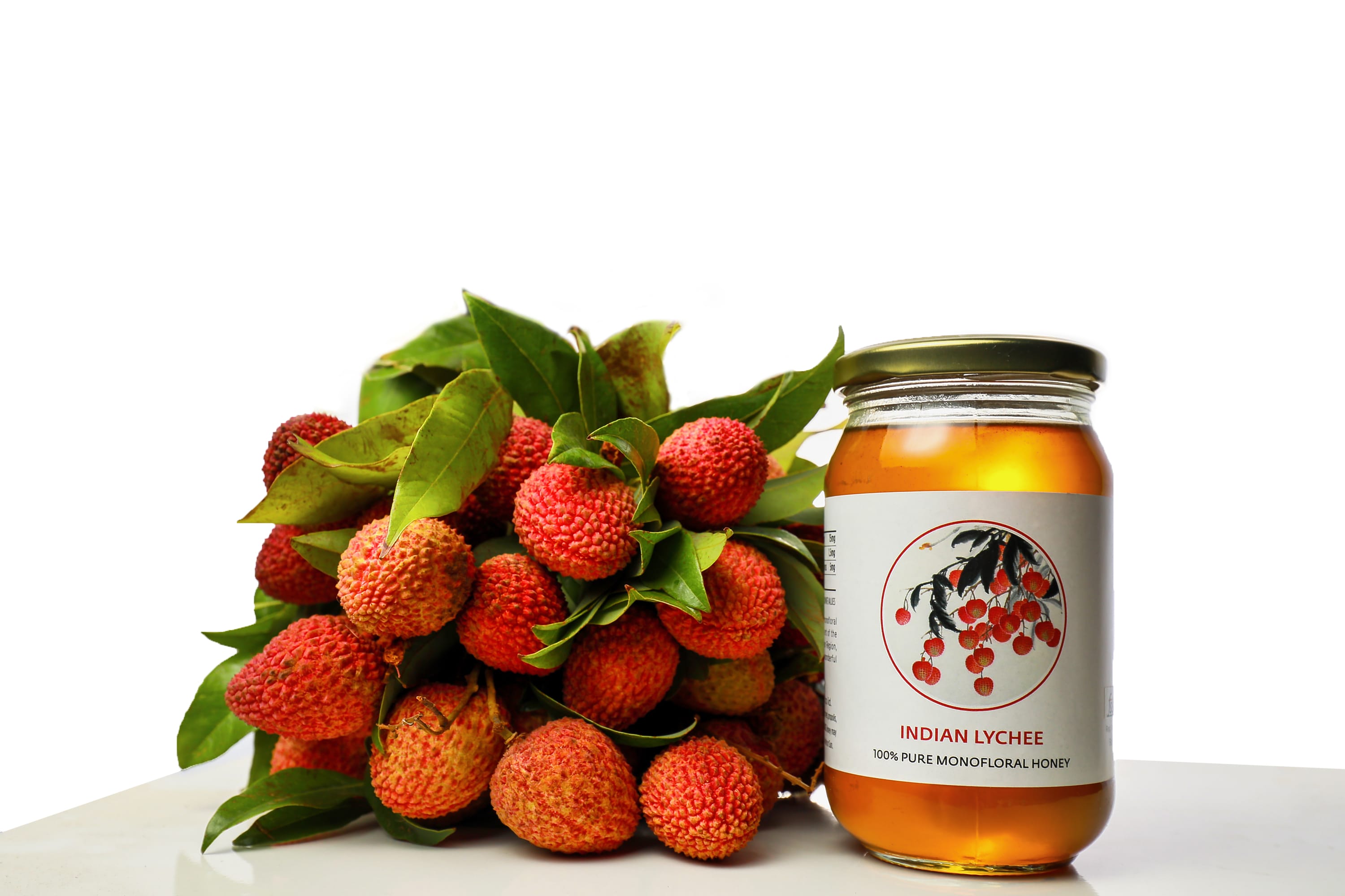
The Beetree packaging features a clean, minimal design that significantly sets it apart from the competition. The simplicity of the design, with its elegant, uncluttered labels, effectively communicates the purity and natural quality of the product. The use of soft, natural colors and delicate illustrations of the wildflowers and lychee fruit enhances the organic and artisanal feel of the honey.
The distinctive yellow lid and the modern, crisp typography further emphasize the brand’s commitment to quality and sustainability. The minimalist approach not only ensures that the packaging is visually appealing but also makes the product easily recognizable and memorable on store shelves. This thoughtful design aligns with Beetree’s brand values and helps convey a sense of trust and authenticity to consumers.
Application
