Client
Alka Hotel
Industry
Hospitality
Services
Brand Refresh, Visual Identity, Tagline, Sub-Branding, Photography, Content, Website
Overview | Process | Application | Website ↗
Introduction


Established six decades ago, Alka has stood as a testament to timeless hospitality and unwavering commitment to guest satisfaction. Their legacy is built upon a foundation of warm hospitality, personalised service, and a deep-rooted connection to the enchanting surroundings of Nainital and to the lake.
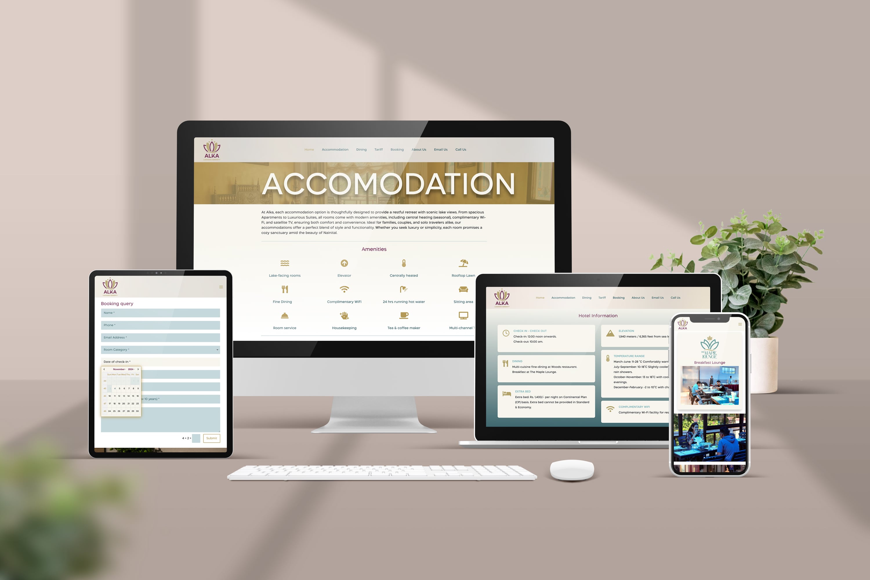
We saw an opportunity to elevate Alka’s brand and positioning. By revamping their brand identity, developing a cohesive brand strategy, redesigning their website, and enhancing brand communication, we ensured that Alka’s branding became contemporary while staying true to its heritage. This comprehensive approach effectively highlighted Alka’s unique charm and long-standing tradition of excellence.
Overview
Brief
Process
Ongoing Project
This project is currently in progress. Consequently, some elements, details, and components may be subject to change in the future.
Visual Identity
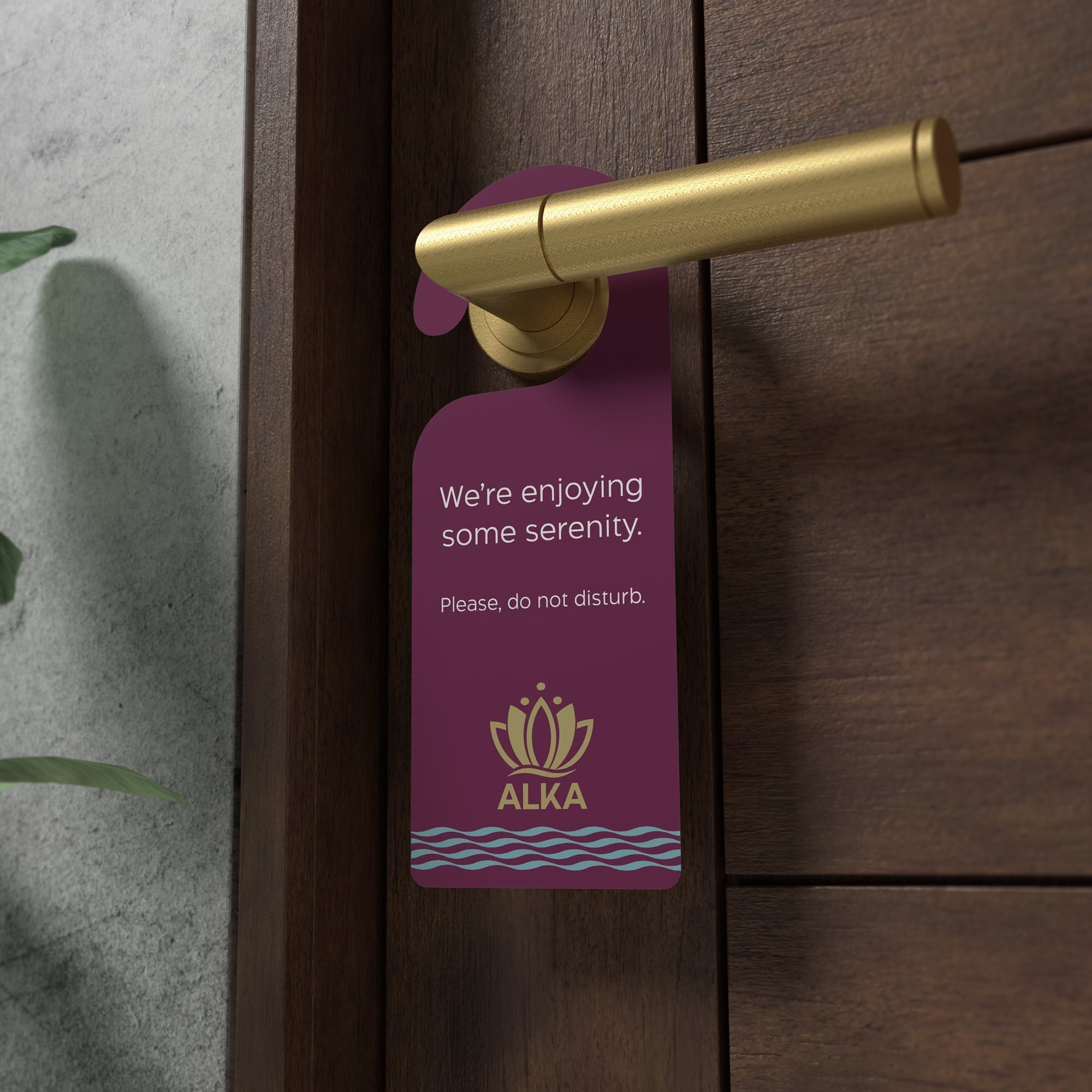
The clean lines and balanced elements reinforce the brand’s commitment to providing a tranquil and luxurious experience for its guests.
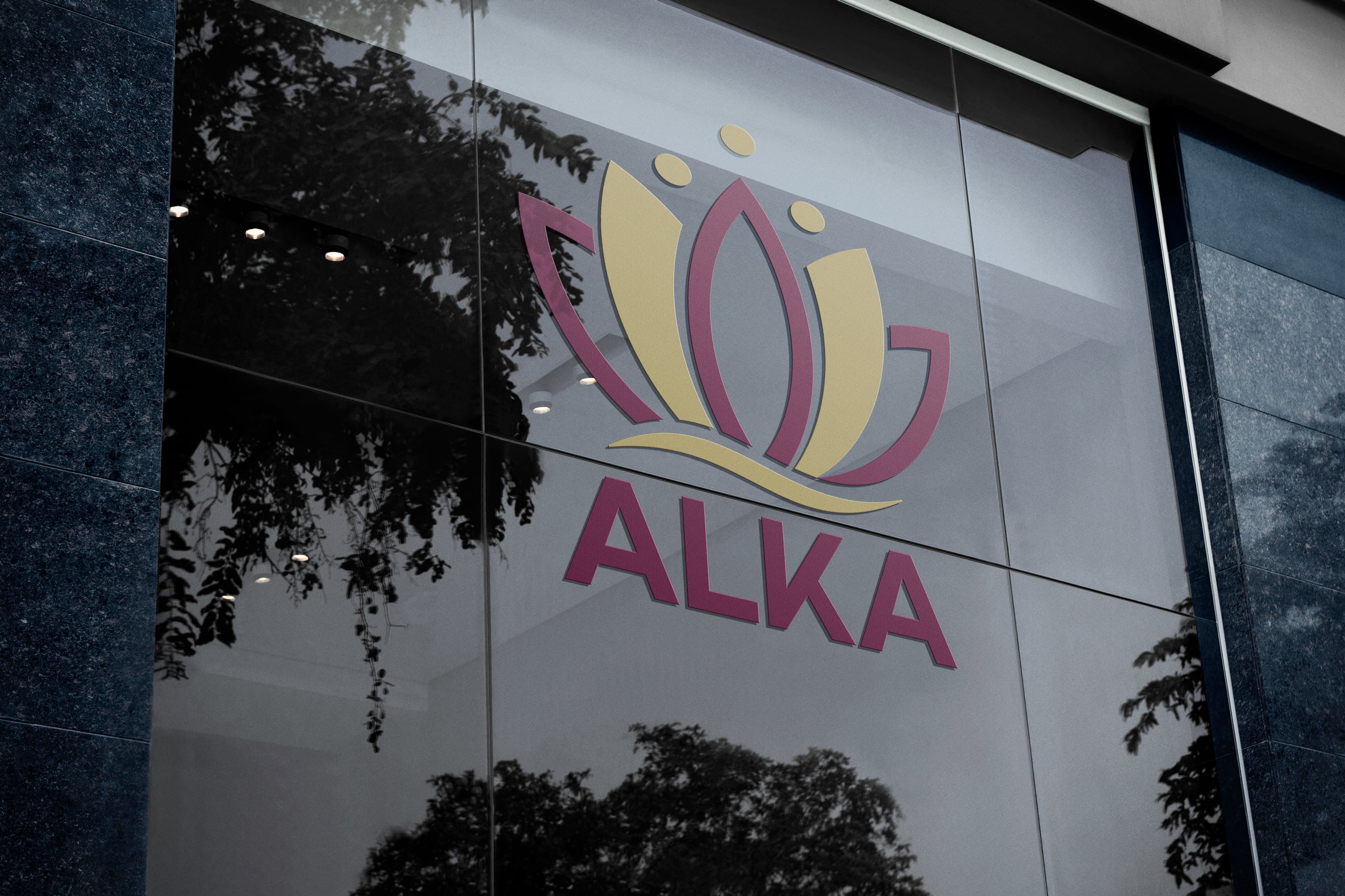
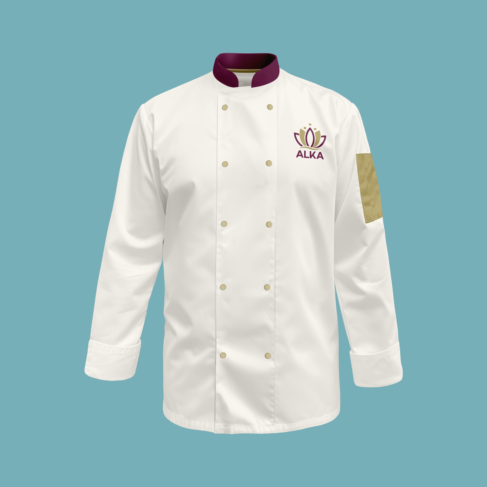
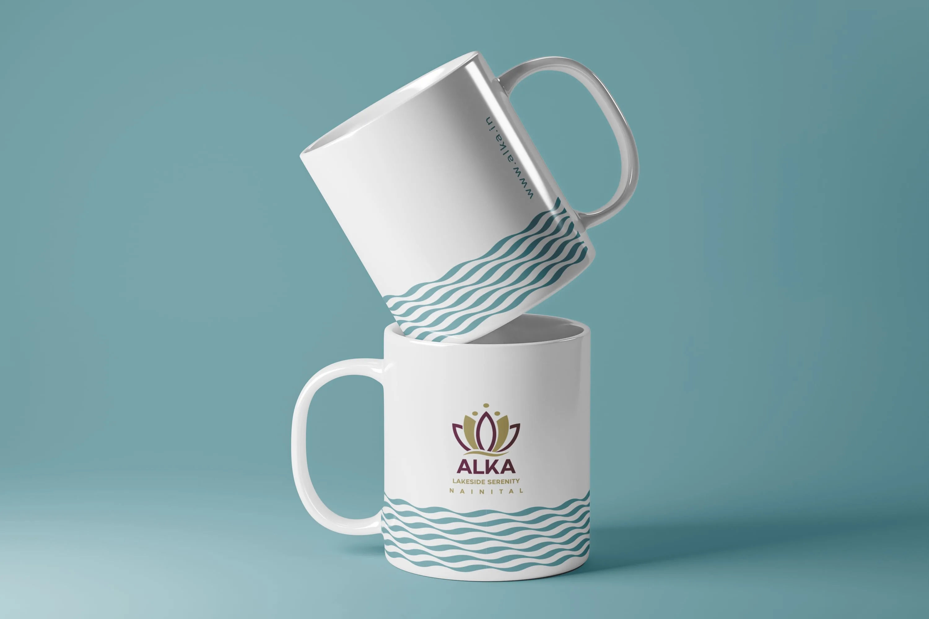
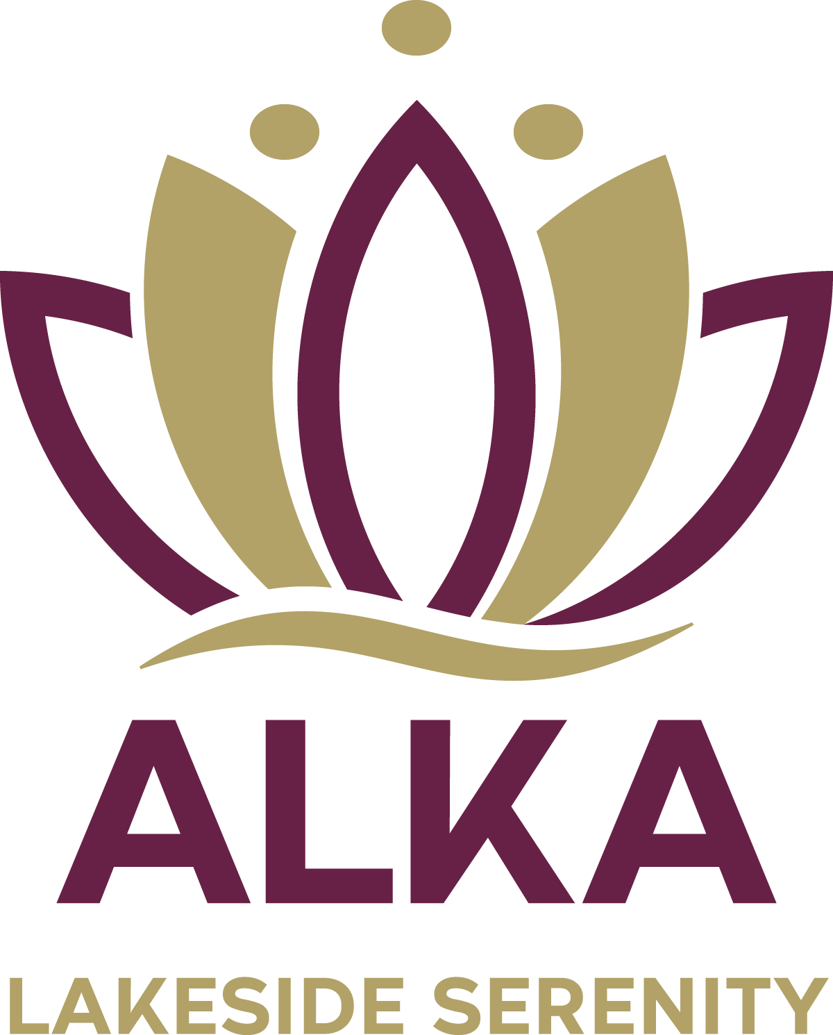
The refreshed logo maintains the iconic water-lily symbol that was a part of the old identity but introduces modern elements for a contemporary look. The updated logo features refined, sleek lines and a balanced composition, enhancing the visual appeal. The wave beneath the lotus remains, symbolising the serene lakeside ambiance, but is more integrated into the design, adding fluidity. The colour palette is also refreshed, using richer tones of gold and plum to reflect luxury and tranquility, aligning with Alka’s brand identity.
Logo Iterations
Refreshed Logo
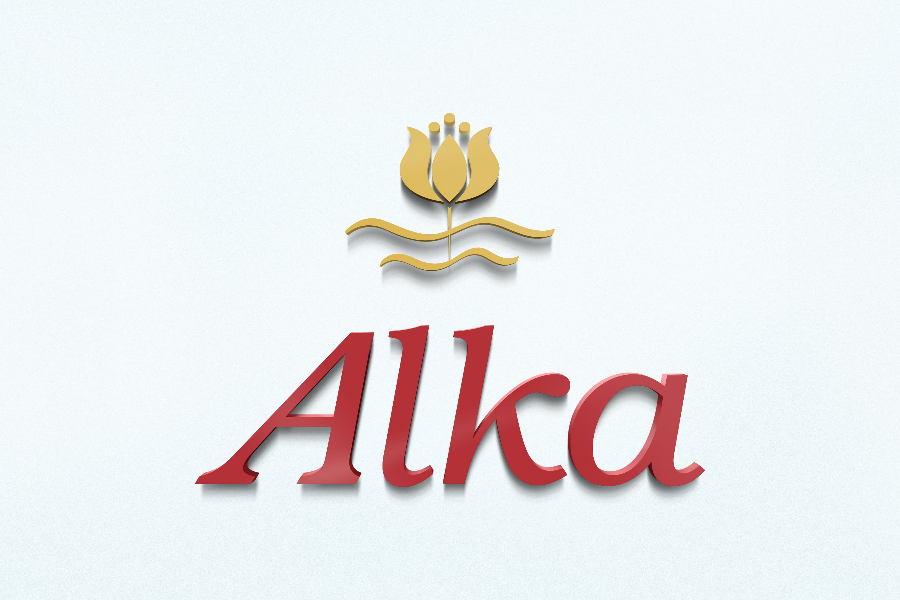
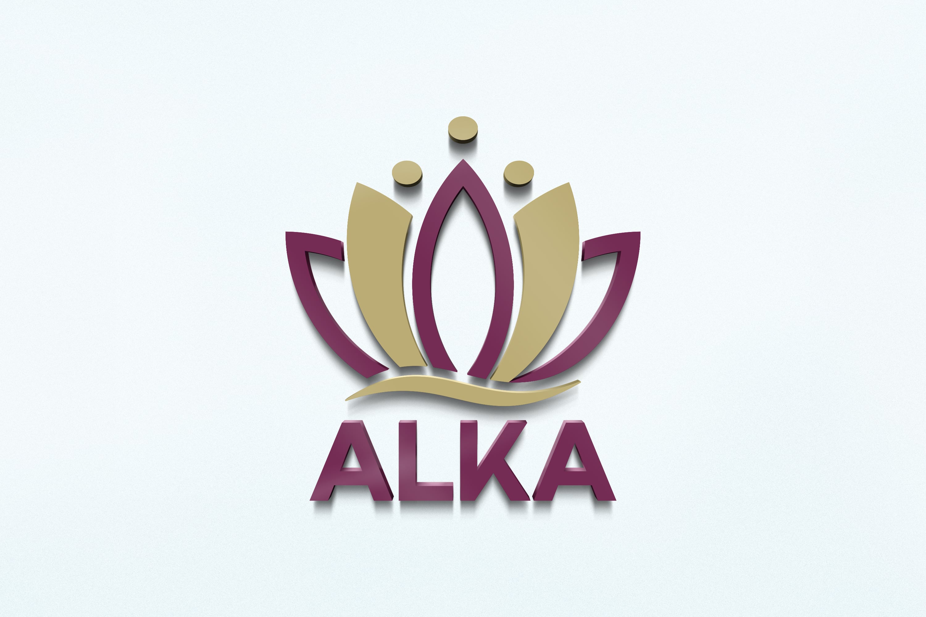
Alka logo before & after
Tagline
The tagline, combined with the updated visual identity, strengthens Alka’s positioning as a luxurious and peaceful destination.
The tagline “Lakeside Serenity” encapsulates the tranquil and peaceful experience that Alka offers its guests, emphasising its prime location by the lakeside in Nainital. It succinctly conveys the essence of relaxation and calm that the hotel promises, reinforcing its brand identity and appealing to visitors seeking a serene retreat. The tagline, combined with the updated visual identity, strengthens Alka’s positioning as a luxurious and peaceful destination.
Colour Palette
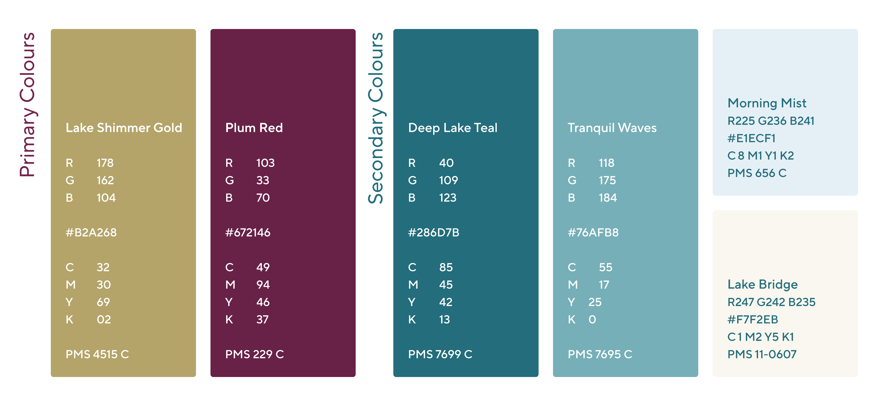
Alka’s colour palette is carefully crafted to reflect the serene and seasonal beauty of its lakeside setting in Nainital. The two primary colors are:
Lake Shimmer Gold: Captures the magical golden hue of the Naini Lake when illuminated by sunlight.
Symbolism: Evokes warmth, luxury, and natural beauty, enhancing the brand’s elegance and tranquility.
Plum Red: A blend of tranquil blue and warm red.
Symbolism: Represents the dual nature of Nainital’s climate, embodying both winter and summer. This color adds balance and richness, symbolizing warmth and calmness.
These colors are not only visually appealing but also deeply symbolic, reinforcing Alka’s brand values and its connection to the natural environment. The harmonious use of Lake Shimmer Gold and Plum Red ensures that the brand stands out while remaining true to its beautiful lakeside location.


Typography
Alka’s typography is integral to its visual identity, embodying elegance, reliability, and openness while ensuring clear communication and a strong brand presence.
Alka’s typography plays a crucial role in conveying the brand’s identity of elegance, reliability, and openness. The chosen typeface is bold and confident, yet clear and open, ensuring it is both approachable and authoritative. This choice reflects strength and confidence, essential for a brand positioning itself as luxurious and serene, while also communicating reliability and trustworthiness. Designed for readability and approachability, the typeface ensures information accessibility across various mediums, from large displays to small digital screens. Its versatility and scalability maintain legibility, supporting consistent brand messaging and recognition across all materials. In essence, Alka’s typography is integral to its visual identity, embodying elegance, reliability, and openness while ensuring clear communication and a strong brand presence.
Sub-branding
Alka’s sub-branding successfully creates distinct identities for each offering while maintaining a cohesive visual language that reflects the values and aesthetics of the main brand. This strategy can strengthen brand recognition, reinforce quality, and enhance guest experiences by providing clear visual cues for each venue’s atmosphere and purpose.
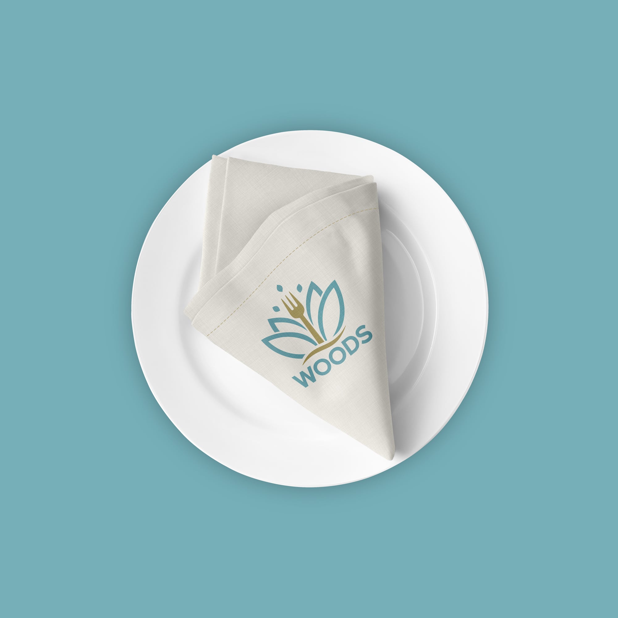
Sub-Brand: Woods
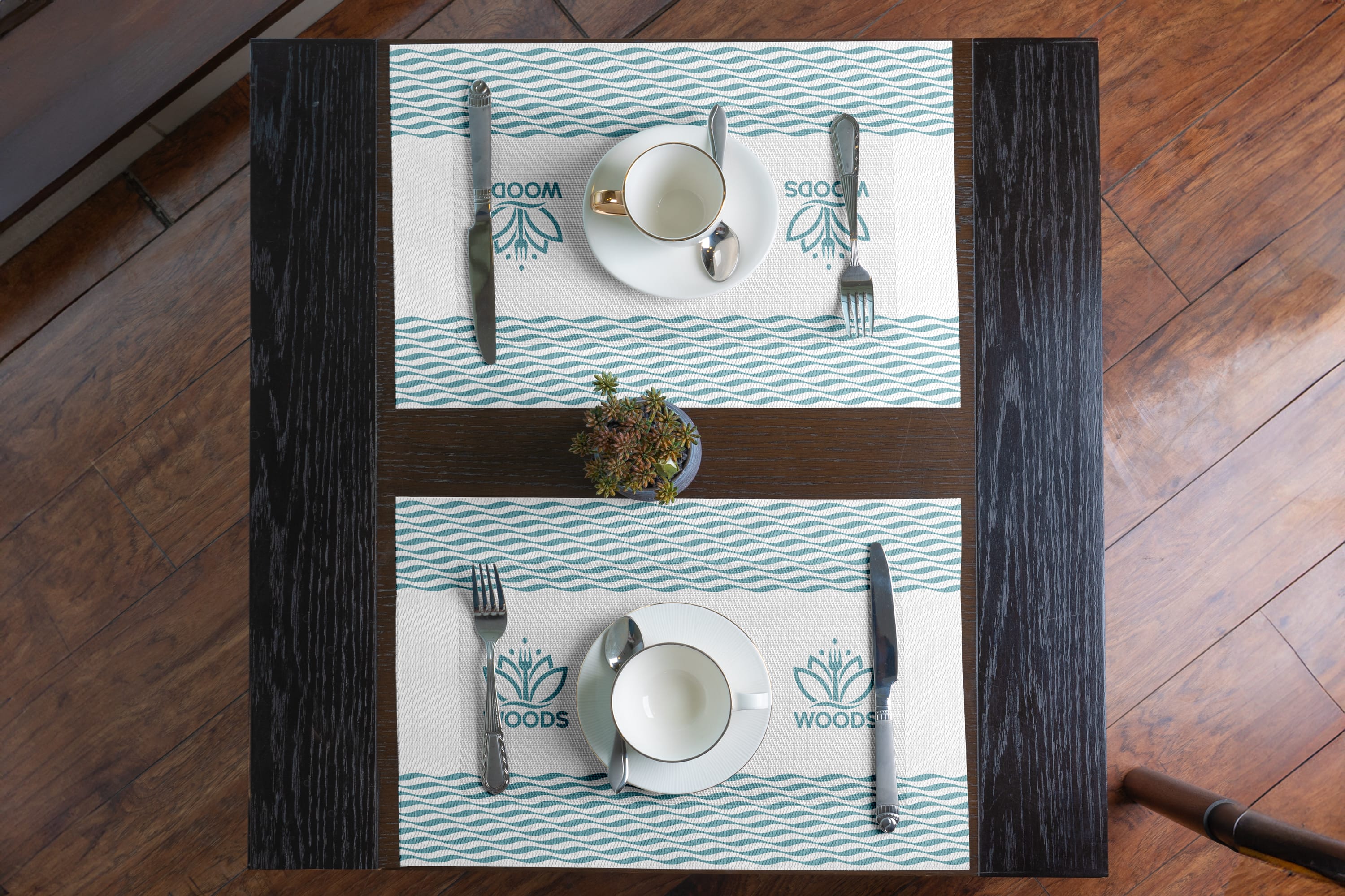
The “Woods” logo, as part of Alka’s sub-branding, maintains the floral motif of the main brand but introduces a fork at the center to emphasize its identity as a dining experience. The continuity of shape and structure with the main Alka logo ensures a visual connection, while the fork makes it immediately identifiable as a restaurant.
The color palette shifts to soft teal and gold, which gives a calming and nature-inspired feel, aligning well with the name “Woods.” This color choice helps differentiate the dining experience as one that is likely relaxed and connected to natural elements, perhaps reflective of a lakeside or garden ambiance.
Sub-Brand: The Maple Lounge
The Maple Lounge logo also draws from the same floral design as the Alka brand, but with the addition of a maple leaf at the top. This change subtly conveys a different experience, possibly evoking a sense of warmth, comfort, or seasonal charm associated with maple trees.
The deeper teal and gold colors used here offer a slightly more refined, cozy appeal, which complements the lounge’s likely role as a sophisticated, relaxing space. The serif typography used for “The Maple Lounge” adds a touch of elegance, setting it apart from the other sub-brands.


Photography
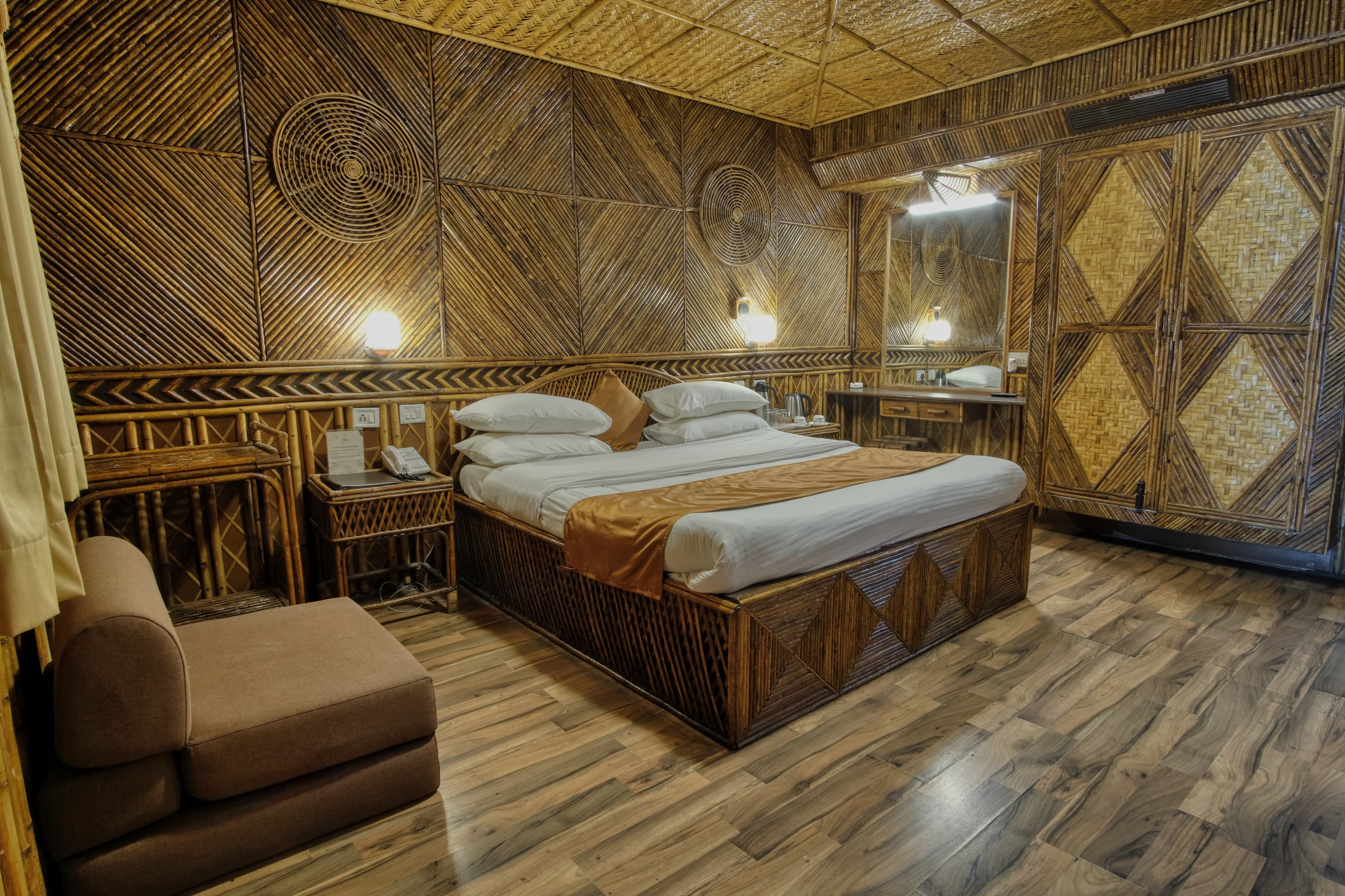
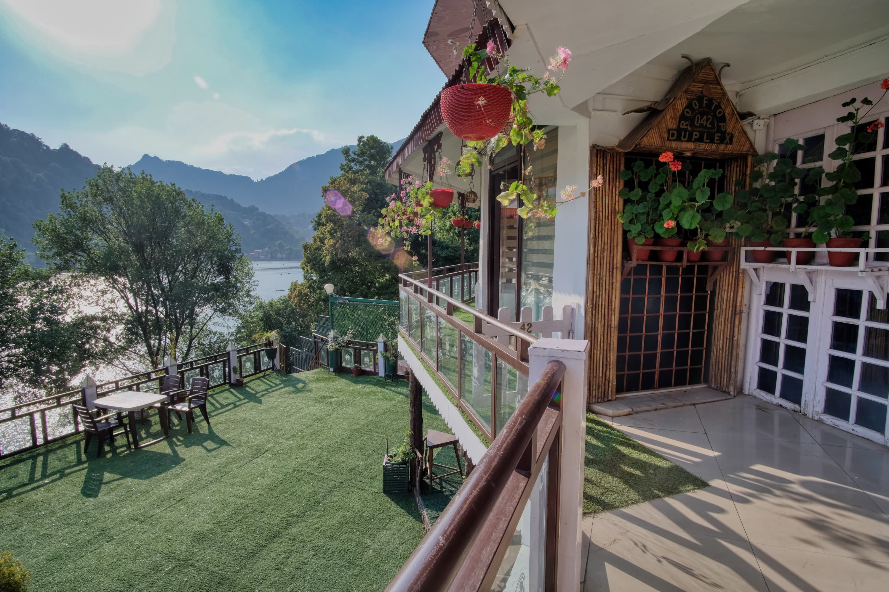
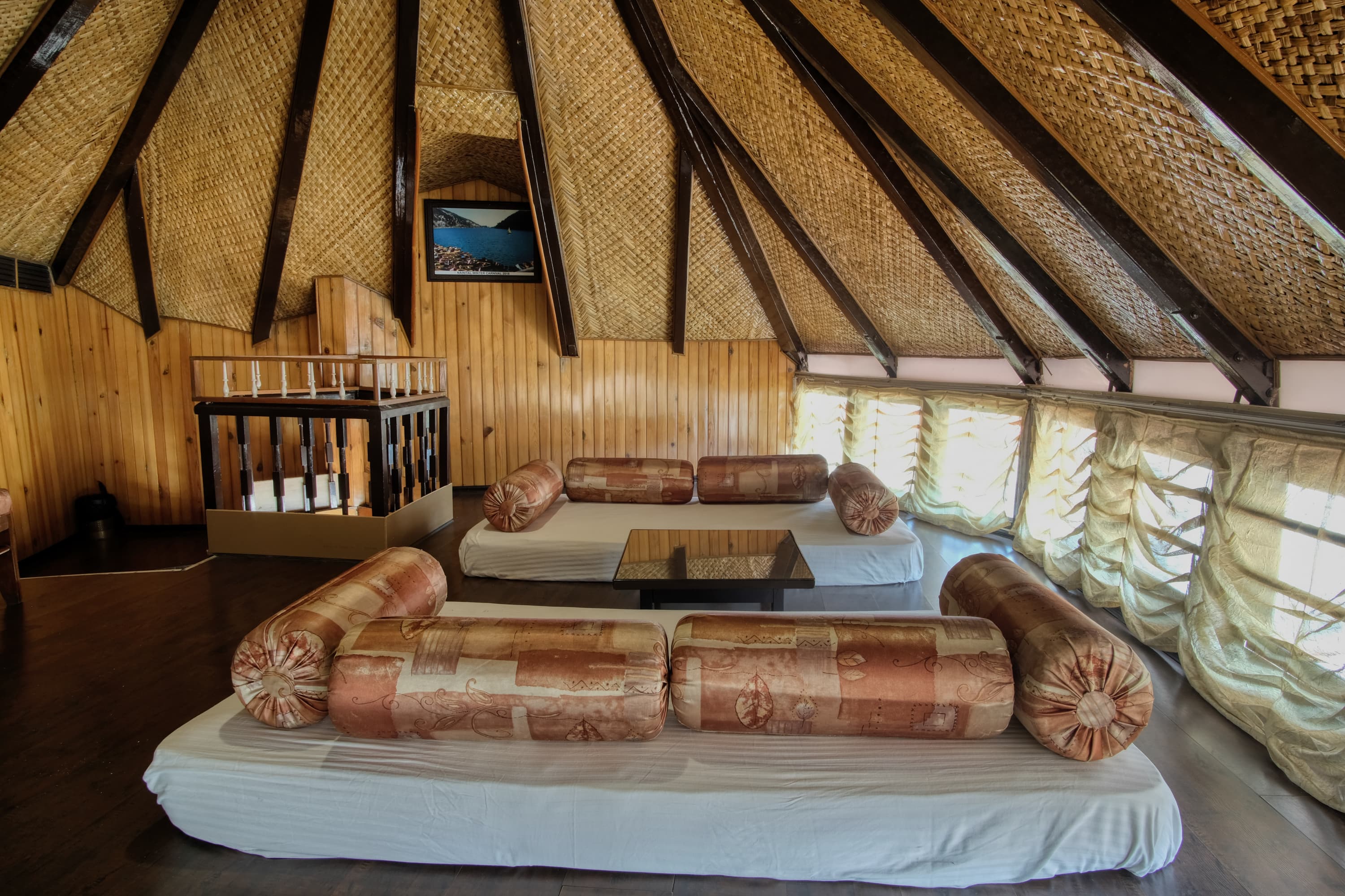
Our photographic approach creates a sense of luxury and comfort, showcasing the aesthetic qualities of the spaces in an elegant and meticulously composed manner.
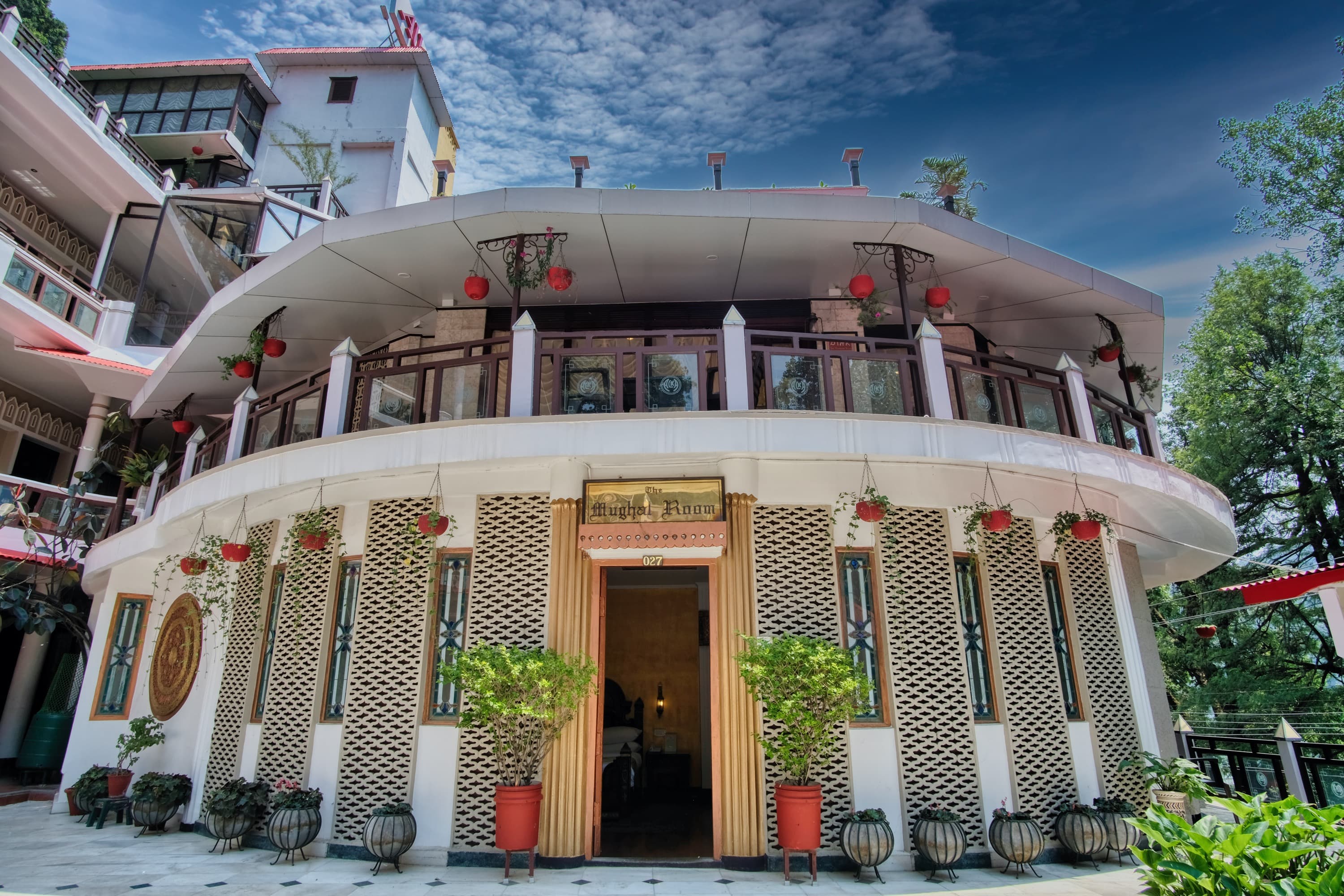
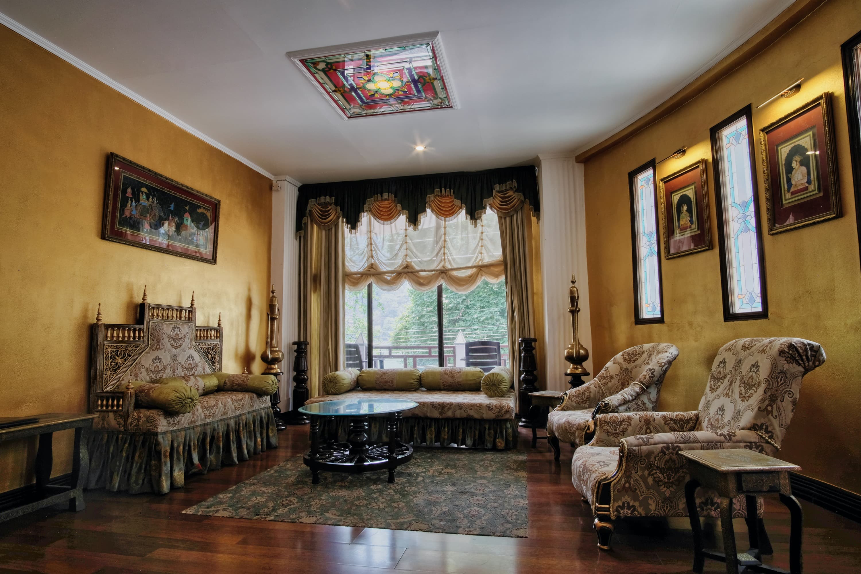
Alka’s photographic style is characterised by our focus on capturing the essence and atmosphere of various spaces. The style emphasises rich, ornate furnishings and decor, with a keen attention to lighting and colour. Alka’s photography often highlights intricate details such as stained glass, patterned furniture, and warm, inviting ambiances. Our photographic approach creates a sense of luxury and comfort, showcasing the aesthetic qualities of the spaces in an elegant and meticulously composed manner. The overall effect is a visually appealing and immersive representation of interior and exterior settings.
360° Virtual Tours
These tours provide an immersive experience, allowing potential guests to explore rooms and spaces interactively.
Pandesign created 360° virtual property tours for Alka, enhancing the presentation of their accommodation offerings. These tours provide an immersive experience, allowing potential guests to explore rooms and spaces interactively. This technology complements Alka’s traditional photography by offering a dynamic view of the properties, showcasing intricate details and the overall ambiance. The virtual tours are designed to give a comprehensive sense of the layout and decor, helping guests make more informed booking decisions.
Application
