Client
Wipro HealthCare IT Ltd.
Industry
Healthcare
Services
Naming, Visual Identity, Tagline
Introduction

Wipro Healthcare offers a range of digital IT solutions designed to enhance healthcare delivery and efficiency. Their services span the entire healthcare value chain, including Health and Human Services, care delivery, and pharmacy benefit management. They leverage AI, automation, and advanced data analytics to improve claims processing, member engagement, and operational efficiency.
Pandesign crafted the name “Proheal” for Wipro Healthcare by merging “Pro,” indicating professionalism and expertise, with “heal,” signifying health and recovery. This name encapsulates the brand’s mission to provide professional healthcare solutions.
Overview
Brief
Requirements
Wipro HIS is a comprehensive enterprise-wide software that covers all aspects of management and operations of a hospital.
This modular and flexible system and the various modules are seamlessly integrated with each other. The HIS provides immediate access to clinical, administrative and billing data required by the various entities for efficient functioning of the hospital. Scheduling, outpatient visits and admissions are also streamlined by the application.
Requisitions and results reporting for laboratory, radiology and cardiology tests and dispensing of pharmacy and non-pharmacy items is possible using the HIS.
Deliverables
- Product Name
- Punch Line
- Product Logo
Process
Visual Identity
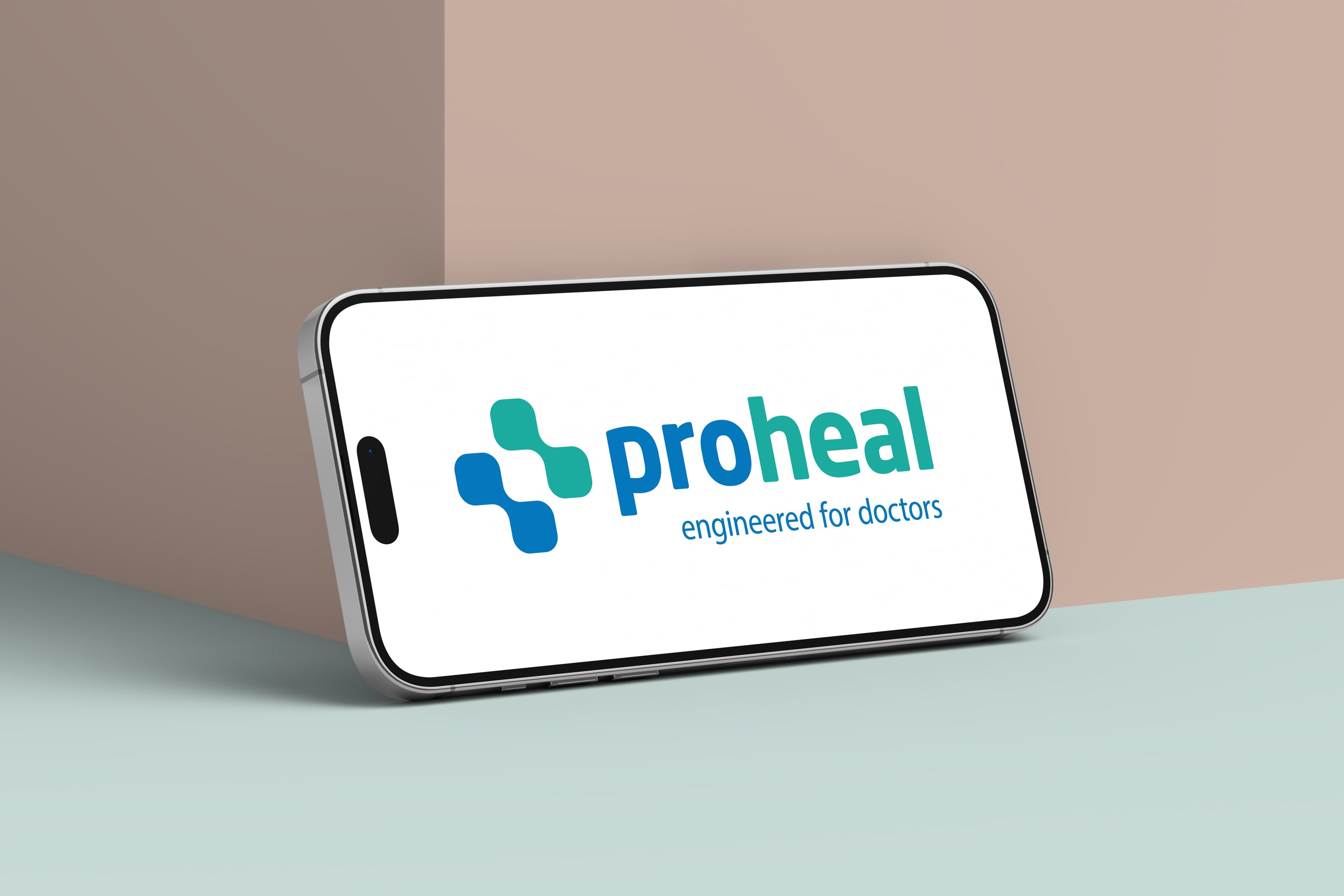
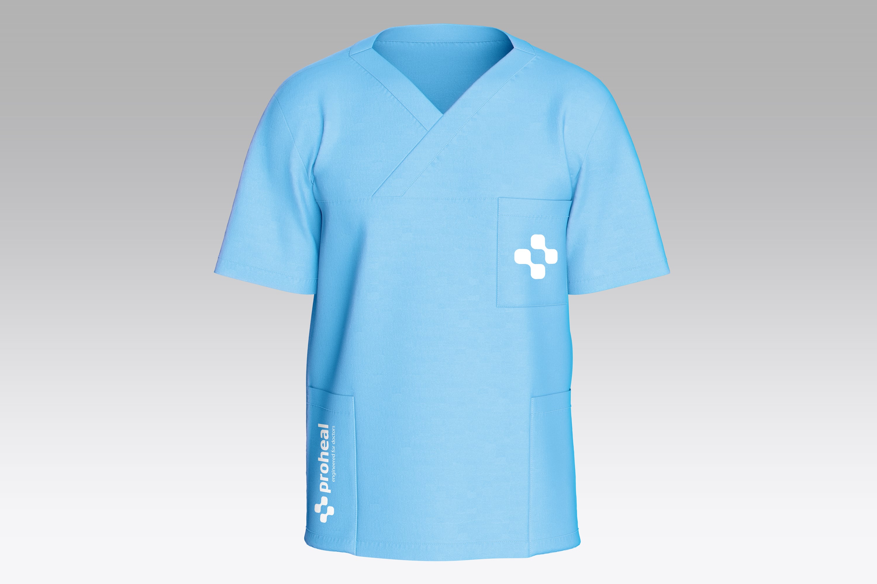
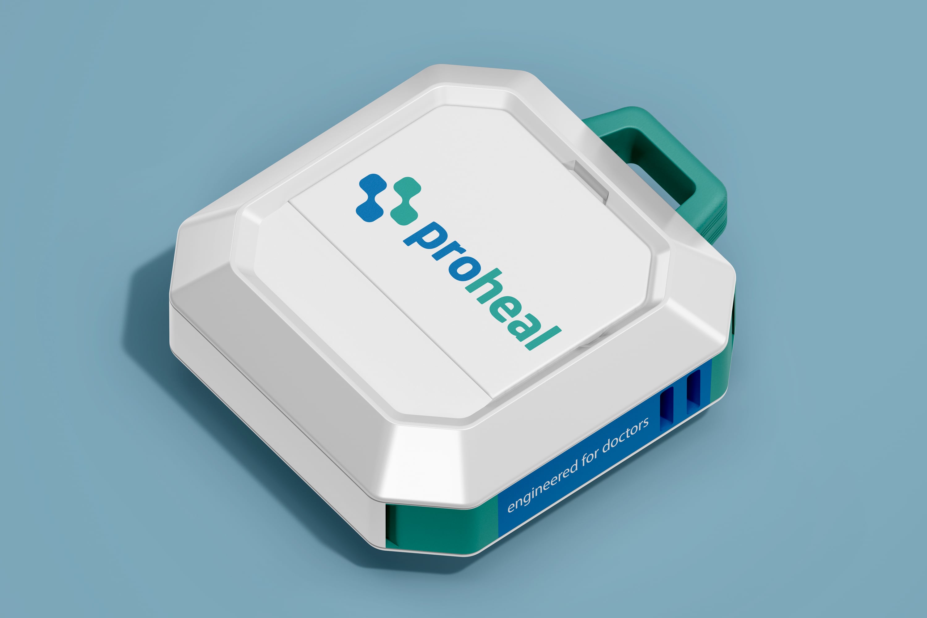
The visual identity is a thoughtful blend of healthcare symbolism and modern technology. The symbol, inspired by the red cross, is stylized to resemble the buttons of a kiosk, highlighting the integration of technology with healthcare services.
Colors: The logo uses shades of blue and teal, evoking trust, professionalism, and calmness, which are essential qualities in the healthcare sector.
Typography: clean and modern, reflecting reliability and forward-thinking, with the name ‘proheal’ clearly signifying professional healthcare.
The overall design aims to convey a seamless blend of medical care and technological advancement, emphasizing innovation in healthcare services.


Tagline
“Engineered for Doctors”
The tagline emphasises Wipro Healthcare’s commitment to creating technologically advanced solutions tailored specifically for medical professionals. It highlights the intersection of engineering precision and healthcare needs, reinforcing the brand’s focus on innovation and quality in healthcare services.

Application


